Scribus is the free software community’s answer to Indesign, Adobe’s program for layout. Along with the likes of Inkscape, GIMP/Krita, Synfig and Blender 3D, it is part of a veritable open source Creative Suite.
Believe it or not, outside the techno-bubble you and I live in, there’s still plenty of room for print periodicals. Sure, one day all those dead tree publications will themselves die, but somehow I don’t believe the art of distributing text and images on a page in a pleasing manner, i.e. layout, will kick the bucket with them. For starters, traditional layout is still finding a new life in all of places the web in all the those infographics everybody loves to make. And, who knows? Maybe some day we may even have a medium much better than the crappy “solution” that is current HTML to lay out digital media, and we will still have a use for specific design applications.
So regardless whether you’re considering a career in graphic design now or for the future, knowledge of programs like Scribus will likely come in handy.
Admittedly Scribus, and any other desktop publishing software for that matter, at first glance seem to make what should be simple, unnecessarily complicated. However, firstly, as with all software, as the number of things you can achieve goes up, so does an application’s complexity. And you can do so much more with Scribus in the realm of layout than you can with, say, LibreOfficce Writer. Secondly, if you do the preliminary legwork your workflow will improve… a lot!
Although we cannot stop people from using wordprocessors for layout (please don’t do this), we can show you how to use pre-layout to make your life easier. Today you’ll be learning how to use page templates, known in the trade as Master Pages.
Preliminaries
Scribus is available in the repositories of most GNU/Linux distros, as well as for MacOS X and Windows. There are two branches: the stable 1.4.x branch will give you most of what you need, but if you’re looking for bleeding edge and more features, you can try compiling the snapshot from the 1.5.x branch. However, be advised that this task is far from trivial and the end result may not be very stable or even work at all, so install 1.5 at your own risk. We’ll focus on the 1.4 branch for the time being.
Once installed, to start the program look for Scribus in the Office section of your launcher, or just type “scribus” in your HUD.
Scribus starts up with a handy wizard. Today you’ll be building the underlying template for a magazine article, so pick Double Sided for the Document Layout. While you’re at it, set the Default Unit to millimeters and set the page size to A4, which is pretty standard for a European publications.
You can also set the margins and bleeds for your standard page. Margins frame the main content on the page, they are limits inside the page itself.
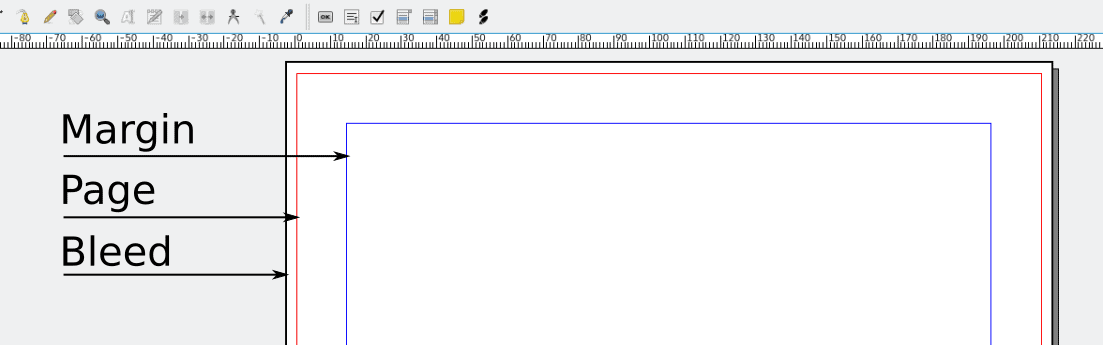
Margins fall within the page and bleeds fall outside the page.
Bleeds on the other hand fall outside the page. Magazine pages (and flyers, and book pages) are printed on sheets larger than the final page itself. These sheets are then cut down to size. As with all things mechanical, the cutters are not 100% accurate. There is a margin of error, and that is what the bleed compensates for. A usual margin of error for modern day machinery is in the +/- 3 millimeter range, so the cutter’s blade can fall anywhere between 3 millimeters inside the page and 3 millimeters outside of it. This means you should not place anything you don’t want cut off less than 3 millimeters from the edge of the page. It also means that, anything you want to go over the edge of the page, say for example a background image, must go over by at least 3 millimeters.
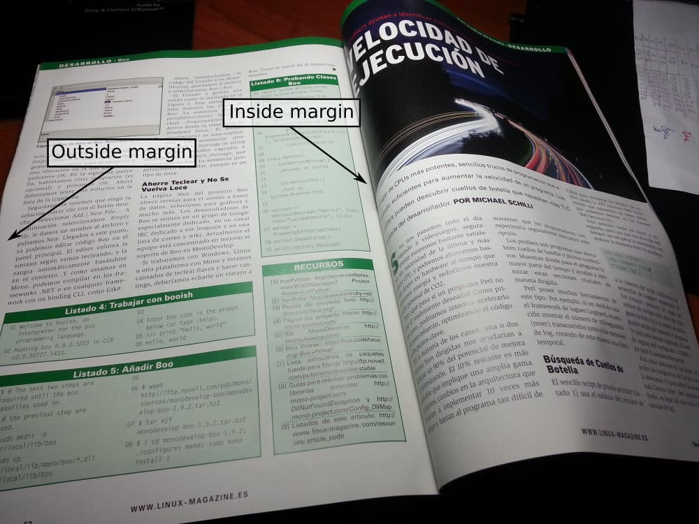
You must also remember this is a magazine and the pages will be bound together, so both margins and bleeds will vary from inside (the side of the page nearer the center of the spread) and outside (the side of the page further from the center of the spread) and, sometimes, from top to bottom too. The inside margin will usually be wider than the outside, since the nearer the center a block of text is, the harder it is to read because of how the page bends.
Likewise, you don’t need a bleed on the inside of a page because the cutter only cuts along the outside, top, and bottom of a page.
The final measurements could be something like what you see below.
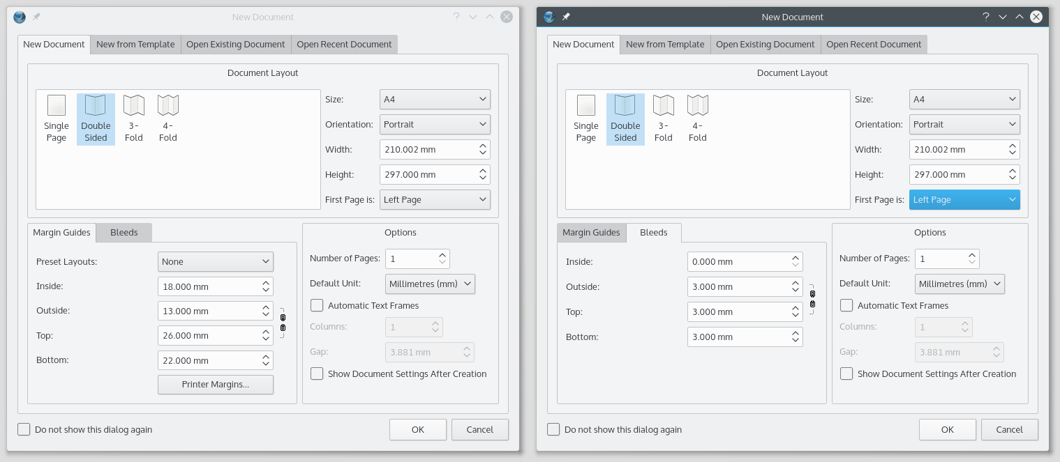
Margin and bleed measurements for your magazine.
Pick Left Page from the First Page Is dropdown and then change the Number Of Pages to 4 (although you can insert and delete pages as necessary later on) and press Ok.
You should end up with something like this:
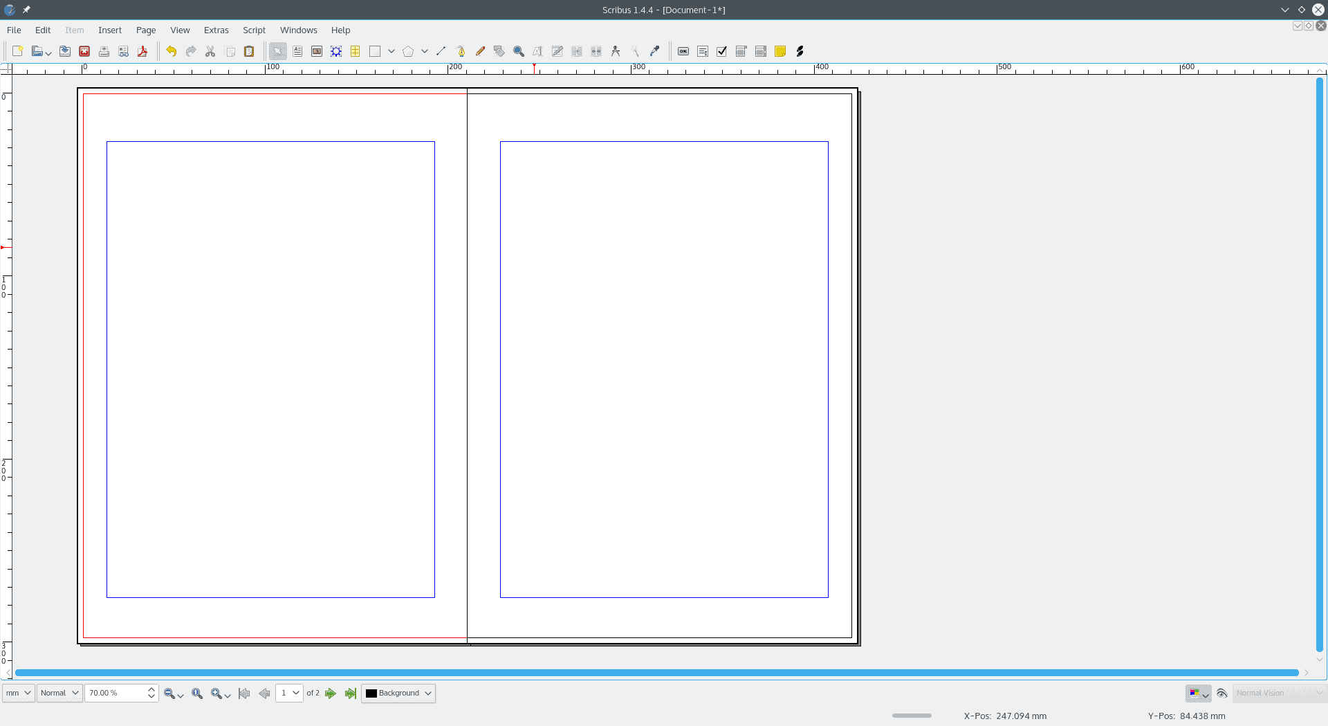
A full spread as generated by the start up wizard.
This is a good start! You could theoretically start placing text and image frames on the page already.
However, although not the hardest, magazine layouts are definitely towards the tough end of the spectrum due to the large amount of different elements you have to pack onto each page. If you want to save yourself a lot of work later on, you should consider building some Master pages.
Designing Master Pages
Master pages, as mentioned above, are half templates, half guides. You would put on the Master Pages stuff that does not change throughout the section, such as text frames that contain the page numbers, the headers, and so on. You would also lay out empty elements and that will serve as guides for the person doing the layout.
If you don’t have a clear idea of where you want to go with your layout, a way to hit the ground running with master pages is to start laying out elements on your document and, when things are starting to take shape, click on Page in the menu bar, and pick Convert to Master Page.
The other way is to start with the Master Pages directly, either because you have everything already more or less figured out or because the design has been handed down to you. Click on Edit and pick Master Pages… from the menu. A little dialogue will pop open with a list of the existing master pages. If this is your first time editing master pages, it will already contain the Normal Left and Normal Right pages. As long as this window is open, you’re editing master pages. To get back to your normal document, just close this master pages dialogue.
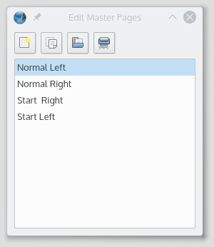
A list of available master pages. As long as this dialogue is open, you’re editing master pages.
The reason you have two versions of “normal” pages is that the layout changes from one side to the other. In the simplest cases, the right page is a mirror of the left side. If the text box that contains the page number is on the far left on the template for left pages, for example, the page number will be on the far right on the template for right pages. In more complex layouts the left and right pages can be completely asymmetrical.
Let’s start with the page numbers. Open the master page editing workspace as described above and pick the Normal Left master page. Pick the Select Item tool (the button with the arrow in the toolbar, or simply press ‘C’) and run a guide down the left margin. To do this, click on the ruler on the left and drag to the right until your guide lines up with the right margin. If you are finicky like me and want to place the guide exactly, you can open the Guide Manager by clicking on Page and ticking the Manage Guides… check box.
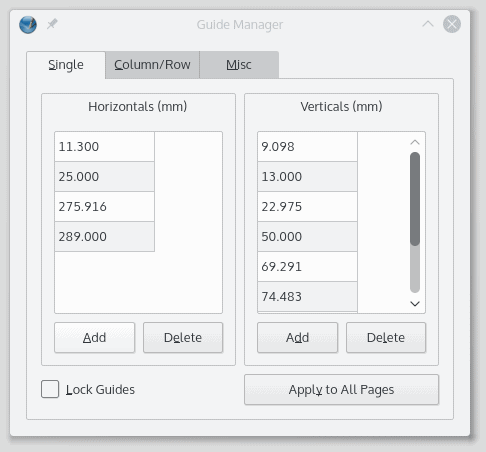
You can place guides exactly with the Guide Manager.
Pick the Insert Text Frame tool (button with the icon of sheet of paper with text to the right of the Select Item tool, or just hit ‘T’) and draw a frame at the bottom of the page aligned on the right with the ruler you drew in the previous step.
You can place the frame precisely by editing its X, Y, Z properties. To do this, select the frame with the Select Item tool and press ‘F2’. The Properties dialogue will open. In the first tab you can set the X and Y position of the text frame’s upper left corner, as well as its height and width. The picture below shows the values I used for my frame.
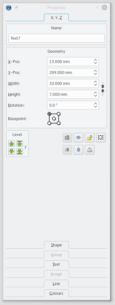
It’s a good idea to keep the Properties dialogue open most of the time.
If you double click inside the frame (or pick the Edit Contents of Frame tool – press ‘E’), you can actually type within the frame. If you type a pound sign (#), Scribus will substitute that with the correct page number on the normal pages.
A quick note on fonts: For the footer and header elements, I chose to use the Oswald font, a sans serif, rather smart, reasonably well-designed, and unassuming font… with a bucket load of different weights. By using different weights and shapes from the same font family, you can be consistent without being boring.
You can add a few more elements across the bottom, such as the issue number, the URL for the magazine’s website, and so on. Across the top I included OCSMag’s logo imported from an SVG (File > Import > Get Vector File…), a line that runs along the top and onto the opposing page (Insert Line tool or ‘L’), and the name of the section and topic of the article.
For the body of the text, call me old-fashioned, but I suggest you go with the typical 3-column-with-a-5 -mm-gutter layout of many tech-journals (a “gutter” is the space between two columns, by the way). If a text frame is too wide, it is easy for a reader to get confused halfway through a line and accidentally skip to a line above or below it. Splitting your text into narrower columns makes it much more readable. Also, although it is counterintuitive due to the extra space the gutters take up, thanks to the magic of kerning and line breaks, you can pack more text into three columns than into one.
When you’re done, you must also build the “Normal Right” page, a “Starting left” page (the template for the page that goes at the beginning of the article) and a “Starting right” page (same as the above, but for articles that start on a page on the right). Fortunately, once you have your base “Normal Left” page, you don’t have to build the rest from scratch: you can base new master pages on existing master pages and even copy and paste elements between pages.
The four master pages I created are shown below.
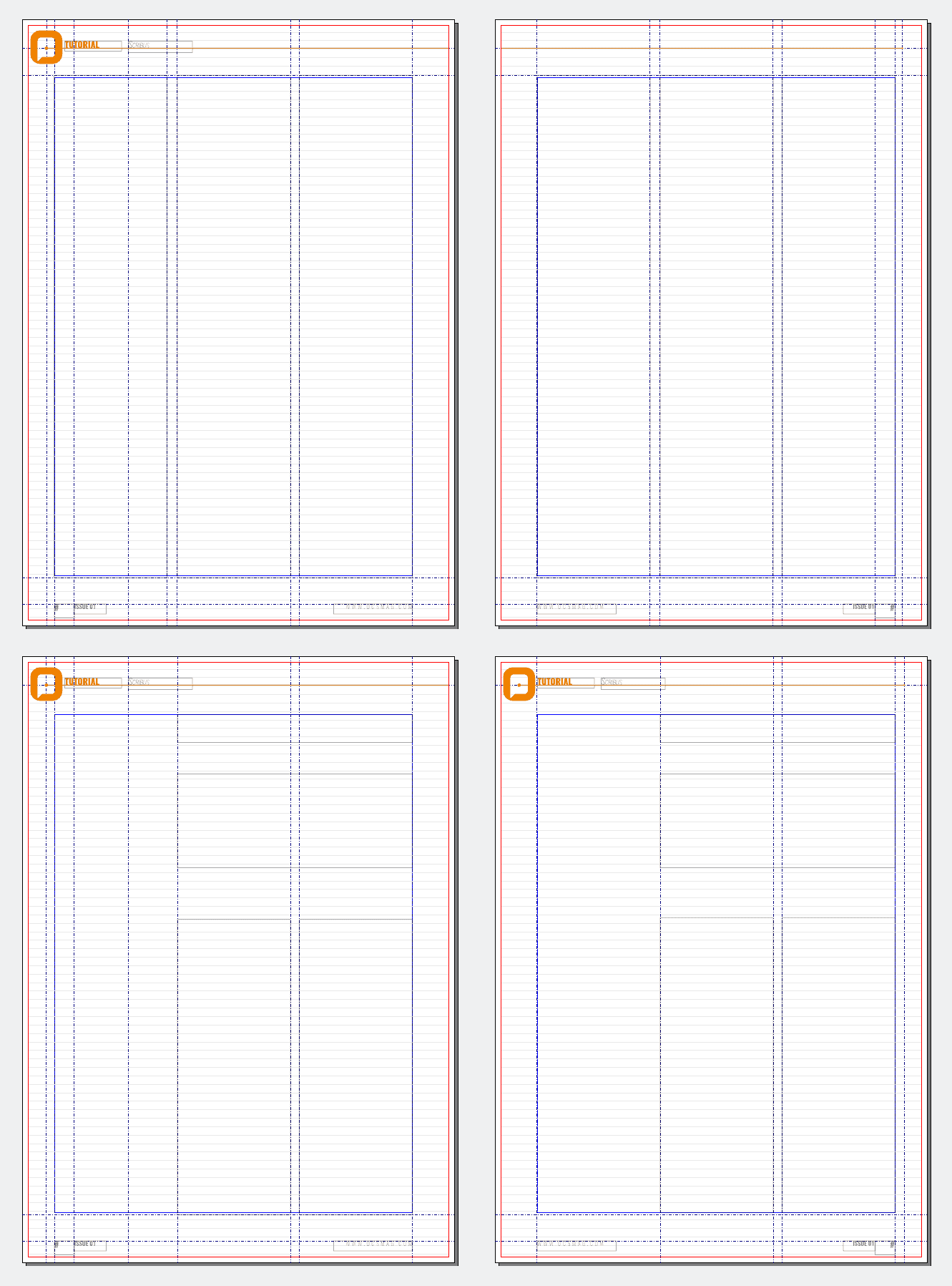
From left to right and top to bottom, Normal Left master page, Normal Right, Start Left, and Start Right.
Note that that you may want to get rid of the excess guides so that the normal pages are not a confusing mess of crisscrossed lines.
Applying Master Pages
Applying master pages to your normal pages is dead simple: just right click on the page you want to apply the template to, pick the master page you need from the dropdown in the dialogue that pops up, and decide if you want to apply the template to the Current Page, all the Even Pages, all the Odd Pages, or to All Pages.
Bear in mind that in magazines even pages go on the left and odd pages on the right. It is also quite typical for planners to try and start an article on an even page, i.e. a page on the left, so the first thing the reader sees is a full spread of the article. Advertisements tend to go on odd pages, because, apparently, a reader’s eyes drift to the right when reading. I am not sure this is also true for languages that are written from right to left.
To number the pages, let’s make your article start on page 10 and runs for four pages, until page 13. To set the page numbers, click on File > Document Setup…. A dialogue will open with a toolbar down the left side. Scroll down until you see the Sections icon. Click on that, and in the tab that opens on the right, change the number in the Start column to 10. Click on Ok.
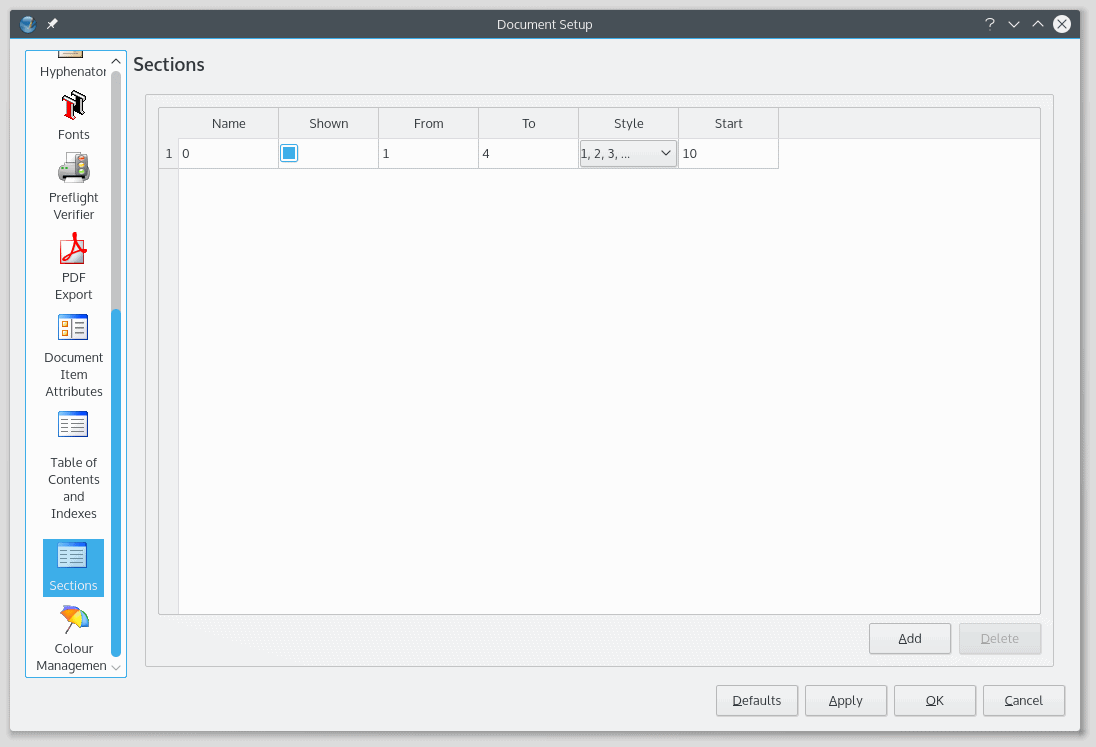
Set the starting page number of your article in the “Sections” tab.
We discovered a bug in Scribus due to which changes in the numbering often did not show up immediately in the layout. However, rendered PDFs showed the correct numbers, and this is what matters.
Filling in your Contents
Before actually copying over text and graphics, go to Page on the menu bar can click the Snap to Guides check box so, when you make text and image frames, they stick to your Master Page guides.
You may also want to adjust the baseline. By default, text in a text frame will move with the frame and will align vertically with whatever you have configured as the line separation, the first line touching the top of the frame, and the rest of the lines adjusted according to the line separation from there on.
But you can also align text to what’s called the baseline. When you align to the baseline, text will “stick” to an invisible grid of lines that are global for all the text frames on a page. The baseline is very convenient to make text that spreads out over several frames look orderly. If you click on File > Document Setup and then Guides, you can tick the Show Baseline Grid and see what I mean.
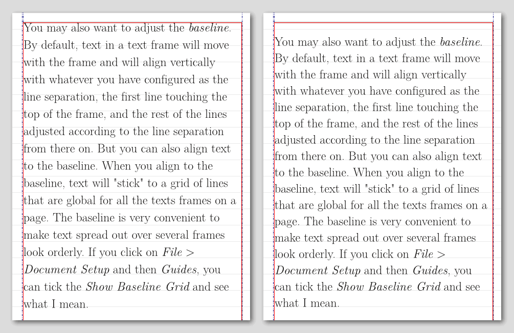
Text with an automatic vertical alignment on the left, and aligned to the baseline on the right.
As you will be using a serif font (Nimbus Roman No9 is a good option) sized at 9 points — a pretty standard size for magazines, the ideal separation between baseline lines (Baseline Grid) for better readability is 12 points. You may also want to set the Baseline Offset to about 9.47 points. This will make the last line of the baseline align more or less with the page’s bottom margin. This last figure was achieved via trial and error, so if you’re doing your own thing with your own measurements and sizes, you’ll need to adjust accordingly.
Add text frames, one per column, and use the Link Text Frames tool (or just press ‘N’) to make text flow from one to another. To do this, select the first frame, press ‘N’ and then click on the second frame. Then select the second frame, press ‘N’ and click on the third frame, and so on.
You can load text into a text frame from a file (Scribus understands ODT as well as TXT) by right clicking on the frame and selecting Get Text…. Or you could just copy and paste from your wordprocessor. Use the Text tab in the Properties dialog to set the font, color, alignment and so on.
Before inserting graphics, you may want to convert them to CMYK using a color profile — see our article on ImageMagick to learn how you can do that from the command line. Alternatively you could use Krita. Also make sure images are at a decent resolution! Your 72 ppi photos which look fine on the web, are going to look super-pixelized on a printed page.
Below you can see an example of what you can achieve with Scribus.
Work in progress: This article being laid out for a magazine using Scribus…
… And what the generated PDF you’d send to the printer looks like.
Coming up Next: A matter of Style – Using Scribus Styles to Streamline your Layout Workflow
[sharedaddy]


Great article and bookmarked for others.
Why is the 1st image Inside/Outside margins a 3.5mb 2000×1500 sized image?
Impacts page loading the whole article and all other images was done loading while this image was only half way done loading.
You’re right. Updated with a more compressed iimage.
Thanks as some may have limited Wifi.