Over the years, my experience with KDE can best be described as a rollercoaster – on ice, with rocket thrusters. KDE3.5 was a great release, followed by a somewhat mellow, emotionally curbed KDE4, which took years blossoming, and then when it finally gained solid form, it was replaced with KDE5, or rather, Plasma 5.
Since 2014, Plasma has kept me entertained and disappointed in equal measures. At some point, I had it crowned my favorite desktop, and then it went downhill steeply, fast, struggling to recover. Not helping was the slew of bugs and regressions across the distro space, which exacerbated the quality of Plasma and what it could show the world. Today, I would like to explore Plasma from a different angle. Not from the user perspective, but usability perspective. AKA Everything What Plasma Does. After me.
Test bed
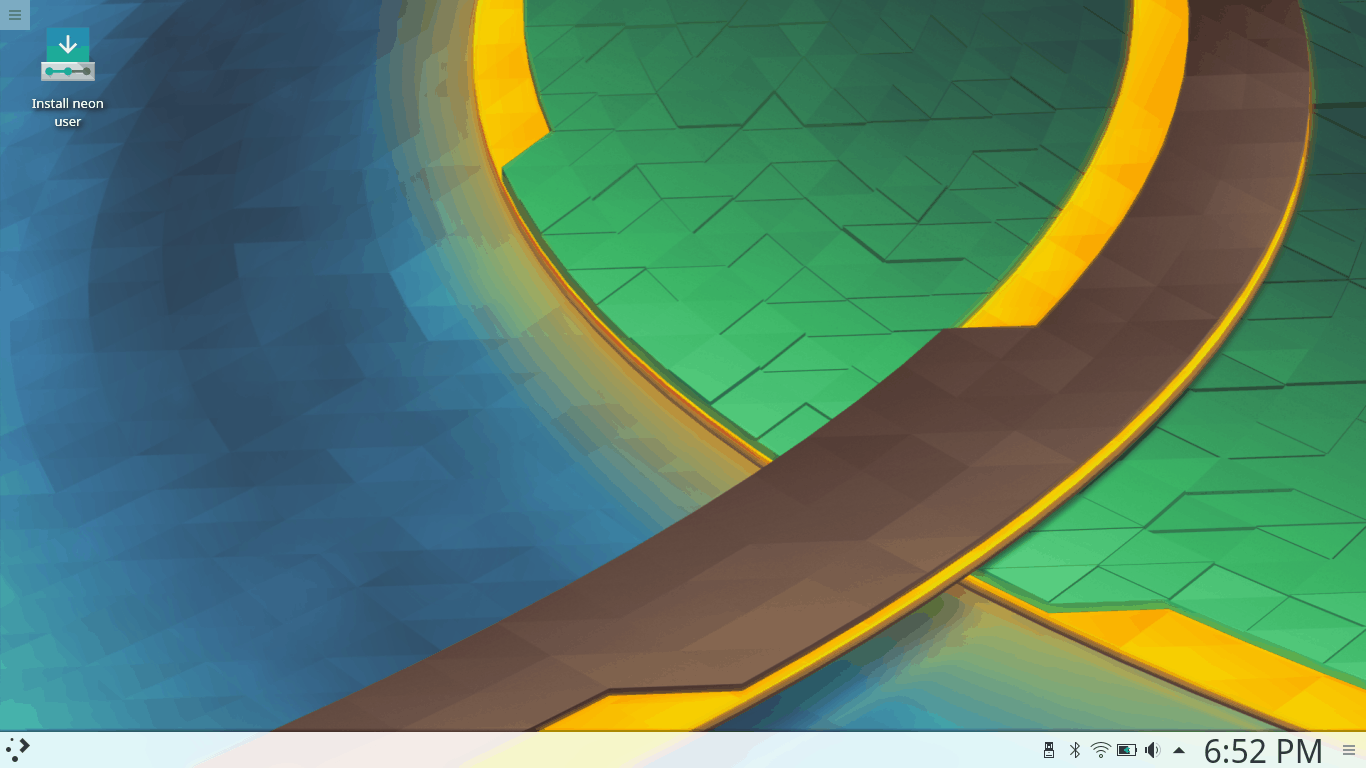
Every experiment needs its guinea pig. I decided to use KDE neon User Edition, running Plasma 5.9.1 (rather than the LTS Plasma image). This build was created on February 9, so it’s fairly new and fresh and comes with all the goodies. I decided to go against unstable developer builds, as they do not reflect the end state. As you may have surmised from my Wayland vs Xorg article, I am not keen on the bleeding edge stuff that only half-works and caters to developers.
Why KDE neon, though, you may ask? The reason is, with the Ubuntu base, it probably offers the simplest platform for testing without going into deeper usability issues that are distro-specific. True, Ubuntu has its own foibles, but largely, they should not come to bear in the neon testing. That said, my previous impression with neon was neutral, with some ups and downs and a heap of bugs. But that is part of the usability experiment we will be running here. Most importantly, neon ships with the latest and greatest in the Plasma and Qt space.
First impression
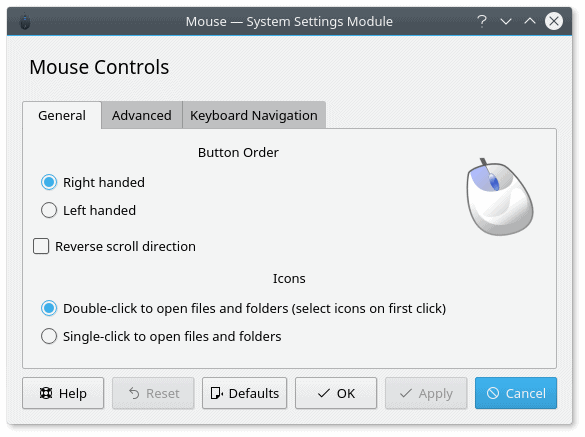
Plasma is a very nice desktop. Fresh, colorful – and pretty. You also get a sense that it is designed with flair and good attention to detail. It also follows the classic panel-down scheme, so it will be familiar to Windows people. Mouse actions are set to single-click by default, but this can be easily changed. Some KDE distributions, like Maui, do ship with the alternative setting.
Make a wish, the Systems Settings menu has it all.
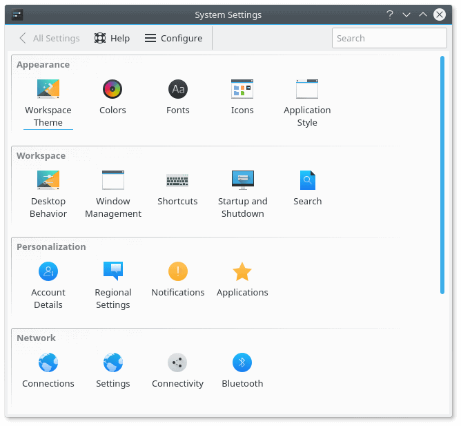
You can go wild with options; everything is there, under a single, simple, coherent menu.
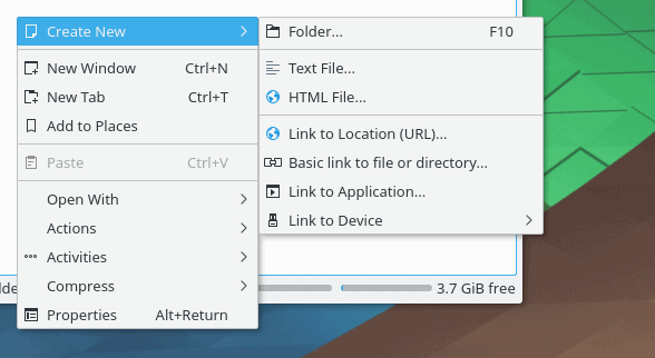
Plasma also retains some of the functionality that has disappeared from the Gnome-based systems recently, including trivial things like being able to create new files using right-click context in a file manager. This used to be something we once took for granted, but this isn’t the case anymore. Luckily, Plasma retains the tradition.
It also features the most sophisticated clipboard in any Linux desktop environment that I have seen, used, or remember. Most importantly, it actually enticed me to use it, which is not something that clipboards and I normally share. Do you get it? SHARE!
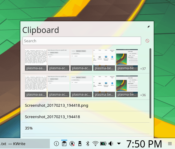
A beautiful and sophisticated clipboard. Sharing is caring.
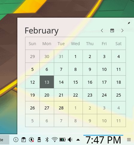
The calendar functionality is also quite decent – and adding new timezones is a breeze – another pun – but it would be nice if there was a deeper system-level integration somewhat akin to what Gnome does with online accounts and its repertoire of default Gnome applications. The calendar should reflect the mail activity and/or appointments, and the timezone functionality should natively play into this. Essential for any type of smartphone adventures, and these are underway, which you should know if you’ve read my interview with a couple of Plasma developers, Seb and Bhushan.
There should be an integration with KMail and/or other programs, as well as an option to include online accounts; cross-functional data sharing will be of great importance, especially if and when Plasma breaks through on the mobile.
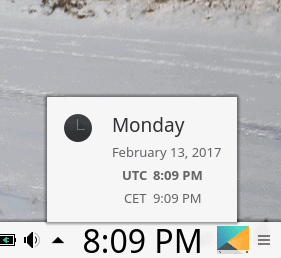
Adding timezones is a charm.
The top right corner is there to offer a rich desktop context menu, so if you’re not sure what you need to do, click there, and you will be able to quickly and easily customize your desktop. Part of the joy of using Plasma is the sheer level of freedom in editing the look & feel, all using the GUI and without any config hacks.
Generally, there is a very high level of commonality and consistency throughout the system. Because an important part of any product is brand awareness. This does not necessarily come through marketing or ad campaigns, but through intuitive aesthetic form identification. In other words, how easy it is to recognize the whole by just looking at a small part, a piece, a seemingly insignificant detail, be it visual, aural or else. For instance, the old Nokia ringtone. Or perhaps the Windows XP blue decorations. If you choose any which square of the Plasma desktop and look at it, will you be able to distinguish it as such? In my opinion, I believe that Plasma nails the formula.
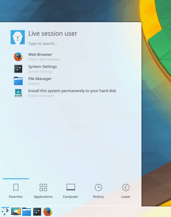
KDE neon also does a good job of offering a palpable session to new users, even in the live session. You get lots of apps, media codecs, so you can also test how your music works, and overall, you are not restricted in what you can do. I was also able to configure my printer, and you can even install new software – or updates.

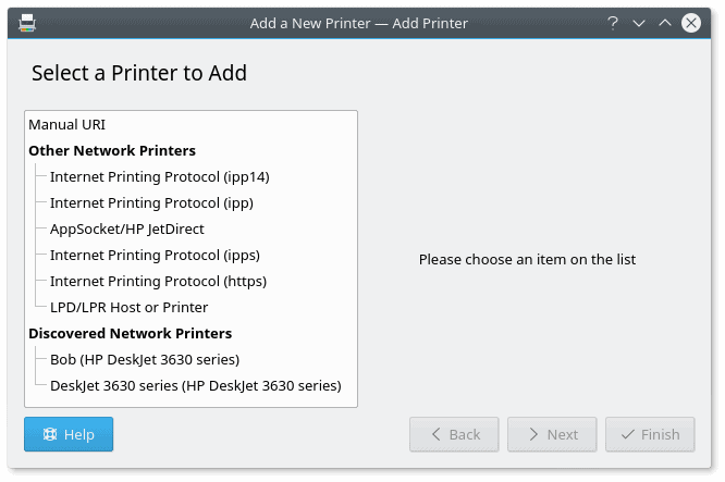
No Printer, No Love.
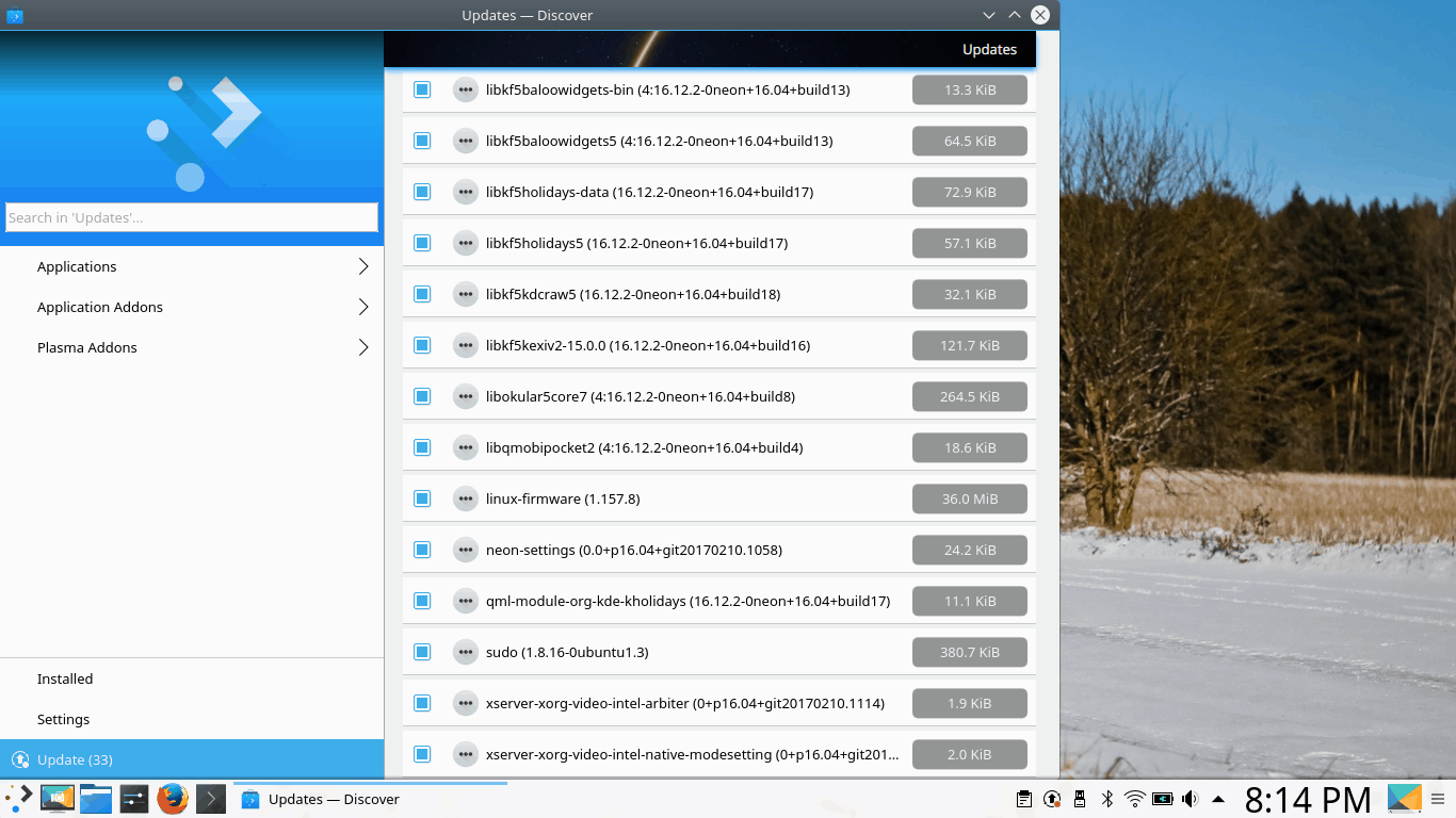
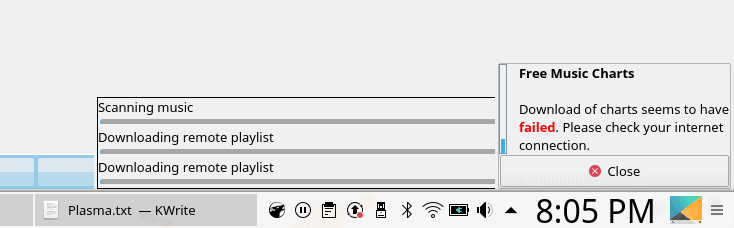
Discover is definitely not the most polished package manager, but it is slowly improving, and it is beginning to offer reasonable results in Plasma.
And then, without too much effort, you can also get to some rather pretty results:

However, I am doing a usability test – so this will largely mean talking about things that work less well or can be improved, but we will also dwell on the strong side of Plasma, as it is not all negative. Far from it.
Visual papercuts
If you ask me, Plasma is one of the more professional, complete open-source and Linux projects out there, and there’s definite focus on consistency, both in the looks and behavior, but this attempt does not always bear fruit, and there’s a long way to go before we can achieve perfection. This is apparent in the little things, the odd pixel here and there, the misaligned margin or padding, and unfortunately, there is no easy fix. Perfection is an asymptotic quality, and an exponentially growing effort is needed to master the finer details once the big stuff has been polished.
Brightness slider
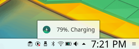
One of the most glaring bugs is the brightness slider that opens when you click the power (battery) icon in the system area. The slider lever never quite touches the far right corner as it should, and there’s a tiny gap that leaves the impression there’s some more percentage left. Not so. I believe this can be very easily fixed by re-calibrating the slider values. Alas, it’s been around for a long time now, so either people don’t have my OCD attention to details, don’t care, or both.
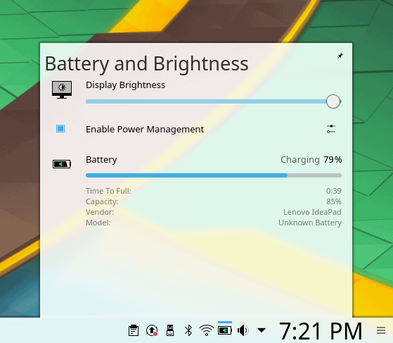
The slider should be in max right position with no gap left when the brightness is set to 100%.
Odd sizes
Some windows open at a rather odd default size, with less-than-full width of the drawn elements, which then truncates a portion of the window area to the right. There’s no automatic wrapping or rendering of window contents, so not only is the text hidden, but possibly vital parts and buttons of the GUI are not visible to the user. There should be a better use of proportions and sizes.
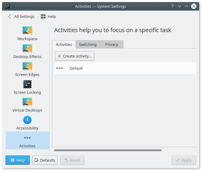
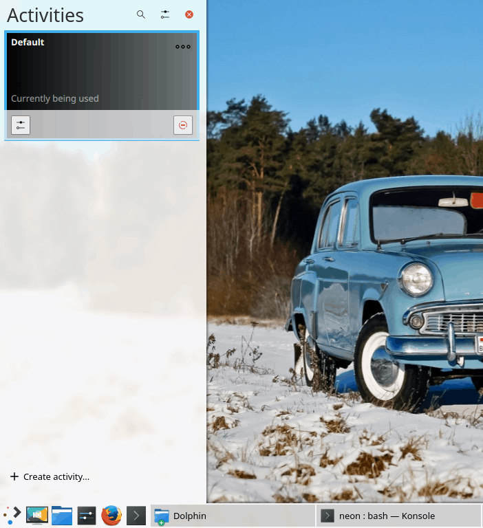
The Activities window opens at a less-than-full width, hiding portions of the UI from the user unless horizontally scrolled, disrupting the work flow; furthermore, the slider is not aligned to the left margin of the window above, and the dividing blue line between the actions in the left sidebar and the main panel on the right does not have symmetric top and bottom margins; this is persistent across many different elements of the Plasma desktop. You may say consistent inconsistency, if you will.
Another example of the blue line divider; if you compare the invisible top line defined by either the icons on the left or the title on the right with the blue line margin to the one at the bottom of the window, there is a 2px difference that breaks the symmetry.
The default icon set is less than ideal – you get three different icon types – full squares, partial squares and circles, and they sure do not look pretty when stacked on the taskbar as application shortcuts. I was tempted to install Moka or Faenza, but decided against it in order to offer as genuine Plasma review as possible.
![]()
Show desktop
This is another tricky one – Show desktop is a widget, which you need to add – it is placed on the far right side, like any new icon you add to the taskbar; this isn’t an ideal configuration. The icon also looks too much like Spectacle. Lastly, if you click on it, it will minimize a single window application, and if there’s more than one, scatter them into screen corners. Not ideal.

Transparency
The system menu has a slight transparency – this can be distracting. More importantly, the menu entries are too small and too pale, so you may not immediately see what you’re looking for if you do not distinguish app entries by icon. The invocation is correctly done using the Super key.
Notice the description text under each application text – hardly readable.
Under Windows Decorations, you can change the appearance of buttons. For some reason, the different buttons show on top of one another. This is probably a bug, but even if it’s not, it makes it rather difficult for users to fully appreciate the theme and how it behaves.
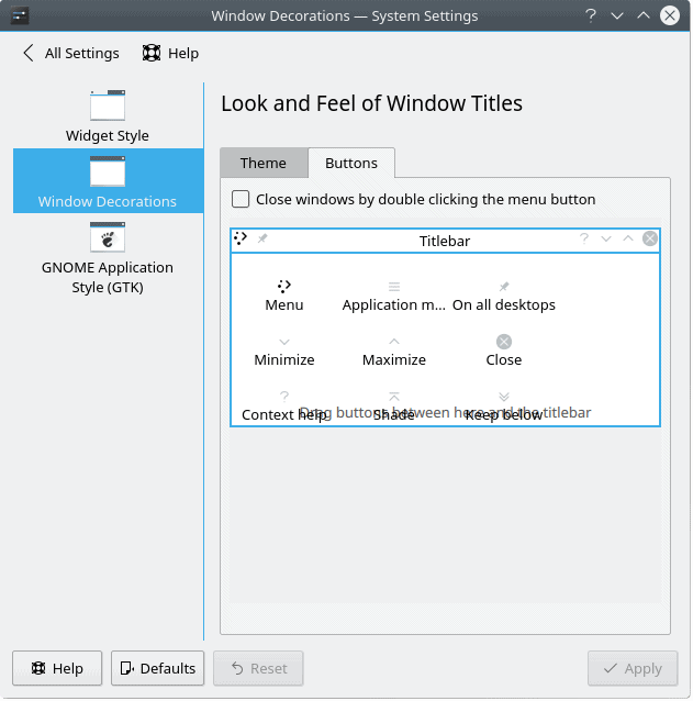
The text and icons in the preview window overlay one another in a very ugly manner.
In the system area, the icons are not equidistant, and additional spacing is required to create a common look.
System area icons – the spacing is not equal in all cases.
Plasma will show you what music you’re playing if you click the ‘live’ volume button in the system area – it changes from being the simple volume thing to a media thumb. It works well for multiple programs, alas, there’s a visual bug. The play button circle seems to have a slice of its pie misplaced by 1-2 px to the right.
Notice the displacement, at 2 to 4 o’clock positions; I guess this comes from scaling objects at non-native resolutions, which ties into the wider constrast, visibility, readability, ergonomics discussion we’re having here.
Un-minimize does not always work – and some of the programs will remain in the taskbar until you expand them manually via right-click. Likewise, if you apply new icon themes, they will not show up until log out and then log back into the session. This contrasts – and contradicts – the live theme preview and edit capabilities we’ve seen earlier.
Functionality papercuts
The most overlooked part of the Plasma desktop is the theme-icon-decorations management. Supposedly, it offers users a rich repertoire of colorful add-ons, without forcing them to wander around the Web and manually download themes and icons. Unfortunately, while the system does offer a unified interface, the functionality is fairly broken.
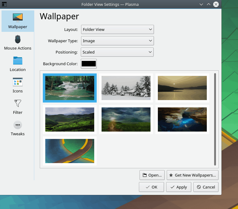
Wallpapers
Plasma does many things well, but it struggles with this one simple aspect of modern computing. If you wish to enrich your desktop with a new background – and use wallpapers that come outside the internal channels, you will need to add images one by one. This can be quite tedious. Then, you do not get live previews, which, again, is not in line with the overall Plasma consistency.
Themes
Some of the themes (and icons) lead to external websites, meaning unnecessary manual downloads, others offer multiple downloads in strange forms (names, archives, code repos), with broken links, malformed URL and 404 missing content more often as not. Incompatible themes are also present and listed, and they won’t do much when installed, if at all.
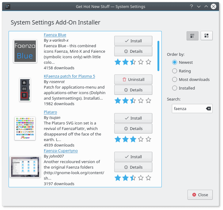
The Get New Stuff applet is fairly broken; a large number of themes and icons cannot be installed for a variety of reasons.
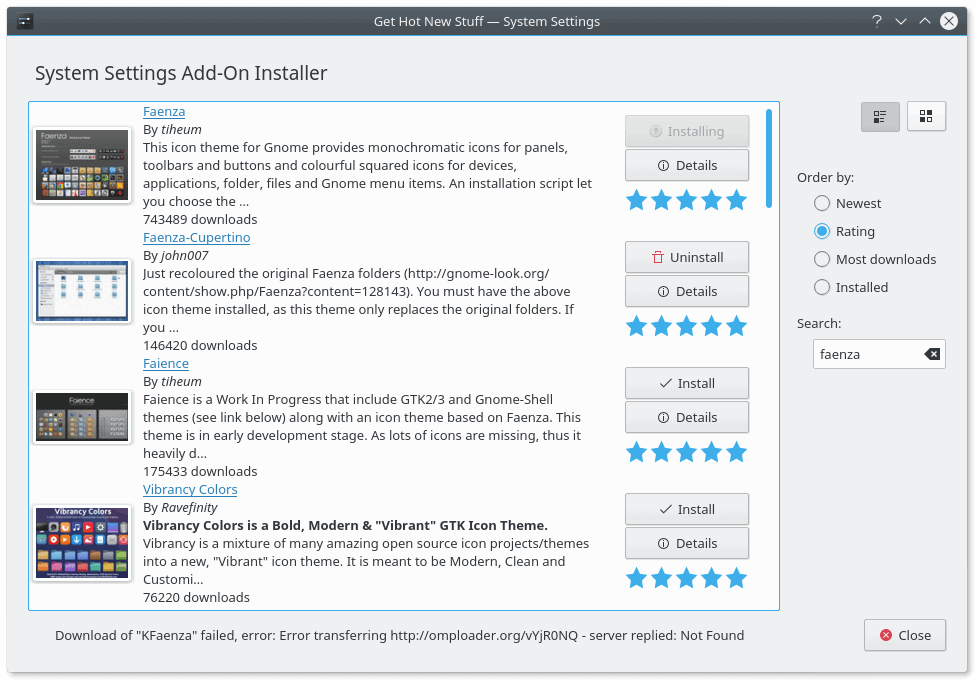
After some quick testing, I estimate that about 30% of all themes and icons are not suitable for use, i.e. broken in some shape or form.
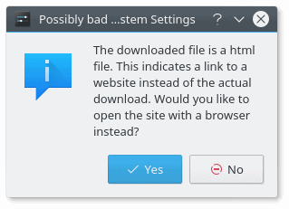
You must visit a website to download the theme, which completely negates the purpose, advantage and simplicity of the built-in theme management mechanism.
A rigorous cleanup is required, as this part of the system sheds a lot of negative light on the Plasma desktop, and it breaks the discipline and consistency that the core team is aiming for. A more structured approach is required, possibly one that mandates a certain file and folder hierarchy, hosting on KDE servers rather than external sources, and basic functionality checks to make sure the decorations can actually be used without breaking anything.
Music playback
We must talk some more about the music context menu in the system area. It works fine, but then, it can be improved. The thumb preview no longer allows volume levels to be changed, for instance. For that matter, Gnome does this better, simply by offering a more interactive experience, even though it comes through an extension rather than native behavior.
This applet can definitely be improved by offering more choices to the user.
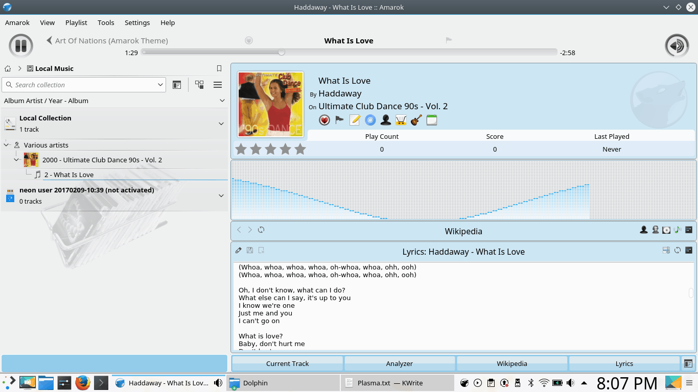
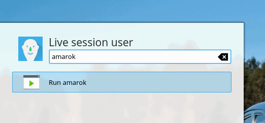
Amarok
By default, Amarok is not offered with neon, but it is one of the staple KDE programs. This media player has had a lot of ups and downs over the years. I installed it, to see how well it complements VLC as the music player. The overall playback functionality is nice, the same drawbacks as to the system integration apply here, plus when it starts, it throws a lot of errors on radio stations and channels that cannot be reached and indexed. This should be hidden from the user, or at least, presented in a nicer, less alarming way.
File manager & bookmarks
Bookmarks in Dolphin are clunky – as there’s no simple way to add a new location through the menu; instead, you need to drag & drop the address bar string into the side pane, which can be tricky. Since KDE file managers have always doubled as browsers, it should be very simple to allow for a basic bookmark functionality. Unless I’m missing something obvious.
Ambiguous entries
Plasma is rather intuitive and self-explanatory, but it is still a nerdy Linux thing, and then, there are some rather vague options and features. For instance, Activities. Are there any similar to what Gnome does? Are these just different desktop views? If so, what do they offer to the common user?
Another inconsistency is that sometimes, the system menu sometimes display the application name and sometimes ‘Run X’. I am not 100% sure what the formula for this is, but it might be that before you run a program the first time, it will offer this option in a more meaningful way. Still, this can potentially be streamlined.
Plasma also lists the bootable media as a removable device, which is a little bit of a self-defeating purpose when running in a live session. I would not expect to be given an option to try to accidentally eject media, even though the umount command underneath the GUI is going to fail doing this. These small things are not really important in the overall scheme, but they sure can change the perception of quality with users.
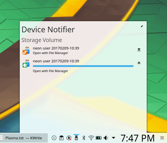
For some reason, the bootable media from which the system is currently running is listed – twice.
Contrast is not good enough
This is a long, protracted – and subjective – topic. It’s part of my fonts saga, but it extends to the wider usability subject in Linux. Overall, most distributions – and desktop environments – do not offer optimal settings to its users. Largely, the desktop is sub-optimized for prolonged use, and you may experience reduced productivity and higher levels of fatigue as a result. We’re talking screen calibration, DPI, font hinting and anti-aliasing, the choice of fonts and font color, the contrast and color separation between active and inactive window elements and buttons, partly due to increased flatness, the contrast and color separation between text and background, text size, color palette, and other factors.
The default Plasma configuration is decent – but not good enough. Breeze offers gray fonts on a subtle gray background, and these fonts may be one 1-2 points too small for the common user, and I’d like to make a clear distinction from the young developer who is the typical tester in this scenario.
I know there’s a whole science behind this, but just contemplate on the following. Objects rendered on a 24-inch monitor with 1080p resolution viewed from a 50cm distance and objects rendered on a typical laptop screen (15.4 inches) with a resolution of 1366x768px and a viewing distance of about 75 cm should not have the same pixel size. Rather, they should have the same viewing surface relative to the observer (the user), and then age and vision play their part, too.
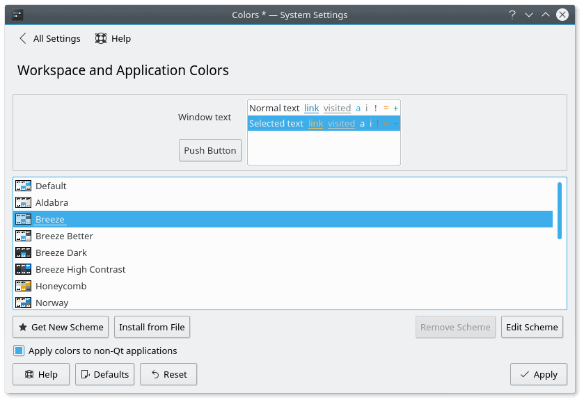
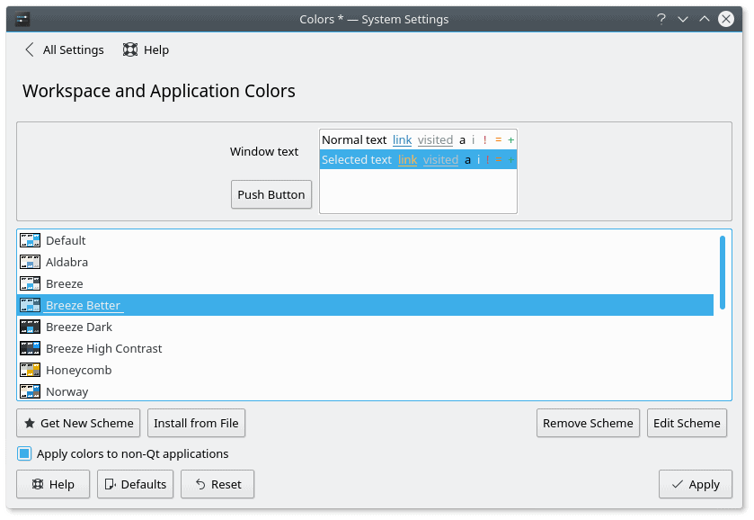
A more optimal solution would be too use black fonts, to begin with. Using the magical powers of customization that Plasma offers – which we will discuss a bit later – I was able to tweak the Breeze theme. This is a great advantage of Plasma over other desktop environments. You can edit everything, and see the results in real-time, in almost all the cases.
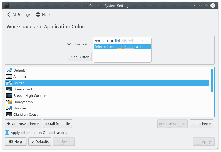
You can edit every aspect of how a theme behaves, including the color of each element; a live preview is available in the window top half.
The customization can definitely take some time and patience, and there’s also an element of trial & error. Luckily, you can easily reset themes, save your work, or create new themes, which can be useful if you want to recreate a Plasma setup on another computer.
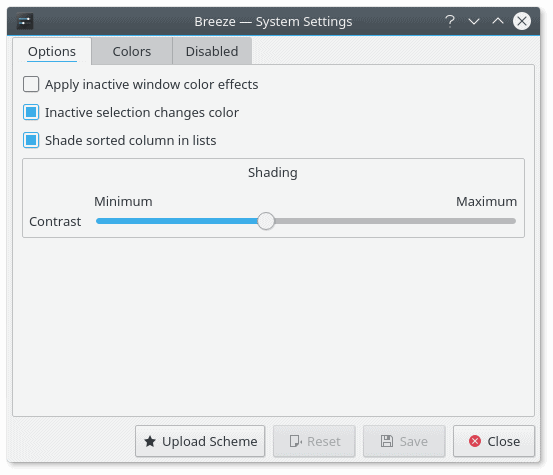
Scheme edit: the simple option is to increase the contrast of shading, which can be important for flat themes with a minimal, monochromatic palette.
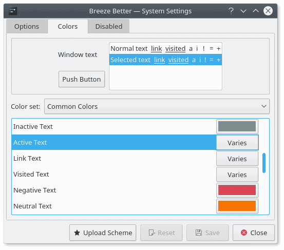
Scheme edit: You can tweak the text color of any type, buttons, active and inactive elements.
Default theme colors, gray text; pay attention to the preview element that reads ‘Normal text’.
Edited Breeze theme with black text color.
Default font-background contrast.
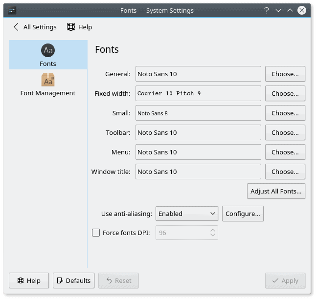
System Settings menu with black fonts – edited Breeze theme; better visual contrast aids productivity; even though the fonts are of the same type and size, and I have not changed the hinting nor the anti-aliasing options, the simple factor of using a darker font creates an impressing of thicker, more easily readable text.
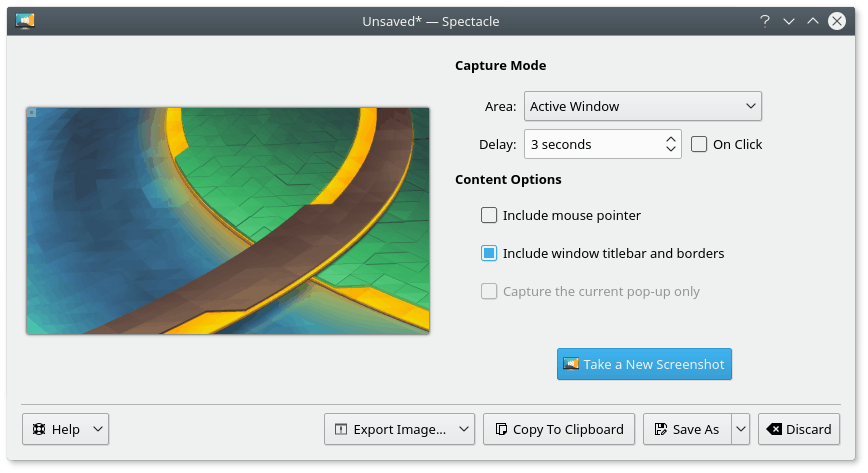
Spectacle (screenshot tool) example, with black fonts instead of the default Breeze scheme.
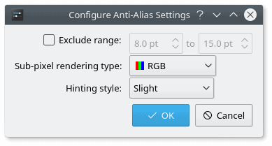
On the plus side, the system has a rich palette of hinting and anti-aliasing options available, which you can manually set, or use the system defaults, which are pretty good, and do take into consideration additional factors, like the DPI and screen resolution.
Font management is fairly solid, and you have enough control and granularity; the defaults are decent, but can be improved – size and font color for starters.
Manual tweaks can easily gobble up time, and for most people, the default hinting and anti-aliasing options will be reasonable.
System default hinting and anti-aliasing options for fonts are pretty good; black font color is a manual tweak.
Customization
All the above said, the strong side of Plasma – and any KDE release – is the customization. You truly have the ability to tweak everything, using the GUI tools, mind. No need for hidden command line tricks, and you do not need to touch any configuration files. ‘Tis a double-edged sword, as any feature introduces its own penalty of visual clutter, complexity, UI flow, resources, and of course, QA checks needed to make sure that everything works tip top.
Breeze
The default theme is fairly decent and complete, and usually, it does not require any big changes. However, if you are interested, you can go pretty deep and make amendments as you see fit. It does take several steps to tweak the theme, as you have separate sub-menus for the theme, colors, fonts, icons, and window decorations.
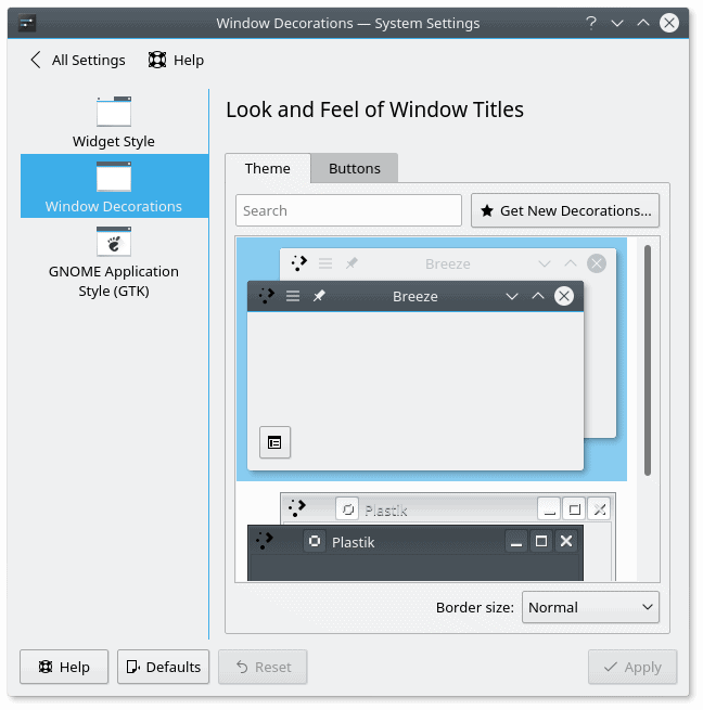
The default set only includes the standard Breeze decorations and the legacy KDE3.5 Plastik set, but you can easily install new stuff (provided the themes are not broken or missing), and then tweak the fine details as you see fit; this can sometimes be overwhelming and definitely time-consuming; you can edit the decorations by clicking on the non-intuitive square button in the left bottom corner of the previewed theme in the right pane.
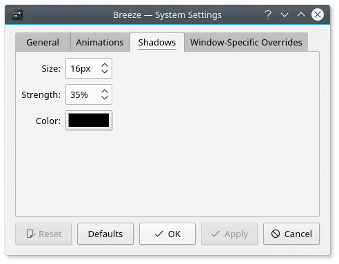
You can go as minute-detail as editing the alpha transparency, the thickness and the color of shadows for each selected window decorations theme, on top of the existing desktop theme.
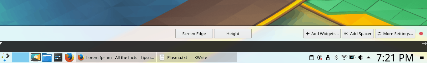
You can also edit the panel/taskbar, but there are better alternatives out there. Re-shuffling the icons cannot be done with a drag & drop unless you’re in Edit mode, and the height is set by sliding the panel up or down rather than using a number.
Screen calibration
I am definitely pleased with the fact Plasma offers a professional-level screen calibration tool. My experience with other desktop environments shows that Plasma is in a definite lead over the rivals, and this can further enhance our ability to enjoy work – and achieve higher productivity.
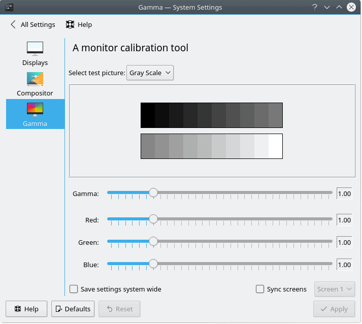
This may be very important for you if you work with images, plus the correct color settings can further improve your productivity and reduce fatigue.
Other aspects of the desktop
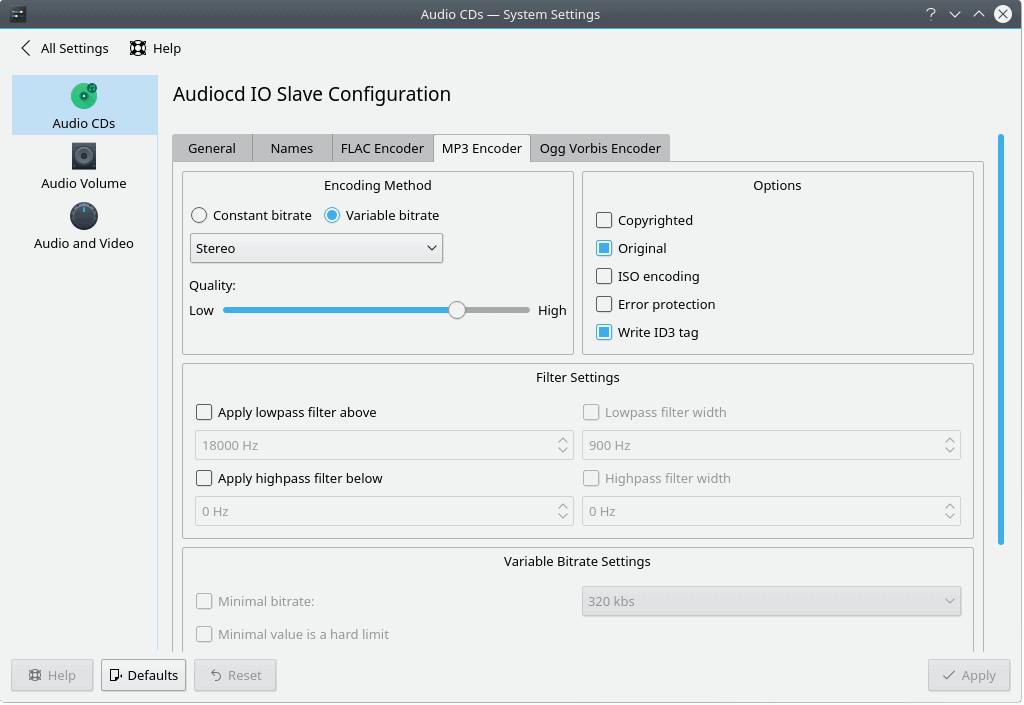
The customization is definitely not limited to just the look & feel. You can literally tune everything, including some arcane options the likes of Audio CD MP3 encoder, compositor settings for desktop effects, and so much more. Again, this requires time, patience and knowledge, but it’s there, fully available for your fun and games.
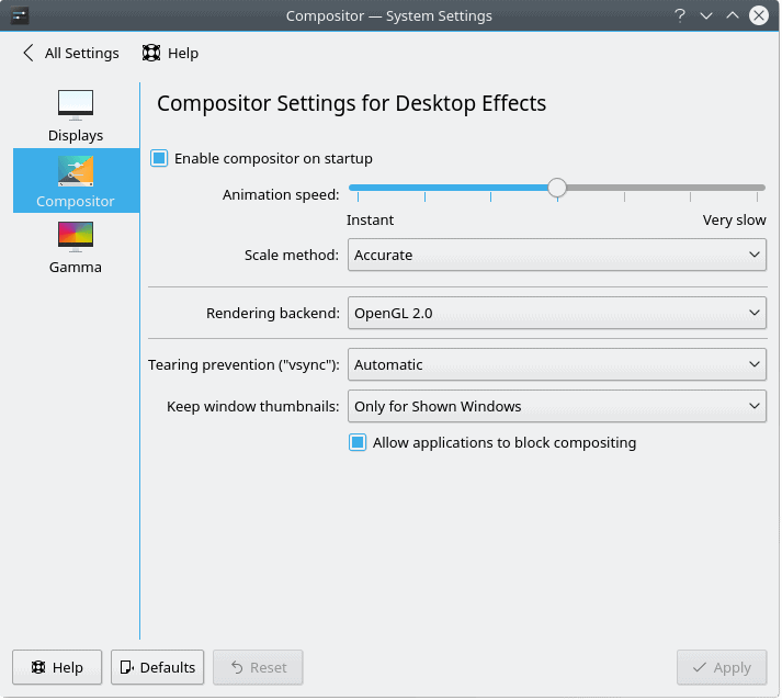
Changing the compositor and desktop effects settings may affect the performance and responsiveness of your desktop.
There’s something for everyone, if they are brave enough to search.
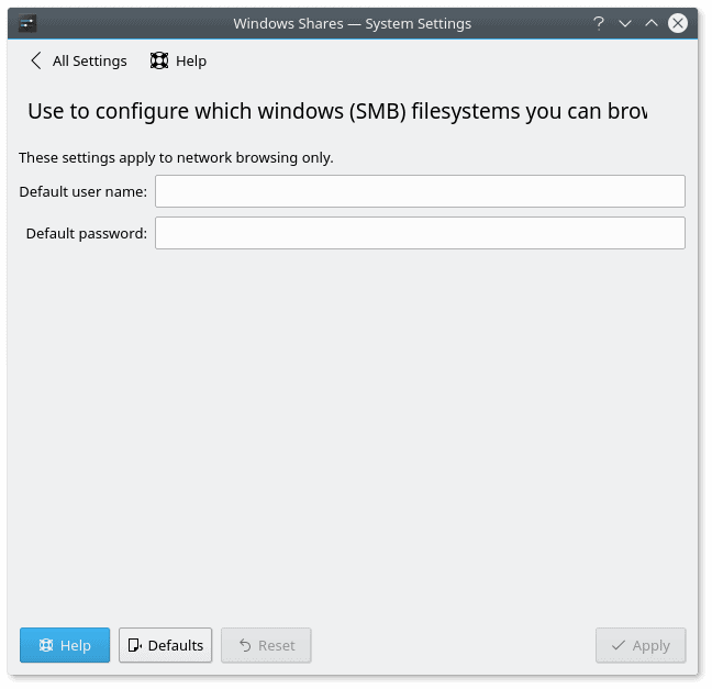
Windows network compatibility
Mentioning Microsoft in a Linux-related product review always causes a bit of a stir, but we cannot ignore the 90% desktop install base, nor the fact most people will be using Windows in some form or another and may require a level of sharing with their other boxes and systems. Being able to provide a seamless experience in this space can be an important selling point a differentiating factor of professionalism.
This is done with a limited amount of success and/or quality today. The first obstacle is that copying files to Samba shares does not preserve timestamps. This is a small and silly thing, but it is also so very easily remediable that it looks strange we have this bug in 2017. But copying files through Dolphin is only the beginning.
The problem becomes more prevalent when you try to access media stored on Samba shares. You will not be able to play media files directly off of these drives, as you won’t have the right credentials stores. I did discuss this in my VLC & SMB guide, but the issue is bigger than just feeding some username & password strings into a media player options window.
VLC may not be a default part of the software installation – it is not a part of the Plasma suite, to begin with, moreover, the option is limited to a single username & password combination, so if you have more than one share, this trick won’t work. The problem also affects other media software, including Dragon, so there is definitely a missing implementation in Plasma. If we compare to Gnome or Unity or perhaps Xfce or Cinnamon, this issue does not exist.
Notice the truncated title at the less-than-100% window width; the utility launches this way, and there’s no auto-text-wrap or scaling; at the very least, the UI should auto-resize internal elements based on the windows size, or at least, open at full normalized width so that all the text is correctly displayed.
Plasma does have an option to provide default credentials through the systems settings menu, but here, we encounter two new problems. One, a single string pair is possible, which brings us back to the earlier issue, and two, the GUI launches at a default width that truncates the title in a rather inelegant fashion, similar to the Activities tool, as we’ve seen before.
Stability
Lastly, in its pure form, KDE neon User Edition 5.9.1 was behaving quite well, and I did not experience any stability issues, be they applications hangs or freezes, weird crashes, or anything after suspend & resume. True, these are also quite hardware-dependent, but given my long record of testing on the Lenovo G50 machine, I am quite impressed. The network bug is there, but it is no way specifically related to how Plasma behaves, so we can fully and safely ignore that. All in all, Plasma was working well, smoothly, elegantly, and with a level of crispness and maturity that I was not expecting.
Conclusion
I do have to say I am surprised by the quality of the Plasma 5.9.1 release. It does pack a very decent aesthetic and functional punch, and KDE neon showcases the capabilities of this desktop environment in a smooth, calm, almost underwhelming way. However, Plasma is not perfect. There are tons of little bugs and issues everywhere, which will require a lot of focus, dedication, hard discipline, and tight timelines to polish, fix and test. In a way, the labor that must be invested in this type of work is probably equal to raw development, but it is the fine foam that separates a plebeian shot of espresso from artisan coffee.
My other big fear is that Plasma will finally reach a level of steadfastness sometime later this year, and then, it will no longer be interesting, and Qt6 will come out, and we will start the cycle all over again, without ever benefiting from stability and quality for any sustained period. This ailment affects pretty much all and every open-source project, and concepts and ideas are being reinvented ad infinitum, without really embracing the past, learning from old mistakes, or actually improving on the user experience. Technically, KDE4 could have been a great product, but we never got to see it in its best form. It went away just as it got good – and boring.
Plasma has the potential to be the real glue that connects all the different pieces of the Linux desktop. It approaches the problem with more savvy than most other projects, it is well established, it has gone out of the survival mode, but then, the cohesive energy is still missing. And I believe the magic formula lies in the finest of fine details, in the 1-2px misalignment and other tiny inconsistencies that few people consciously notice, but they do subliminally reject, as we are naturally tuned to see perfection in everything we see and use.
Plasma is not there just yet, and if my review today is any indication of the state of things, there’s a whole lot more that needs to be done. With every passing year, my skepticism into the reign of Linux desktop diminishes more and more, but then, after a couple of days like this, the hope sparks again. Let’s indeed hope it won’t be killed by nothing more than a whimsical transition toward something than is newer and more glamorous. Because usability is all about simplicity and intuitiveness of form, and that’s a kind of magic very few have captured in the software world. To be continued, in one form or another. See you around.
[sharedaddy]


Nice article as always,you’ve articulated many things that have always been at the back of my mind when trying to move to Linux as a daily driver for any length of time. Plasma has the makings of a great desktop but can any open-source project ever reach that magic level of refinement?