Our friend William Shakespeare once wrote: To be or not to be, we must rejoice, for our GUI is so well-designed, the user always has a choice. Not really, but if he lived in our modern era, he probably would gaze upon desktop environments with a combination of bemusement, scorn and confusion.
Testing desktops over the years has led me to a number of interesting conclusions. One, the chasm between the ordinary user and the nerd is so vast, it’s almost incomprehensible. Two, there’s such a thing as natural logic, and to deny is to to break the brain patterns we have developed over the past 35,000 years. Three, a good UI is intuitive, and that means is responds to how the user thinks. And so, if you ask, is there a perfect desktop out there, the answer is, let’s talk about KDE some more shall we?
Introduction
The reason for my rekindled interest in the Plasma desktop is that it comes nicely into the void left by the demise of the Unity desktop, the lack of enthusiasm that is gripping the wider Linux world, not being helped by the changes in the Gnome desktop, coincidentally selected as the replacement for Unity, and some genuine honest progress in the Plasma world, spearheaded by Kubuntu Zesty and recently by the sum of all nice things that went into Plasma 5.12 LTS. But to claim functional perfection is like saying Star Wars is better than Star Trek. Ha.
As it happens, Plasma also uses the classical desktop formula, and if we take into account the fact 90% of all desktops out there use this same layout, you can see the potential for greatness waiting for happen. Then, it’s flourished, grown, matured, become more stable and much faster, approaching the quality levels that one might expect from a real, good product, whatever its price tags. This hope prompted me to consider the critical obstacles that still stand in Plasma’s way of becoming worthy of everyone’s attention.
Now, let’s not delude ourselves. Windows is Windows, and without Office and a heap loads of games, there’s no incentive for anyone to switch to Linux. Until these conditions change, it simply won’t happen. Also until then, Plasma has a chance to do something right – nail the desktop equation so that if ever Windows users decide they want to try this wondrous thing called Linux, they don’t end up quickly burned by the experience. The answer to avoiding the classic mistakes is called: IU – Intuitive Usage.
Skill and determinism
There are two core elements to my concept. One, skill. UI are designed to try to meet some average common denominator of ability in order to allow the biggest percentage of users to solve problems easily and find answers to their questions. Alas, most UI are designed by technical people who do not have the same brain patterns as ordinary folks out there. This is particularly true in Linux, where product design is led by developers, who are probably as far distanced from reality as conceivable.
Two, determinism. And what I mean by this is – people expect reactions to their actions. In other words, if they click a button, they want to see something happen. Conversely, if they are not happy with the action, they want to be able to go back. In most cases, software UI only satisfy the first part of this equation, rarely the second. Actions are sometimes reversible (but not in the way people expect). Most of the time though, not only are actions definite, they are also paradoxically vague and imprecise.
So how does this relate to Plasma?
Before I give you a few examples, let’s answer this question. KDE/Plasma has a golden opportunity to fix an ancient evil. If and when it becomes a popular household item – say Plasma Mobile wins big, and the desktop somehow shifts Linux-way – it will be too late. The age to innovate, make mistakes and then fix them is now. The conditions are ripe for the desktop to revitalize itself.
If you’re wondering why, look at the wider market landscape. Saturation is the natural progress(ion) step for every technology. Once everyone had their desktop and laptop, the growth slowed. The mobile world opened a whole new dimension of possibilities, but this too will hit its limit soon. There are only so many people in the world. This is why companies are constantly trying to push new gadgets, new methods, new things, trying to expand into new, untapped dimensions. This leaves the desktop as an old – 30-year-old concept that has seen little actual change. You may say the desktop is complete and needs no improvement, but if you’re ever in doubt, just spend 30 minutes with your neighbor to understand how deeply deluded you are.
Plasma has the opportunity to make the desktop perfect. And by that, it should embrace the IU model, which calls for imprinting human brain patterns onto software. It’s an ongoing battle, there’s rich academic research on this topic, but in the end, pragmatism and costs always win. Not being burdened by a higher mission statement, and still in the best overall position to tackle the issue, Plasma could offer the desktop users what they do not have anywhere else.
Fonts
You will hate me for mentioning fonts once again, but mention them I must. It’s a tricky topic. I always claim that system defaults in Plasma aren’t good enough: 1) color 2) anti-aliasing settings. I always change them. Then, you have people saying that for them, the defaults work better. Is it a matter of taste or actual neurological differences between us?
Well, let’s see.
I decided to run a small mathematical test, if you will. I wrote the same sentence in the text editor, twice, once with the default AA settings and once with my own preferred choice (RGB, slight hinting). I then took screenshots of these two documents and blew them up to 800% size in GIMP, to see whether there’s an actual difference. And there is.
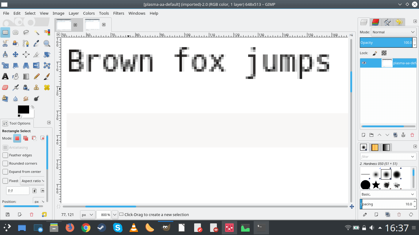
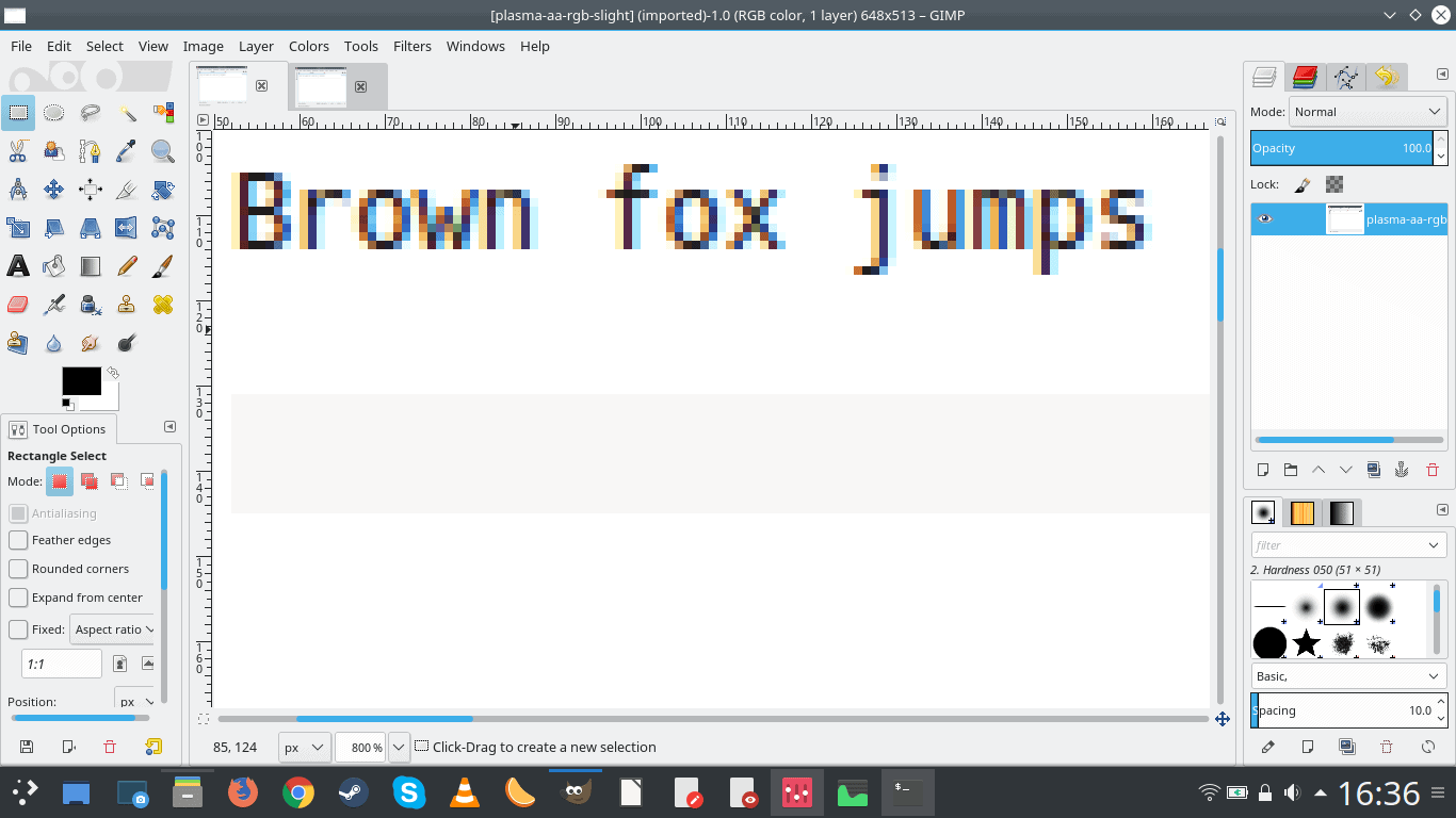
You can see for yourself that RGB hinting does result in color pixelization around the shape of the letters. On LCD screens, which do have sub-pixel elements, this makes more sense than using gray hinting, as gray color requires the use of all three colors at the same time. But that’s not important. What matters is that there’s a difference.
Now, how does one decide, apart from the obvious user choice, what gives a superior experience? We need to account for user taste, age, vision, distance from the screen, screen calibration, viewing angle, lighting conditions, and many other factors. Then, since we want to solve the problem programmatically, we need to somehow translate shapes on the screen, i.e. fonts, pixels, into equations. Signal to noise, color distribution, you name it.
Answering that complex question is very hard – and it also imposes an impossible task on the developers in trying to figure out the optimal layout.
But there’s a much simpler solution.
Choice.
Why not have all of the options available?
Wait, it’s there already!
No, not really. The fact you need to use seven different buttons, four different menus and eleven mouse clicks to actually change font setting AB to CD means that an ordinary person will never be able to achieve this task. Because that task today includes: font settings and color settings. If you dumb down the problem statement, then why the hell would anyone need to mess with color if they’re fixing fonts? Or why would color be a separate category? And why would anyone need to play with hexadecimal values in order to nail down the right hue for their font? Can you even begin to understand how nerdy and unreal this requirement is? How many people can even begin to relate to colors in RRGGBB hexa values?
No. What we need is – intuitive usage. Give the user an option to choose between several profiles, which combine size, color and whatnot – ironically, weirdly, this exists in Konsole and pretty much all other text-based consoles, but not in GUI programs and the desktop itself – and allow the user to switch easily. We need to remember – skill and determinism. Simple profiles eliminate the question of desktop savviness, and being able to preview changes and easily toggle among them satisfies the second condition, allowing the user to trace a clear path between desire (optimal reading/viewing settings) and result (selected option). The actions become symmetrical, whichever choice is eventually selected.
And onwards we go
This small example highlights the crucial problem we’re facing when using the desktop. Sometimes, the solution needs not be a mathematical interpretation of what technical brains want. It should be a simple expression of human needs. We can use tech brains to solve the problem but not use it as a template for the solution.
As a guiding principle, it comes down to: what will a user do? Can we fully control their mouse clicks? Can we predict what they want to do? No, and when you only give them a limited range of choices – that do not fully encompass the entire needs spectrum – the moment they step outside the boundaries of expected behavior, it becomes total and utter chaos. Because they will go crazy, clicking, ticking, moving, changing things, hoping to accidentally achieve something that the UI was not designed to do. That makes for bad user experience and unpredictable results. This means a bad product.
It is reckless, vain and hopeless to expect people to behave the way you want them. The only thing we can do when designing software is to make sure that our if-then choices cover everything. It’s not just doing the three choices we give them, it’s also not doing the infinite number of choices we do not give them.
A trivial example. Running rm -rf / on the command is a (dangerous) legitimate command. And if complete, it will have an exit status 0. From a programmatic perspective, there’s nothing wrong here, but there’s everything wrong from the user perspective.
Now, changing a desktop theme. Technically, it’s a matter of opening the right menu, selecting a different entry, and then hitting Apply. We will discuss the problems with this approach in a moment. But I want to focus on the work flow. Technically, if a user can hit Apply, then they have – programmatically – done the right thing. They could do this once a year or 100 times an hour, and it still has the same outcome when it comes to the code logic. But we have no understand if the user did what they wanted. Needed.
So, let’s track this.
I know, I know. An alarm bell rings. Telemetry, oh so hated. Privacy implications. Yes, but then no. It is possible to profile usage patterns without compromising user privacy. It is possible to conduct studies, where you put a bunch of laptops on a desk, and then invite people to do tasks while people monitor and time their actions. Normally, these kind of studies are done at universities, with willing students taking part, enjoying both the experience and token payments.
The issue with this approach is manyfold. Students are young, curious creatures. Deliberate tests force people to behave in unnatural ways, in order to impress, achieve the goal or else, but their normal patterns change in almost unpredictable ways, spoiling the results. Then, every test must also be baselined, which means testing Plasma alongside other desktop environments and/or operating systems, Windows included, and this invites a whole different spin to the game. Also, it does not tell us whether Microsoft systems are superior or not. They merely serve as the majority control group. And yes, as you can imagine, these kind of tests are skewed, expensive and impractical.
Which is why operating systems have embedded profiling tools, designed to monitor all sorts of parameters, in order to improve the user experience. There’s a thin line between benign metrics and rich analytics, as we all know. So this makes for a tricky case. Just remember how much heat Ubuntu drew for including online results in the Dash, even though you could disable this with a single mouse click. And now again, we have the same story, with the desire to introduce additional diagnostics. The witch hunt begins anew.
So what’s the alternative then?
Eval
I remembered doing image and signal processing algorithms in Matlab back in the day, and I’d often have 90% of my code consist of if-then statements plus eval functions, designed to validate the output of commands before actually running them.
Indeed, most UI do not have any history. They keep track of completed actions, but they don’t really check whether what the user is trying to do has been done (tried) before. Case in point, trying to change a desktop theme. This can be accomplished very efficiently – or not. You could do this with three mouse clicks or fifteen. The end result is the same. Moreover, if you hit the button that reads Apply or OK, the command completes, but that does not guarantee user satisfaction.
Another example that illustrates this is – trying to install a new desktop theme or a set of icons. Lots of the existing packages are actually broken, missing – the dark side of Plasma. However, you discover that only AFTER you try to install a theme. Sometimes, the install action times out for whatever reason, and sometimes, you learn that even though the theme installation was successful, the theme itself is broken and cannot be used. This leads to frustration, erodes user confidence, and makes the desktop environment look unprofessional.
But what if there was a way to check things before doing them – in other words, the system VALIDATES that the package is complete before installing (somewhat like system package managers). And what if the system could test (preview included) the installed package before really committing. A temporary overlay that allows changes to be tested and then reverted back if they do not prove adequate – and by this, I mean both from the code AND user perspective.
The other thing is – efficiency. Intuitive usage is efficient by design. Assuming a given interface, then there’s the minimum amount of steps needed to achieve an action. That minimum amount can still be WRONG, but that’s not important now – we don’t want to sideline this into Plasma versus Gnome.
So, going back to the previous examples – changing a desktop theme. The most efficient way – assuming the user made no shortcuts or customization, vanilla system only – is to invoke the menu, search for system settings, open the application, open the correct sub-category(ies), select the desired theme, and then apply the change. Let’s say we have the following equation:
Menu [MC] – Search [Keyboard][MC] – [MC] – [MC] – [MC]
The optimal path is then five mouse clicks plus a text string search.
But then, what if the user does not know the name of the system settings tool, and needs to search for it? What if the user misspells the application name? What if they take a long time figuring out the correct subcategory?
It is possible to actually profile the work flow – without invading on the user privacy in any way – in order to understand the logic patterns in the user’s brain. A sequence of clicks and timings really. This can help product designs and developers better understand if their intended UI is working as it should.
And I am convinced that it is not – working as it should.
UI studies have existed for decades – and still, most programs have interfaces that take a lot of time studying and learning, and few actually make any sense to ordinary people. We can deny this of course, but we’re such a nerdy bunch we cannot even begin to grasp or relate to how common folks go about their computing business.
Now, imagine a system that actually keeps intelligent track of what it’s doing. It could then potentially suggest things – or offer help to users. Some websites do this, usually popping a chat windows when they supposedly notice you’re bumbling around, navigating, trying to figure out what to do. Most often, this has little to do with actual intelligence, but it’s a nod in the right direction.
Windows has the troubleshooting wizard, which is a sort of a semi-automated way of trying to help users figure out a way out of a clincher without calling for human help. Linux systems have nothing of this kind, but then if there should be one, it ought to be so magically advanced it leaves everything behind.
Back to our system helper. Imagine a tool that notices you’re taking too long to click an action after making a selection. Or that you’ve tried multiple mouse clicks on the same button. We all know the joke, yes hit Enter a few more times, it will make the system respond faster, right. Stay with me, please, and put your Linuxy cynicism on the backburner.

Image courtesy Mr. Lovenstein.
Imagine the GUI that has the artificial intelligence to actually spot HUMAN trouble. For instance, not that your Wireless is not working – that’s the easy part. The fact that you are unable to cope with the problem on your own. Or that you’re trying to cope and failing. Repeated actions are one of the classic indicators of people struggling with software. It’s almost trivial. But it’s probably the best indicator of the disconnect between the intended design and outcome. The user does not know how to achieve what the UI promises. Either the UI is broken, or the user is confused. There’s no other option.
Mobile world
To play the Devil’s Advocate, one could argue that people have mastered the mobile, touch world beautifully and that they have no issues is with their phones. This would indicate that desktops are complex.
And they are.
There should be no comparison between the two because phones and desktops serve different functional purposes. Touch systems are SIMPLER. Hence, they can have simplified and more easily determined work flows. Conversely, when you try to do a complicated action on a phone, you will see how frustrating the simplified UI is in this case.
Try to copy several files to a network share, for example. This is a very simple action on a desktop using the mouse and the keyboard. On a phone, let’s begin with the fact that most systems have no file manager, and even if they do, how exactly does one go about discovering and mapping network shares?
So it’s not that mobile devices are superior in their design. They are simpler. There’s no point comparing a bicycle to an airplane. They serve different purposes, and their interfaces match accordingly.
So what can Plasma do?
I already outlined – time and time again – many things that Linux can do to become more professional. Centralized management of bugs, automated tools, deterministic approach to system actions. The same principles apply here, and they need to be extended to the user interface. Of course, the magnitude of the challenge is much bigger, because humans are inherently unpredictable.
1) Try not to solve problems that are too difficult to define on paper. Fonts. A superior font presentation is possible, but for the time being, it seems to elude almost all and every Linux desktop and environment, save perhaps Ubuntu. Apparently, there are reasons for this. The solution is then not to try to fix this the way it’s been done so far. If the issue is too complex, then present the user with several choices – that encompass the entire scope of the problem – and let them make the correct decision for themselves.
2) UI too simple? UI too complex? Dual-mode with basic and advanced view.
3) An action requires too many steps to complete? Do not dumb down the UI = this usually culls functionality. Create a wizard! In fact, this is another big one. Some Linux systems do have first-usage welcome screens and configuration wizards. Pardus, KaOS, Bunsenlabs Linux, to name a few. Plasma as a desktop should have a setup tool that allows users to configure everything they need.
4) Test actions before applying them, i.e. will it work?
5) Confirm outcome of actions. Is the user happy with what they tried to do? How can this be done? Not with pure code. There must be an interaction with the user. If they stop doing what they tried, it means they either are happy or they give up. The second is a trickier scenario, which is why it is beneficial to try to map user actions and measure it against an outcome. I am dead certain, and I’m betting 100 kidneys, the moment an efficiency study is done (on clueless, REAL people – not techy students), we will discover some rather shocking findings into how much discrepancy there is between our conviction in the simplicity and quality of UI and what the users expect and get.
This is the so-called grandma test. Let your grandma use it and see what happens. Now remind me, how many 75-year olds are employed as QA testers with KDE, Ubuntu, Debian, or whatever? How many 65-year olds? Hell, how many non-techies (people who think code means a secret word)?
Now how will this AI monitoring mechanism be implemented? That’s a different thing. It’s not important now. What matters is that such a system be designed and introduced. It can cover everything from users searching for applications in a package manager to font configurations to widget installations to music playback. I’m not claiming to be a genius (secretly I am) – or that I’m trailblazing a revolution (secretly I am). But I know that we have almost zero intelligence in this space. For all sorts of practical and financial reasons.
6) Smooth integration … with everything. While Linux exists in its own bubble, there’s no denying the vast world out there. For instance, I don’t like smartphones, but they serve their purposes, and not using them robs one of useful functionality in the modern reality.
Plasma should – first and foremost – be designed to please 90% Windows users and cooperate nicely with the smartphone users out there. It sounds cruel, but that’s the reality. If a desktop environment is designed to exclude 9 out 10 potential users, then it will have some serious deficiencies in its model.
The future Plasma should – without sacrificing its goodies – allow for seamless usage across multiple devices, form factors and alike. Online accounts are important. They might be a gimmick, but they make sense to the ordinary user. Being able to sync your phone stuff is another big one. Lots of small, seemingly trivial things that we as power users look at with scorn and derision. But ultimately, these are the things the decide whether someone stays with your system or uses an alternative. Especially when the alternative already gives them a lot.
Lastly, regressions …
We must not forget these. Every single thing that gets fixed EVER should become a part of an automated test that can run and detect it before the software is released. Yes, this poses a significant challenge, and entails a lot of work, but it is infinitely better than a seesaw of recurring bugs.
Conclusion
The desktop works. It’s a given. Plasma works, too. No argument there. But that does not mean we’ve peaked, or even come remotely close to nailing the desktop formula. It is true that a lot of things we do today have become a habit, which is why people rarely look at the norms and wonder if they might be silly or inefficient. They just are. But Plasma is a growing, evolving, and it has the power – and chance – to break through the stagnation. It won’t be trivial or fast. But it’s possible.
The main reason why Plasma can do this – it has the most advanced desktop ecosystem in the Linux world, and it’s probing into the waters of mobile usage. It could become the superior, superlative face of the desktop, so that one day, when the technology and human needs finally meet, i.e. the Linux desktop will have the applications that the majority of people need, it will not fail due to a classic mistake of neglecting the convoluted randomness of computer usage. Linux never had to face this problem due to its small share. But that day may yet come. You don’t want to be the guy telling your grandma to chroot her mail, now do you?
On the long road to Utopia.
[sharedaddy]


I think you meant “But that does NOT mean we’ve peaked, or even come remotely close to nailing the desktop formula”.
You are right, thanks!
Dedoimedo
Great reading and while I agree with most of it, I think some of the suggestions will just move the problem around without actually fixing anything. Like who will be responsible for the popup questions when a user is stuck? Will it again be developers and their nerdy mindsets? Websites that makes suggestions trying to be helpful are usually more annoying than helpful, and are often made to cover for their bad design decisions. Microsoft tried with Clippy in MS Office which was eventually killed off and which finally let users pop their most expensive champagne.
I think we need to take a step back to the root cause: How do we apt install contributors?
It’s very common that developers are not only programming, they are very often the same people that are responsible for writing documentation, that design the user interface, that do the webdesign, that make their logo/icon, that do everything that are outside of their actual field and interest. That is maybe acceptable when you’re a startup, but how about 5-10 or more years later and it’s still just you and maybe some other nerdy developers? Maybe your icons and fonts are still just as bad, your website would still not win any price and nobody but developers themselves are still not fully understanding the documentation. You still have those weird names for everything. Your whole thing is still weird in the eyes of normal people. Most developers are awesomely skilled programmers, but they suck as much on everything else as any non-programmer would if she/he was to do the programming part. Why is it that most projects don’t have dedicated designers and dedicated this and that on board on their team?
From what I’ve learned it is not only endusers that are confused and frustrated, even potential contributors are! The path to start contributing are often a muddy path uphill that most people would never understand. It’s sometimes comparable to expecting travelers to pilot the planes themselves. That’s cool if you ever wanted to become a pilot and did a lot of reading beforehand, but most people would never get anywhere.
This is not a KDE specific problem, it’s a common problem for many projects, but say you wanted to get into something as basic as translation for KDE. Go take a look right now on how complicated KDE localization is! First you will need to join a translation team (I’d put my money on that most local groups don’t have a active organizer), you will then have to contact them using mailing lists (how many normal people would easily understand the concept?), then you are supposed to checkout PO files with svn (WTF!). Everything on the road is made by and for developers, there are roadblocks on every corner and you would need another developer to do translation.
Not every project are this complicated, some uses Weblate or similar tooling, but when you have such fundamental problems for something like translations how are you expected to get more dedicated contributors doing the documentation, design, etc? The tooling and path from A-B needs to be top notch if you want to reach out to any potential contributor, it should be dead simple for firsttimers and the majority of people that don’t care about python or whatever to get started. If you as a developer don’t care about these things, you will never get many contributors and they will all be other developers. A translator should not be expected to use developer tools, neither should anyone else wanting to contribute something that really not require having a developer brain.
If we can fix these fundamental problems then the right people will get on board, developers will no longer have to spend as much time on the things that are not as fun as programming (where they truly are experts), and the things like usability problems will be uncovered and start getting “patched”.
“I am dead certain, and I’m betting 100 kidneys, the moment an efficiency
study is done (on clueless, REAL people – not techy students), we will
discover some rather shocking findings into how much discrepancy there
is between our conviction in the simplicity and quality of UI and what
the users expect and get.”
I have often thought about exactly the same thing.