If there’s one aspect of Linux that has more Wild West in it than a typical Charles Bronson movie, it’s fonts. Linux fonts. This is something that we all take for granted, in fact so much granted, it’s almost Cary Granted, see what I did there, and yet, the reality isn’t all Rosie O’Donnell.
Today, I would like to discuss the management and beautification of font rendering in Linux. On one hand, we want to have pretty fonts, and make sure our eyes do not tire even after a long day staring at a screen. On the other, we want Linux fonts to be better as a strategy.
Ubuntu and Windows
Without trying to provoke fanboyism, I believe that most people will agree Windows fonts, as well as those used in Ubuntu, have a superior clarity compared to most other Linux distributions. The reasons may be many, including legal sabrerattling, but the simple fact is, the way letters are drawn on your screen differs significantly from one desktop to another, and, on average, across the widest range of devices, graphics cards, and monitors, Ubuntu has the upper hand, and so does the proprietary system called Windows. Facts of life.
This, on its own, isn’t a biggie. Because if we could all agree that Ubuntu has the best way of doing it, then why not use Ubuntu fonts? Problem solved. Well, in a way, that is a part of the solution. Indeed, why not do that right now.
Take a look at the three images below. The top one shows the default Mint fonts. The middle one is of the same fonts with no hinting. At the bottom, we have full hinting. You can see a big difference in how the fonts show up on the screen. If you don’t, you are a happy reader. Or your monitor might be configured in a way that does not show the subtle differences. Another reason is that Mint, based on Ubuntu, already comes with a solid font baseline.

Default Mint fonts.

Mint fonts, no hinting.

Mint fonts, full hinting.
But then, you can achieve a more drastic result just by changing fonts. I have praised Droid Sans way back when I tested Fedora 12 and Moblin, and that impression remains, and I am backed by lots of positive feedback from the general community across the Web. So Droid Sans it is, and lo and behold, the crispness arriveth.
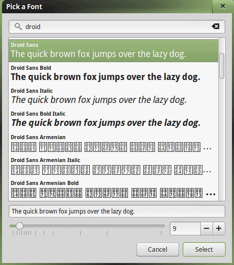
Fonts, Droid Sans.

Droid Sans applied.
If you are still unhappy, then you can try the following trick. We will install Infinality, a set of font patches that lets you change your fonts to look like OSX, Windows, Ubuntu, iOS, and other operating systems. Specifically, there’s a PPA available for Ubuntu-based systems.
sudo add-apt-repository ppa:no1wantdthisname/ppa
sudo apt-get update
sudo apt-get install fontconfig-infinality
I tried Infinality in various guises, and did not see much difference between the available choices. Again, when the default set is good enough, you won’t need any tweaks. This is how it should be, unfortunately, the overall Linux landscape is far from this Utopia.

Windows fonts.
OSX fonts; subtle changes, but maybe that’s all that’s needed.
For Fedora and friends, there’s more work to be done. Namely, you will need freetype-freeworld fonts, which might necessitate an extra repo. Moreover, you might need to make manual adjustments to the anti-aliasing and hinting. This means playing with xrdb and the ~/.Xdefaults file. Only for the brave.
dnf install freetype-freeworld
Now, the biggie
All right, so we have learned how to fiddle with fonts and improve the looks. That is a tactical workaround for a much more serious issue that we all have. There is no simple, consistent, easy way to manage fonts in Linux. We are dealing with a legacy of thirty odd years of X Windows, seven or eight different desktop environments and managers all piled up together, and licensing limitations and restrictions that prevent a unified, common theme across all distributions.
Consistency
If you look at Windows, no matter which version, overall, you will get pretty much the same results on the font front. You may use different monitors, with different sizes, you may use different graphics cards, but in the end, you will not really worry about fonts. Likewise, Ubuntu does the same thing. On average, you won’t think about fonts, you won’t mess with them, and for most people under most conditions, the default set will be the optimal set.
Branch away into Fedora, openSUSE, Mint, Arch, Manjaro, and you hit a big problem. Just search for something like “linux better fonts” and you will get a hundred forum posts trying to resolve this issue. Worst of all, they try to resolve the issue in a hundred different ways.
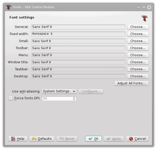
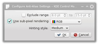
AA Slight Hinting setting on the left versus AA Medium Hinting on the right; in Mint, we had better crispness with slight hinting, but in SUSE, it’s the other way around; now the big question, how do you make these changes in a typical KDE desktop? Aha!
Not only do you not get a consistent approach to aesthetics, the fonts settings that are available and visible through the GUI settings menus and wizards vary between distributions, with some offering more tweaking and freedom and others less. Furthermore, each distribution has its own way of handling fonts, so you may need to edit this or that hidden file in your home directory or the system tree. But it gets worse.
The end result will also be different, even if you try to use the same settings, because the distros and their desktop environment all behave in their own unique way. Finally, working with configuration files is a nerdy task that the average user should never need to do.
Simplicity and ease of use
To demonstrate, just compare the exercise we did earlier with the one in openSUSE. The menus are different. The options are different. The settings are different. The results are different. You need to be well familiar with KDE or Plasma, but you also need to master Cinnamon, if you wish to enjoy your fonts the same way. This translates functionality into administration. Rather than consuming the system resources, you are fixing them.
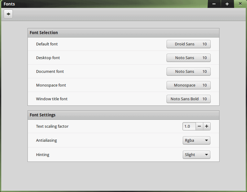
A new GUI, a new way of doing things. Whence the DPI settings, all of a sudden?
What is sub-pixel rendering, and why does Mint not have it? Or does it?
One font strategy to rule them all
Paving the road ahead is always a tricky task. But having standards and common rules always helps cut down the cost. In our case, it can be development time or maybe QA. However, if there were one set of fonts and a consistent way of managing them that could be applicable to all distributions without reinventing the wheel or just presenting the X commands in a slightly different manner, we would benefit from an enhanced user experience.
Moreover, think of new users, who are already accustomed to Windows fonts. Once you give them Fedora or Debian, they will be disappointed. And it may even happen on a subconscious level, because they may not understand fonts, but they sure understand the input from their eyes. In the long run, it will be the simple things that deter people from using Linux, not the technology. The underlying bits and pieces are largely irrelevant.
Conclusion
We could try to justify the current situation by blaming Microsoft and patents, by arguing about copyright and legal obstacles, debate one font type versus another, and a million other techno details, which don’t really help us in any way. Even if you believe your own distro has superior clarity and presentation, the rest of them don’t, so as a WHOLE, the Linux ecosystem has a problem, because you cannot easily replicate your experience – be it good or bad – with another distro. What we want is the same thing everywhere. Hopefully done in a good way.
In a way, we are privileged. The fact we are discussing fonts means we’ve overcome all the other, more teething problems. But that does not make the problem any less important. The risk of Linux imploding or stagnating or not ever growing remains the same. Improved technology brings about improved expectations, and the users will not put up with any sort of font nonsense. The fact you gave them live distros that can initialize all their hardware without a hitch won’t cut it any more. People have accepted it as the new reality, and now, the challenges are much subtler, much deeper. Fonts seem to be one of those little, neglected things, but just an annoying little mosquito bite, you can’t ignore it for long. Food for thought. And hopefully, a crisper future.
Cover Image: Letter Soup by Bo de Visser for Freeimages.com.
[sharedaddy]


First of all: fedora 12, really? Or is it a typo?
Second of all: you’re not comparing distro’s font management, you’re comparing DE’s font management tools. And they are both quite the same at that: a list of pre-defined fonts and antialiasing (called subpixel rendering in KDE) and hinting.
Ubuntu and Mint already include free implementation of stuff patented by MS (Apple’s patents expired anyway), since they’re based in a country that doesn’t consider those patents valid, Fedora requires the installation of package “freetype-freeworld” package from RPM Fusion repos. Don’t see what’s so hard about that, especially with Ubuntu and Mint having everything out of the box along with an easy configuration utility if you want to get things just right for you. So please, tone done the whining, get to know the topic you write about and stop worshiping windows. At least until they fix their god-awful no-antialiasing or hinting metro fonts.
I’d thought Fedora 12 was an allusion to 2009; dismissing six years ago as a ‘typo’ is mildly amusing. Denouncing Dedoimedo as a ‘worshiping Windows’ is very, very funny – although I’m not sure you intended the irony.
OK, Fedora 12 is totally my flop, serves me right for glancing instead of reading.
But Windows’s and Ubuntu’s font management is called superior, which seems a little far fetched.
You could just drop your custom configuration in /etc/fonts/conf.d/, which is available in every single distro, and have a consistent configuration across distros. This is my attempt: http://hastebin.com/zoqiwohabe.xml
A unified approach would require use of the same fontconfig and freetype across all distributions. This won’t happen until distributions like Red Hat believe they, or their customers, are no long legally at risk for including the same patches that Canonical does. Red Hat, today, believes that as a U.S.-based corporation, they and their customers, who RH indemnifies, would be at risk, and that Canonical is not because it is not legally based outside the U.S.
Hence, we don’t, and won’t be, seeing those patches in Red Hat, Fedora, or CentOS.
Contrary views are often seen in net chatter. I discount those. Red Hat pays a legal staff to make these calls.
The freetype-freeworld package available on rpmfusion (it’s not available from Fedora) does not completely enable all of Canonical’s patches. It’s a simple rebuild of Fedora’s freetype package with a single compile-time flag flipped.
BTW, I’ve found that adjusting a display’s sharpness setting can make a big difference in font rendering. I found that especially true with Windows.
Actually, there’s a lot of free algorithms to do proper font rendering.
Merely reconfiguring fontconfig on Arch (which provides unpatched
upstream packages) yields great results (though fonts are awful
out-of-the-box).
I honestly don’t see any valid reason for
Debian/RH/etc to have nicer stock settings. Getting better font
rendering is a matter of altering config file – no new code that might
risk any IP infringement.
On a side note: I agree that Ubuntu’s and OS X’s font are beautiful out-of-the-box, but Windows is by far regarded as the very worst – from what I’ve seen, a lot of font’s and elements don’t get any hinting/antialiasing at all.
Just try the Myriad Pro font and linux and see the difference..
this is why lubuntu is my favorite distro.
Fantastic article! I completely agree. I started using GNU/Linux only from 2011 and my first distro was Ubuntu. Over the last 4+ years I have used at least 10 distros and I always keep going back to Ubuntu because Ubuntu has the best fonts. Period. I actually developed a dislike for Fedora and Open Suse because of this font problem; spent countless hours googling to fix this and no fix satisfied me.