Roughly a year ago, I wrote my fairly lengthy State of Plasma article, which examined the KDE’s fifth major desktop environment incarnation in great detail, focusing on the many facets of goodness and badness that imbue it. Fast forward, there’s a new LTS coming, with final touches being added to a largely baked beta release. Styled 5.11.95, it’s what we ought to expect to be the cornerstone of KDE distros in the coming days.
The importance of Plasma is (subjectively) ever so greater these days, as I feel its chief rival in the Linux world is taking more and more steps away from simple, sane ergonomics that people expect in the desktop. Then, the reactions to my article have been rather positive, and I have also seen a lot of traction in the KDE circles, aimed at addressing the shortcomings in the desktop environment. It is with great pleasure and added focus to detail that I’m commencing a renewed examination of Plasma. Has it reached the Utopia state of perfection? Let’s see.
Testing setup
I decided to perform a somewhat elaborate test – which is there to stress the robustness of Plasma. The test machine is my Lenovo G50 eight-boot system, recently repaired from its read-only NVRAM fiasco. As for the distribution, Neon is the top demonstrator for Plasma. Indeed, I decided to start with the User Edition of Neon, which comes with the last stable official release and then upgrade to the stable Dev channel using the package manager. And to make all this work, I also installed Neon on the laptop – I will follow with a separate distro review at a later date.
First steps
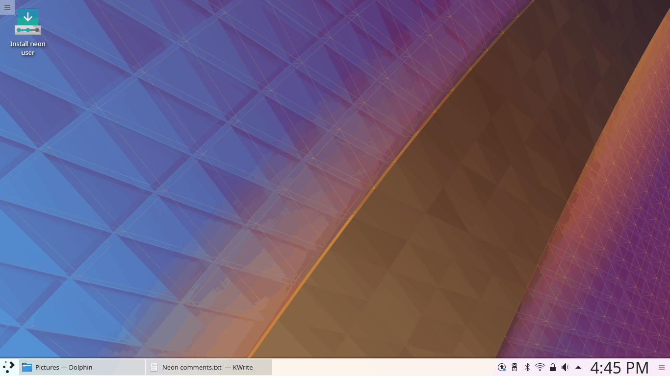
Neon booted fine – but you can already spot a few niggles during the boot process. There was a flash of text, about FIFO underrun errors, probably related to missing CPU firmware, followed by a KDE Neon splash followed by a KDE splash. I do not believe both are necessary. All in all, the boot sequence was relatively fast for this particular crop of distro (Ubuntu LTS under the hood) and the desktop environment.
The current stable version of Plasma looks the part – we talked about this, too – but some of the long-standing issues that I mentioned in numerous KDE-related reviews remain. Specifically, the widget button on the left side sits too close to the desktop icons. A placement on the right side would make more sense, and it does occasionally shift sides. There was a double prompt for Wireless password, another ghost of the past, and I think it has to do with the use (or lack thereof) of KDEWallet. Either way, it ought to be fixed.
The partitioning step was super-long – it took more than 10 minutes for the distro to scan the disk and present the partition table, and without any labels to help me decide which partition I ought to use for the installation. That said, the installation setup was quick, with the GRUB part taking less time than I have seen before. The slides are crisp and inviting, but they do scroll too fast. Again, don’t pay too much attention to this for the time being, this is only a primer for the actual 5.12 configuration.
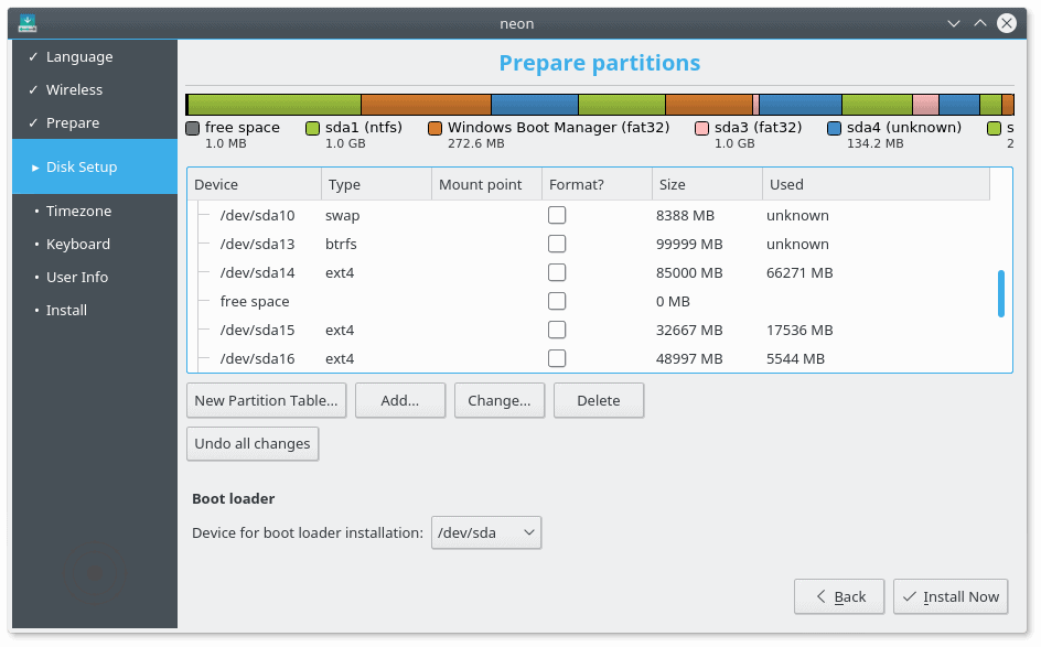


The installer comes with an accurate percentage counter – more so than pretty much any other distro/system.
When I tried to reboot, there was no indication that I should hit Enter – so I spent a few minutes starting at the spinning Neon logout splash. Add still more text console messages to that. The installed distro comes with a glaring-blue GRUB menu, but there were no text messages, only the two splash animations. The Wireless configuration was not preserved and ported from the live session. To make things even more interesting, I reused an existing account (with a Plasma configuration) from Fedora 25, and also set up a brand new user, to compare how Plasma behaves when it needs to handle leftovers in the user’s home directory.
An immediate finding is – it is very difficult to reset Plasma to defaults, if you need to. There’s no single button or option to just start fresh, WITHOUT deleting user data, only Plasma rc files. For instance, for the existing user, I had to manually delete a few of these (.kde and under .config, various plasma* files), but that did not fully cleanup the desktop, or the file manager, and quite a few other items besides. This is something that ordinary users need not do. A GUI options would go a long way toward helping users get a clean start if they mess up the setup or the configuration.
Plasma 11.5 to 11.95
This was a relatively simple and painless procedure. I only had to add a single repo line to the sources list. I did this manually, rather than through Discover – we will talk about the ups and downs of the package manager a bit later. I refreshed the repos, there were approximately 350 packages worth (only) about 120 MB of data available for upgrade, and very soon, I had the latest Plasma installed and running. This comes with a brand new GRUB menu, still two splashes, but no other visual niggles for the time being.
deb http://archive.neon.kde.org/stable/ xenial main
...
Get:149 https://archive.neon.kde.org/dev/stable xenial/main amd64 kwin-addons amd64 4:5.11.5+p16.04+git20180120.0215-0 [24.3 kB]
Get:150 https://archive.neon.kde.org/dev/stable xenial/main amd64 kdeplasma-addons-data all 4:5.11.5+p16.04+git20180120.0215-0 [614 kB]
Get:151 https://archive.neon.kde.org/dev/stable xenial/main amd64 kwin all 4:5.11.5+p16.04+git20180120.0120-0 [10.4 kB]
Get:152 https://archive.neon.kde.org/dev/stable xenial/main amd64 kwin-data all 4:5.11.5+p16.04+git20180120.0120-0 [3,508 kB]
Get:153 https://archive.neon.kde.org/dev/stable xenial/main amd64 libkdecorations2private5v5 amd64 4:5.11.5+p16.04+git20180117.0107-0 [8,902 B]
Get:154 https://archive.neon.kde.org/dev/stable xenial/main amd64 libkdecorations2-5v5 amd64 4:5.11.5+p16.04+git20180117.0107-0 [40.8 kB]
Get:155 https://archive.neon.kde.org/dev/stable xenial/main amd64 milou amd64 4:5.11.5+p16.04+git20180118.1317-0 [66.7 kB]
...
Look ‘n’ Feel
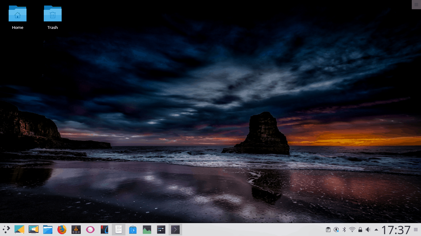
Plasma 5.12 is a pretty, largely consistent desktop environment, with a smart, elegant use of colors and accents. It has a classic panel + menu bottom placement layout, it feels natural to Windows users, except the single mouse click as a default action. It’s also quite consistent – just look at my 5.11 review. This is a very important thing, because users hate when things suddenly change.
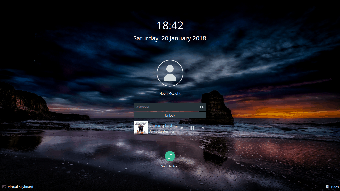
Without repeating myself – you get excellent notifications, a super-smart clipboard, smooth integration of services and media, even a dope copy progress bar. Now, a brand new and shiny thing – you actually get music playback notifications and controls on your lock screen. This is cool, and perhaps a nod to the mobile world, and given the rumors/attempts to launch Plasma on mobile devices, it’s actually a very cool idea.

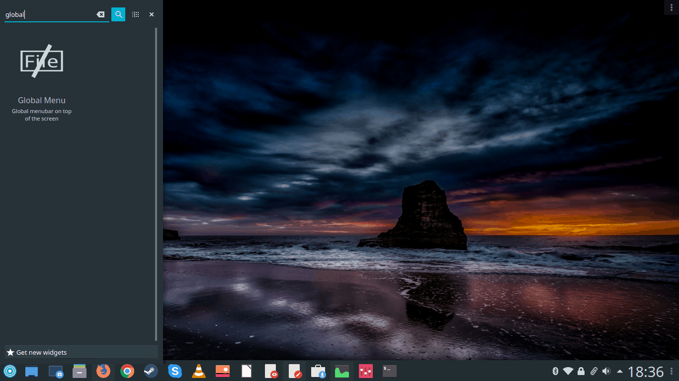
Global menu
An old-new component of the Plasma desktop is global menu. If you use Ubuntu with Unity, you have seen these. They do save a little bit of vertical space, and sometimes also help maintain a cleaner interface. You can install the Global menu widget and then pin it (somewhere). When you launch/use applications, you will suddenly see a contextual menu show up wherever your widget is located.
This is a nice idea – but with the default placement of the panel at the bottom, and the widget tucked there, I found the workflow somewhat quirky (you edit the panel, so it’s the natural place to put widgets, especially if you’ve already done that with the likes of show desktop, clock, etc). It’s difficult shifting eye focus from an application somewhere in the center of the screen to the bottom right corner. But even if placed on the left, it makes no sense. The only sensible option that I can think of is a permanent, dedicated (narrow) panel at the top of the screen that will be used for this widget alone.
However, the global menu does not work with all programs. I had nothing with either LibreOffice or Steam, so I presume there’s more work needed here. This is a shame, because you do get smart menus in the task manager that do make good use of applications’ individual settings and options. However, in this regard, Ubuntu/Unity is still ahead, but I believe KDE can make it work really well easily.
The contextual menu does not show up for all applications, and I still haven’t figured out the rules of the game.
If you don’t like this, you can use a different type of global menu, and that’s by adding the Application menu button to window controls. This is a little bit difficult to find and configure, but it’s doable. The plus side is, you gain vertical space. But now, menus always open in a horizontal fashion, which can be a little confusing, and using the Alt button, which normally invokes menus in different applications, does not seem to work anymore, so you’re somewhat less efficient/fast than before. Still, you have not one but two options, both purely optional, and it does not hurt testing to see if this makes your desktop usage smarter.
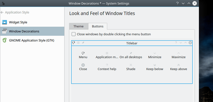
However, not all is perfect on the looks front. For example, the system settings menu opens at a weird initial size and position, with categories text breaking over onto the next line. This does not look pretty, especially since it takes only about 100-200px extra of width to make it look dandy. Moreover, different functional grouping category titles show in a pale gray font that is barely visible.
Opens by default like this; the text breaks onto the next line. Clunky.
Fonts
This is a big one. I’ve talked about fonts time and time again, and I dread to even think about linking to all my different articles on this topic. In essence though, fonts are the Wild West of Linux, with distro and desktop developers sacrificing usability for aesthetics. Non-black fonts are harder to see, the fonts are often too small, and there’s a sub-optimal use of anti-aliasing settings, leading to severe eye strain almost across the board. Ubuntu leads in this regard, which makes KDE flavors that use Ubuntu as a baseline feel oddly out of place with their own setup.
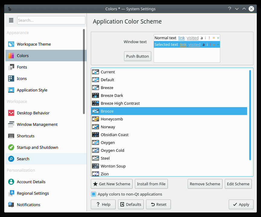
Breeze still has a slightly less than optimal configuration (although it’s better than in the past). But even more importantly, it’s not just the color, it’s also the AA. System defaults are not good enough, and you actually need to manually set the RBG profile and hinting to slight, which leads to an immediate improvement in results all over the place.
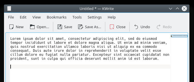
Default fonts color and settings.
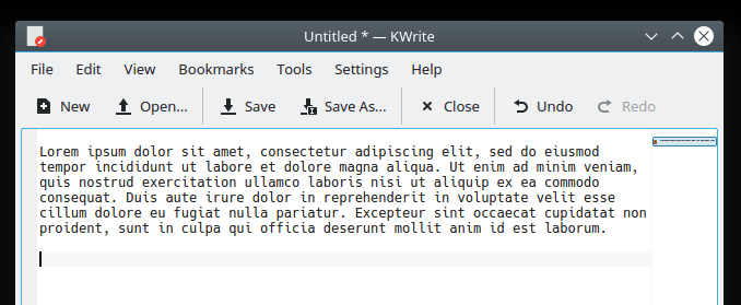
Black font color – using a custom “Brooze” theme, and anti-aliasing settings: RGB, slight hinting.
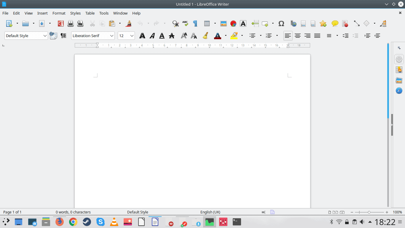
LibreOffice, normally a culprit of bad fonts/AA, looks quite the part – also due to the unified look approach in Plasma.
Increasing font size is also a tricky deal, as the default size 10 (Noto) feels too small, and 11pt feels too big. Likewise, the terminal colors and size can be improved – pure black/white combo rather than gray as well as larger text.
Ergonomik Supersonik
But it’s more than just colors and shapes. The big question is – can you be efficient with the Plasma UI and still enjoy it? Does it provide the necessary combo of nice and easy? Part of that equation lies in how simple it is to change the sub-optimal defaults. Plasma has a very neat feature of providing necessary extras, like fonts, themes, widgets and other desktop elements using built-in menus, so you don’t need to go about the Web, searching for random decorations. For whichever category you choose, there’s an option to get/install new stuff.
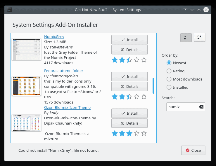
Alas, this remains the black sheep of the distro. Like every single time I tested Plasma, within minutes you come across broken resources. When you’re installing themes or decorations, sometimes you have more than one download option (often labeled in an obscure way, e.g. master-theme-1.tgz, master-theme-2.tgz), and sometimes they fail altogether. This really is inexcusable.
Worse yet, you may install something, but then it will not actually show in the list of available options because of some broken/incompatible piece somewhere. Switching themes may also leave with with leftovers from your previously used decorations, and you actually feel the need to log out and then log back in. There’s really no reason why any and all aesthetic change inside the desktop ought not to be seamless and smooth.
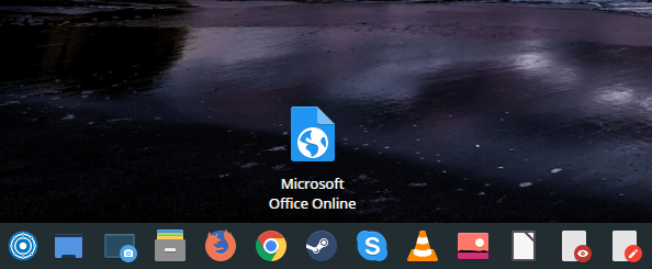
Then, a really sore point is the icon/shortcut management. You cannot pin more than one shortcut for an application of the same type (e.g. two versions of Firefox). This is actually doable,as I’ve shown you in my guide on this topic, but it requires manually editing configuration files. ‘Tis a hack really. The ability to pin any which program, including multiple versions, WINE apps – and even individual files – should be possible.
Case in point, as part of my testing, I tried creating a shortcut for Microsoft Office Online. I love and use this in Linux frequently, and for instance, in MX-17, which runs the Xfce desktop, it was a matter of a few simple mouse actions, and I had the URL shortcut pinned to a panel the same way I would with any which application.
In Plasma 5.12, this was a frustrating exercise. I first had to create a URL shortcut on the desktop, as my attempts to drag a website and then pin it to the panel (icons-only task manager) did not work. For that matter, even dragging a website from a browser and onto the desktop space merely made my browser window move about. Once I had the shortcut created, I still could not pin it. And when I did click it on, it merely launched the default browser (Firefox), so there’s that. It would be great if shortcuts were treated like any which application, and website favicons automatically used as shortcut icons.
If you wish to change the bottom panel height, you don’t have a field where you can input an exact number. Instead you need to slide the panel up and down. This isn’t the end of the world, but it can be made simpler for those who prefer precise values.
It’s a Spectacle
The default screenshot tool still has problems, most notably a huge alpha-channel around captured window area. I have an article that explains how one might go about taking screenshots without shadows in Plasma. This has not yet been fully implemented it seems. I am aware that there’s work underway. Then, it’s also somewhat clunky setting up the Save As options rather than Save & Exit.
In Plasma 5.12, it would seem the shadows are even bigger than before – but at least you get a symmetric frame rather than what used to be the default in earlier versions, where there was always more alpha equity right and bottom (in the land of KDE where the shadows lie) than the other two directions.
In the end, I resorted to using gnome-screenshot, because it makes overhead of managing created images much lower. I really want to see this resolved, especially since it’s a trivial thing.
Discover
Again, we talked about this package manager in the past. It’s an important piece of the UI setup, which is why in its current guise, it’s less than suited for purpose. Muon does the job better, but even without any comparison, the program has significant problems.
Visually, it’s nicer and cleaner than before, to some extent. But it’s still too abstract. For instance, if you go into any which program, to see additional details, you get no screenshots – and no rating, even though there’s a link to program reviews. But then, you need an extra click to actually see what users think.
You do not get any app/program preview, no rating, and you need to expand the review section to actually get an understanding of what the software is all about.
Managing sources remains a big and confusing pain – while the listed sources are more readable than before, I still do not understand what the nine-dot square icon represents. Or what is supposed to happen when I click on it. Then, there’s an overlay scrollbar that is always present, and it obscures part of the UI. Yup, not just the listed sources entries but also an actual part of the Discover interface!
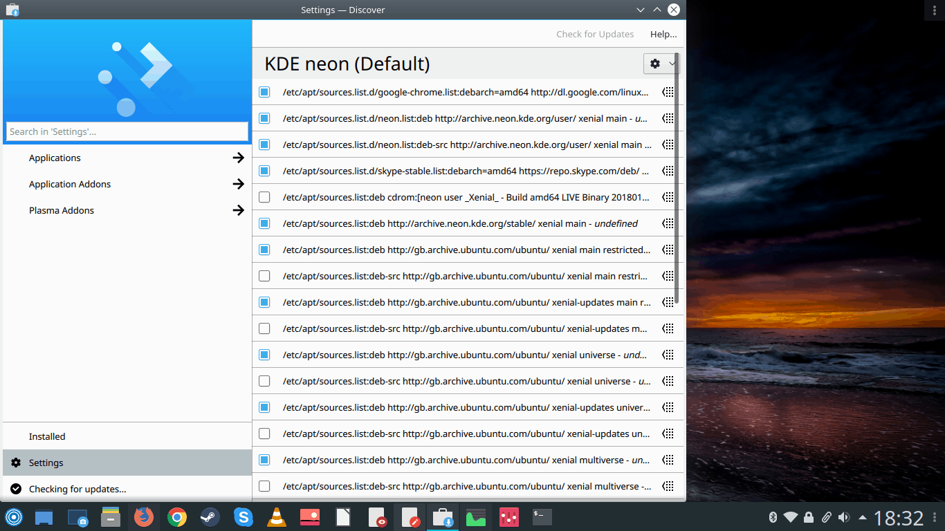
Ugly scrollbar intrudes into the work area. It does not fade after a few seconds, and the visual effect is quite jarring, making an already busy and confusing repo/sources management even more difficult.
I have also not found any easy way to switch repos (for better speed, for instance), no way to install proprietary drivers and/or firmware, and the default categories in the sidebar on the left are confusing. All in all, it’s still far, far from being adequate for any serious use, and I will always resort to command line. I believe this needs to be fixed. Fast.
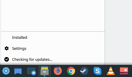
Discover also seems to be checking for updates all the time. I’m not sure why, but actions that take seconds on the command line seem to take forever through the UI. Moreover, Discover is out of sync with apt-get. I searched for Muon, which would be a Synaptic-alike, reasonable replacement, and there was nothing in the UI, but it does show up in a terminal window. This is quite inexcusable.
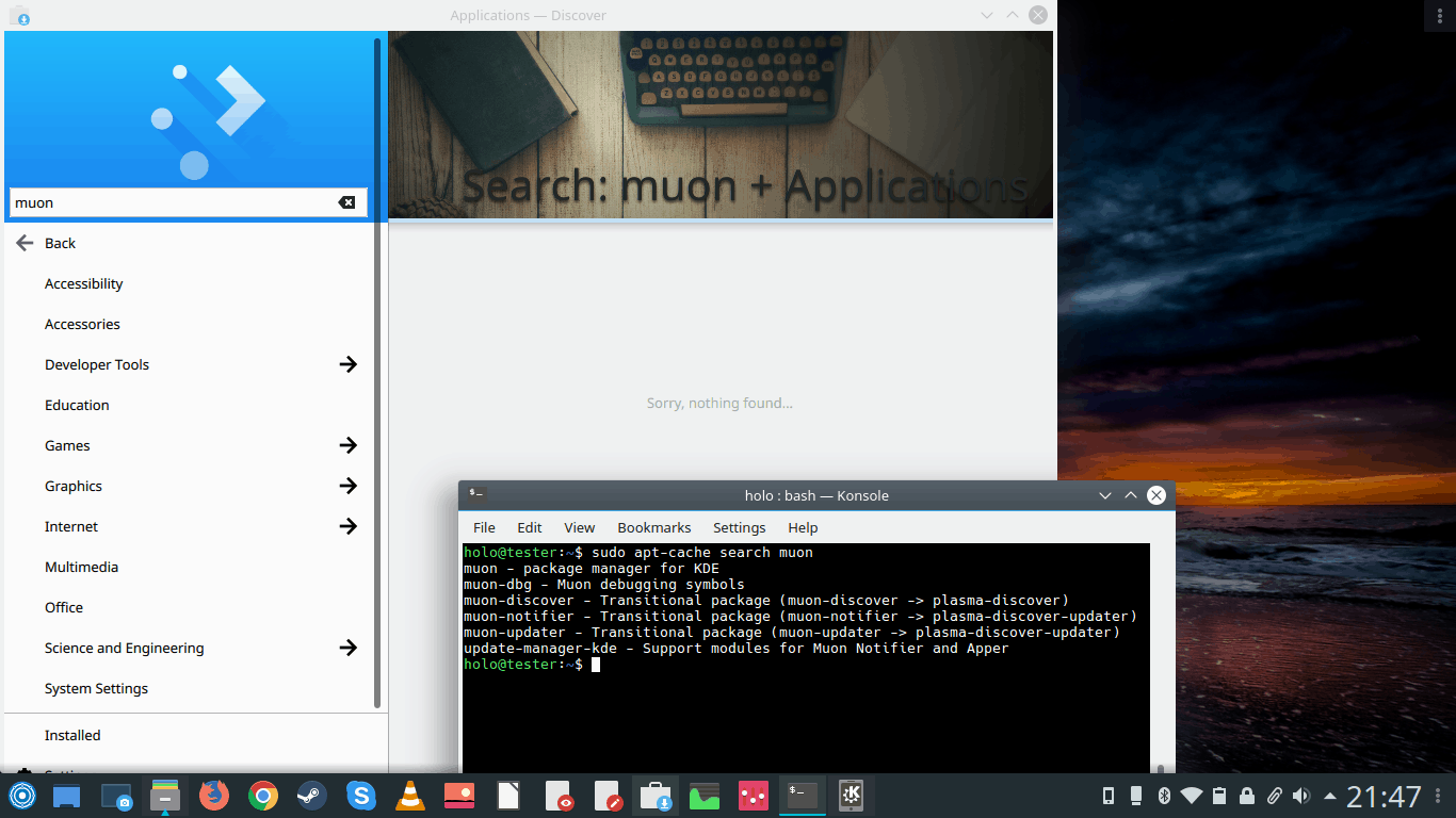
Notice the mismatch between the GUI and the command line.
Dolphin
The default file manager is a great program, to be honest. It’s smart, powerful, rich, and customizable ad nauseum, but in a good way. I do think the default look can be slightly improved. Search categories are probably less important, and the default home directory entries are missing – Documents, Downloads, Pictures, etc. You need to drag ‘n’ drop them, and here, an option to use a menu entry rather than a deliberate and somewhat clunky mouse option would be preferable.
There’s also no quick way to remove/hide all the different sidebar entries one does not like or need, like for instance the list of all the internal partitions. You need to work one by one. Having a home button in the main toolbar might also be a good idea.

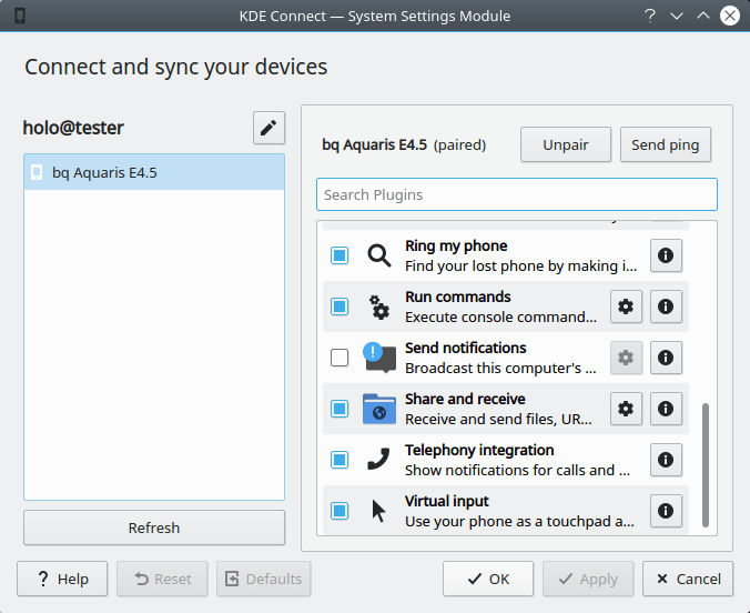
KDE Connect
This is a great thing – being able to connect your mobile device to the desktop. There’s a whole bunch of things you can do, but a two-way control would be even better, although I understand why logically you would want to manage the phone from the desktop and not the other way around. No complaints. However, it would be nice if KDE Connect also supported iOS (and hopefully also Windows Phone), but this does not seem to be in the works at the moment. Speaking of iPhones …
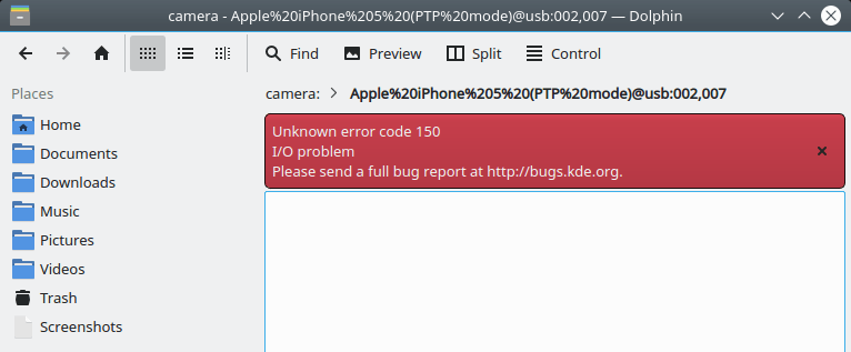
Smartphone connectivity
Plasma still lacks behind the rest of the Linux world (essentially Gnome/Cinnamon/Xfce) when it comes to smartphone support, Apple’s products in particular. The expected plug ‘n’ play functionality is not there. It’s a hit and miss thing. I’ve written a tutorial just recently explaining how to connect iPhone 6s with iOS 11 in Plasma. Ideally, this should be a trivial, automatic thing. At the very least, the support for Windows Phone and Android is reasonable, and MTP is supported for both.
Network connectivity
This one remains a tough cookie, on many levels. I am aware of several ongoing efforts to improve things, but at the moment, we’re still not there. Most notably, Samba connectivity (Windows if you will) is finicky. Timestamps on Samba share copy are set to the current mark, making it difficult to sort items by time and date later.
More importantly, playback from network shares is difficult. For example, in VLC, you need to specify a user/password combo (the SMB access module only allows for one such entry) before you can enjoy your media files. There’s going to be a change in VLC 3.0, but this is still a third-party change and not a KDE change. What about other media players? What about Plasma defaults?
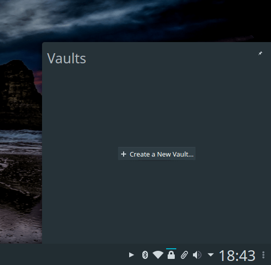
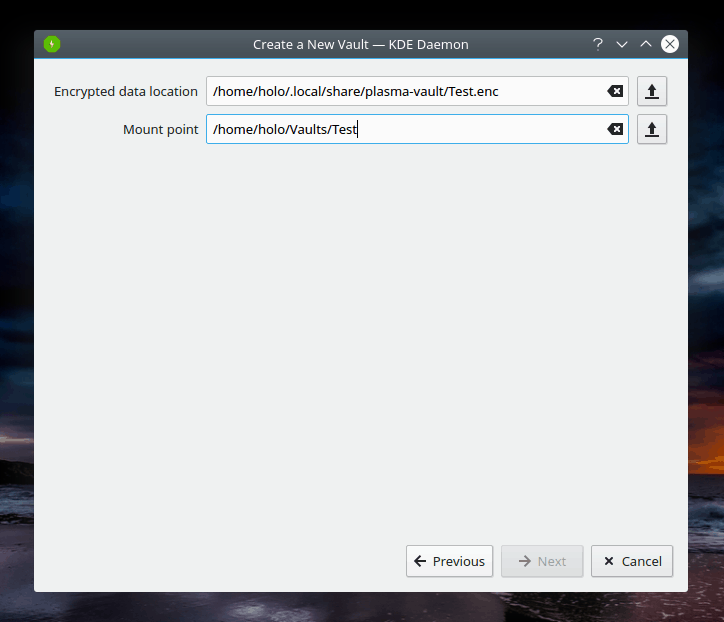
Vault
Something got broken on the way to the forum. I tested the Vault functionality in 5.11, and it was just fine, well apart from the niggles in getting it to actually show up in the system area. Now, you get the padlock, you can go about creating a new vault – except after I tried to create a file and set the mount point, there was no way to continue. The utility complained about a file not being found. What am I missing here?
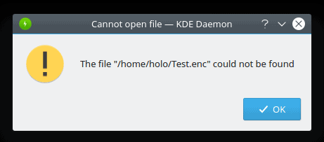
I presume this is just a bug that slipped into the Dev channel, which is expected. And I believe this ought to be sorted out relatively easily. Now, as far as functionality goes, this is a very neat feature. But it’s still rough around the edges. For one thing, there’s no reason for the whole saga around audited and tested encryption methods and such. If something isn’t secure, don’t use it and/or include it. No point giving users a long explanation about a technical topic.
Accessibility
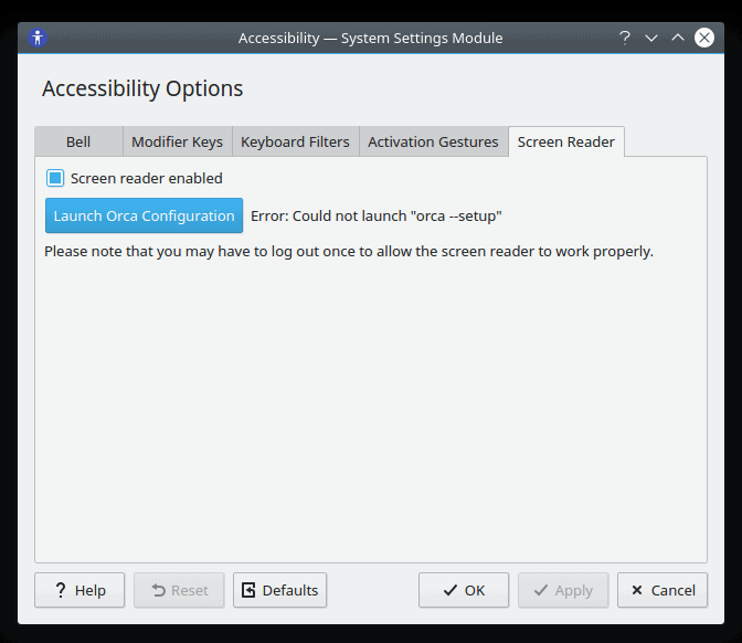
This was a tough one really. In general, accessibility is to overlooked in the Linux world, it’s embarrassing. I still remember Knoppix Adriane (from 2009) as probably the one and only distro that had this configured right from the start. Now, this isn’t just KDE or Plasma, and we need to take into account the Ubuntu code and Neon and whatnot, but I struggled with accessibility, even more so since it’s mentioned in the release notes, and that KRunner can actually work seamlessly with Orca, the screen reader.
Sounds great, except I struggled getting things in order. First, a non-trivial setup. And then, nothing happened, because Orca isn’t installed. Worse yet, there’s no auto-install of the missing dependencies, libraries or the program itself, or even a prompt/notification to the user that they will need this in order to use the screen reading feature. The after-the-fact error message is genuinely awkward. Browsing through the repos, I couldn’t find anything that matches Orca, so this is even worse.
Krunner
This is a highly useful part of the Plasma desktop experience. You can think of it as search on steroids, and it can perform a few useful functions in addition to just returning results for a chosen string. The list of available modules is long and colorful. And even though I have not been able to test this yet, it ought to work with the Screen Reader – but can it also receive verbal commands? Aha. I like Krunner and what it does, but then, my friend Bruce disagrees (somewhat). I do believe that there’s a lot of room to extend the functionality. And also limit it. You may want to use this for specific scopes, like wiki/scientific search, online vs offline search, documents only, inline application commands and menu functions, and so forth. Ubuntu tried this, and the idea was good, so it is worth pursuing.
Other stuff
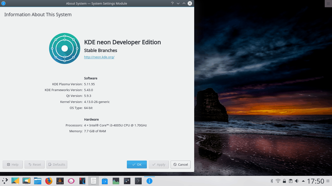
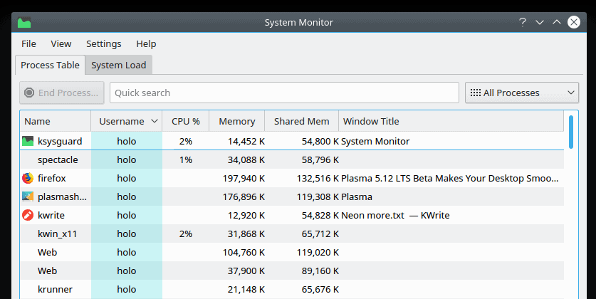
Looking at the official announcement, I also noticed a few small discrepancies compared to what I have. For example, the System Monitor is labeled System Activity, and it shows a nice per-process CPU history graph rather than just the current value. Maybe I’m missing something? Anyway, this is neat, and it would be nice to add other metrics – network and disk I/O, GPU, and perhaps some others.
Konsole comes with nice tabs – but there’s a lot of inconsistency with this across versions. For example, Kubuntu Zesty had a 50% width implementation, so you could always click and create new ones. Aardvark goes with a cumbersome 100%. Here, in Neon slash 5.12, we get a 20% width, which is practical.
More bugs?
Well, there are quite a few other cosmetic issues. They are not strictly related to Plasma 5.12, which is why I’m not going to list them here, and I am actually going to follow up with a separate article that focuses on all the little papercuts and issues that I often encounter when working with Plasma.
In the past year, Plasma did change, and we can see some new features coming and old bugs vanishing, but there’s more fresh stuff than refinement. It should be the opposite. I believe it is more important to resolve existing problems rather than add new features, which build on elements and functions with problems, and then create even more problems.
Specifically, I think the big issues that I raised in my 2017 report remain – the package manager is rather wonky, Samba connectivity is tricky, decorations are still half-broken, and some things are woefully complex to discover or configure, including the desktop defaults. A paradox when you consider how extensible and accessible Plasma is. On the positive side, there’s more consistency in the UI. There are fewer errant lines and dots and colors and whatnot, and the wizards and windows feel more complete. The integration of elements is better, and when you judge the entire desktop experience, it is better. It all comes together once you start using Plasma and uncovering its secrets. Music, smartphones, online accounts (where have they gone btw?), system notifications. Not perfect, but then, there’s really NO operating system that does this well. In this regard, Plasma is really trying its best to make it all work together.
Conclusion
This article may sound like a healthy tornado of criticism against Plasma, but no. Far from it. I really like Plasma, and I’m amazed by the amount of quality, consistency and innovation that has been invested in the desktop. It’s also maturing nicely. Plasma 5.12 LTS brings in a range of goodies, topped by a solid layer of eye candy. I also exposed a bunch of bugs, but they are only expected in the beta release, and you will hopefully never see them in the official version.
Plasma looks the part, it’s visually engaging, and it works well. But it still fails in a few big categories, including smartphone and network connectivity, and the package manager is really weak. The decoration side of things requires some thorough housekeeping. This sounds horrid, but when you compare this to some other desktop environments, it’s not that bad. However, you should never compare down – always up. The idea is for Plasma not to be better than its competition, but excellent for its users, regardless of what the competition does. All in all, apart from Unity (which is sort of gone), it’s the nearest thing to a pro desktop that we have in the Linux world. And it can get there. But there’s still more work to be done. However, you should definitely dabble and test. Kubuntu and Neon are both stable and mature enough for games, just be ready to weather the occasional squall of bad QA and regressions. I shall follow up. Stay tuned.
Cheers.
[sharedaddy]

It’s funny how you comment on suboptimal font setup in Linux distros in an article that uses an appalling grey font. The shoemakers son always goes barefoot 😉
It’s quite likely you have no influence over it, but it still makes me laugh. Any CSS that gives a worse experience than Firefox reader view belongs in the garbage bin. Which is 90% of them.
There’s an element of mirth in your comment, indeed, yes.
Dedoimedo
Yeah, I was thinking the same thing. Funny how any webwite would think these grey fonts are appealing or easy on the eyes.
About Discover, it’s not aimed to be a package manager but an app manager (and a ‘backend’ to update the distro’s packages). It’s purpose isn’t replace the terminal, just a eye-candy complement to install apps (debs, flatpaks and snaps) easily.
And the additional details, screenshots and the rest, it’s not Neon’s fault. You can read more about it in pointieststick.wordpress.*om/2018/01/27/how-to-make-an-app-look-good-in-discover/
Look at it from the perspective of an average user – they want to install stuff, somehow they figure Discover is supposed to do that, and then they search for something, cannot find it, etc. The technical reasons behind decisions are irrelevant. What matters is user experience. From that angle, Discover is a sub-part choice for the time being.
Dedoimedo
And why was it incapable of finding Muon, which IS an app?
And if Discover isn’t meant for managing repositories as well (as it isn’t meant to be a package manager), then that half-baken
repository option should go away. Or it should be done right.
I, too, am in constant discomfort when using Discover and I default to Synaptic on those systems. However, all in all, I feel Discover is getting better slightly.
We are working on it. 🙂 I know there’s still a long way to go, but please believe that we hear your feedback!
Just installed it after manjaro became unbootable on an update, and I absolutely love it aside from some of the criticisms here, and a screen tearing issue that I’ve encountered in several other distros. The customizability is the main attraction for me, so I’m glad you highlighted a need for default settings.
The right pathway KDE has chosen is visible already since a long time. KDE 5.12 LTS in combination of Ubuntu’s announcement to stick for 18.04 with Xorg should make us now hopeful to get a reliable, polished system (for at least two years) with Kubuntu.
16.04LTS had 3 years support, 14.04LTS 5 years. I hope 18.04LTS will have at least 3 years again.
LOL If you’re waiting for KDE Connect Windows Phone Support, it’ll never happen. Microsoft have up on it years ago, they are telling users to use Android, mainly promoting Samsung.