The world of documents, spreadsheets and presentations is roughly divided into two. There’s Microsoft Office, and then, there’s everything else. In the second bunch, LibreOffice features prominently, often touted as a free alternative, with a wealth of tools, options and features. I am a mostly happy user myself, although I’ve never been able to fully commit to it, for various functional as well as practical reasons. And yet, whenever there’s a new release, especially a major one, my hope soars up, thinking this could be it, the moment of truth.
With version 6.2 freshly launched, I set about testing, to see whether I could perhaps upset the status quo and shift the balance away from a proprietary, payware solution to a free, cross-platform suite. After all, LibreOffice has many merits, but it is not without flaws, either. Anyway, let’s see what gives.
The UI revamp
The major focus of this release was getting the Notebookbar right, the contextual ribbon-like interface that was introduced as an experimental feature in LibreOffice 5.X. First, it’s no longer called that – it’s just the ordinary UI layout entry in the menu, but it comes with multiple options. You have quite a bit of freedom customizing your interface.
There are a total of nine layouts in Writer. You can use the classic arrangement if you prefer, or go for contextual, which has a ribbon-like functional division. You can also used a tabbed layout – slimmed down or fully expanded, as well as grouping, which is somewhat similar to the ribbon.
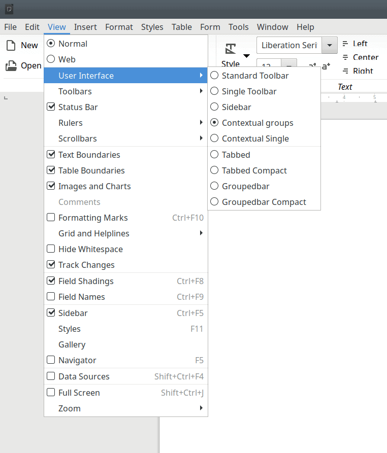
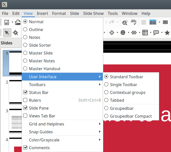
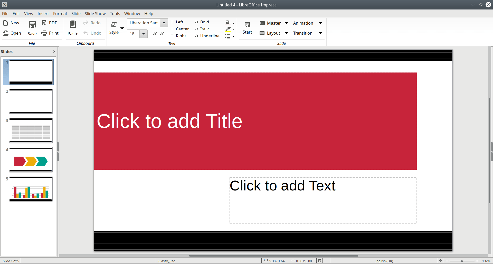
To make things a little more confusing, you only get six available layouts in Impress – rather than nine we’ve seen earlier in Writer. This does makes me baffled, and I wonder if these different programs in the suite may have been tweaked in isolation. I don’t understand why this is, or the fact you can tune each one individually.

Groupedbar Compact.
LibreOffice Calc
Some reasonable improvements here. The UI is somewhat cleaner, and you get a bigger, more easily targetable close button. But there are still issues, because some elements look tiny, and others just too big. There does not seem to be a way to increase the default document zoom, or make Calc comply with my system scaling settings. The usage of charts and images remains unchanged.
LibreOffice Impress
If me eye does not trick me, Impress has benefited the most from UI changes in this latest release, as it has the most polished feel of the three programs. I don’t know the reason for this, but I am happy in this regard. Overall, much like Calc, the usage remains the same.
Visual bugs
I was annoyed to discover, side by side with these nice UI improvements, some rather glaring visual glitches. I did some extra digging, and found out that this issue also exists in LibreOffice 6.1, so this is not a new thing, and I wonder why it wasn’t spotted or fixed just yet. I am also not sure if this is somehow related to Plasma AA settings or perhaps HD scaling – although I did play around, without any discernible improvements.
Long story short, in some of the UI layouts, the text will be vertically truncated – looks like a typical DPI problem, but then as an end user, I don’t really care how or why this comes to bear, I expect the program to look great regardless of the platform choice.
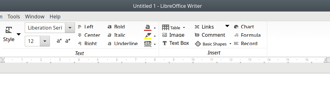
Notice the text that reads Left, Center, Italic, Formula, etc. The bottom bits are truncated, and I’m not sure why – it could be any mix of font size, family, scaling, DPI, etc.
The cropping isn’t restricted just to Writer, it also affects the other programs in the suite. It also affects different icon themes, like Sifr or Elementary.
Then, notice there are two close buttons (depends what layout you chose). No, actually three, if you count the window controls, too. Quite odd, and the odd alignment also makes my OCD demons scream in abject terror. I mean, really.
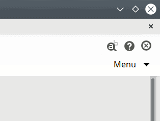
It’s almost they want you to close the document at all costs. Every button has a different style and size, and then, there’s horizontal margin from the right border, too.
The layout are quite interesting – and welcome, but I think there should be fewer options. I’d rather see one or two layouts, which have been thought through completely and designed to perfection, than nine layouts that come with bugs. After all, maintaining nine workflow patterns is a complex, difficult task, and it takes a lot of effort. In a way, it’s like the fragmentation in the Linux distro world. Fewer but higher quality choices would be a better solution.
The choice of the UI layout will dictate the visibility of the menu and some of the sub-menus, the position of the expandable menu and options, the position of navigation buttons for individual documents, etc.
Switching the UI layout leads to a drastic change in how the program’s command interface is styled – the menu is now visible, the drop-down menu button is gone, there is a different set of functions and buttons available to the user.
Styles
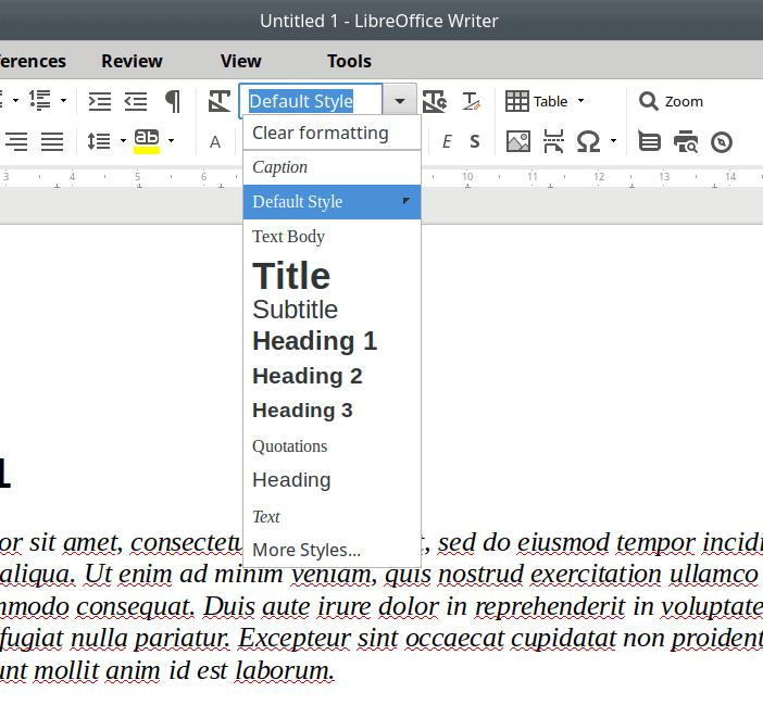
I’ve talked about this before – the style management in LibreOffice remains tricky. Regardless of the UI layout choice, you don’t have an option to quickly apply a style with a single mouse click. In some of the layouts, you can use one of the presets, when they show under a dropdown menu, but this is a static list that does not change based on your usage. The dropdown menu does update to feature your most recently used styles, but it is still a waste of perfectly good mouse clicks. Moreover, you need to double-click to apply a style, and the style list in the sidebar will jump to the current style used for the selected text, so you will need to scroll up and down to re-apply styles. More waste of mouse clicks. Microsoft Office does this a lot better. So much can be done and improved here.
You don’t have an option to update H1-4 listing under the dropdown, nor will it feature any of the custom styles you may use, and there’s no way to quick-apply the shown style – you need to re-select it.
Microsoft Office compatibility
This remains one of the more important – if not the most important – test for any office suite. While we can argue the philosophical point ad nauseam, the simple fact remains that most people on Planet Earth use Microsoft Office for their documents, and if you want to or need to exchange files with them, be they letters, essays, presentations, or spreadsheets of data, you will most likely need to use Microsoft Office formats. This means that if you use LibreOffice for your work, you must have a very good level of file format fidelity.
Over the years, the LibreOffice > Microsoft Office compatibility has improved, with some ups and downs and occasional regressions, but it is still not accurate enough to warrant blind trust in LibreOffice. If you send people DOCS or PPTX files made in Writer or Impress, they will most likely not look quite 100% as you made them once opened in Word or Powerpoint. If you send them ODF documents, they will get silly errors before the files do open, looking just right. So in this regard, the safer bet is to actually share files in the native format, although people on the other side might not figure out how to open them. Likewise, if Word or Excel or Powerpoint users send you their stuff, you will be able to open them in LibreOffice, but there will be visual misalignment.
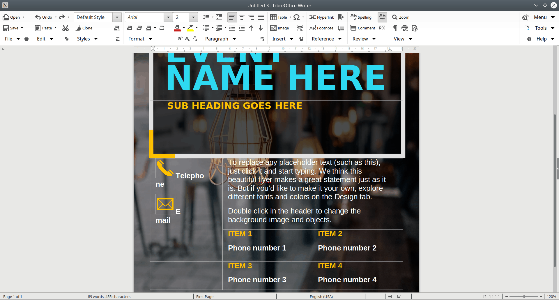
To test this, I went to Microsoft’s Office official page and downloaded two Word templates, which you can use to make nice posters. These files are a good indicator of format compatibility, as they include tables, colorful elements, images, font in all shapes and sizes. So, the first one:

In LibreOffice, the results were so-so. The margins and the padding were all wrong. For instance, the line height of the poster title was only about one quarter of what the Word template has. The telephone icon and text were placed on the same line rather then separate ones, with the actual word telephone broken over two lines – and the same is true for Email. I really don’t understand why this would be the case. Then, the placeholder text was touching the white frame above, whereas in Word, this has a nice, healthy padding.
I tried another template:

The results weren’t good. The center column was shifted down about 30%, and so was the left pink frame, resulting in a rather ugly effect, where the small inset photo of models on the left is half-obscured by the frame shift. The logo also clashed with the color triangles in the right column, and the text was badly displaced.

Now, imagine you need to work with these two templates, and then send them to your colleagues or prospecting customers. Would you really want them to have something that requires precision looking off by 30% on a page? Or have a decorative element introduce into a picture it was supposed to elegantly frame?
I am aware of the technical limitations – but they are neither the excuse nor the explanation for the fact people require something that will not alter the expected results. If you send a file to someone, and it looks wrong, then you can’t rely on this entire sequence – from you to someone else, where LibreOffice files might need to be used with other programs. In an ideal world, we’d have 100% compatibility, but even in the Web space, it’s still all pretty wild, even thought we’ve had years and years of progress and improvements and standards.
Performance & stability
I have no complaints on this front. The suite is fairly robust, and it does its job well. I’ve played with a bunch of 200-page ODT files, and did some basic Calc work, and I didn’t notice any issues. LibreOffice was stable, and did not throw any errors. I also tried different packaging formats, and ran the suite on several Linux distributions and Windows, and the results were rather consistent.
Some other observations
I also noticed that LibreOffice tries to be smarter than I am when it comes to language choices. I use EN (US) as my system choice. But if you change your timezone (region), it will open new documents with the language set to the locale it thinks is best. So if you choose a European one, you’ll get EN (UK), if you choose Canada, you will get EN (CA), and so forth. I cannot express how much I hate this – not just here, but with any software that tries to localize my language choices based on either the IP address or the timezone.
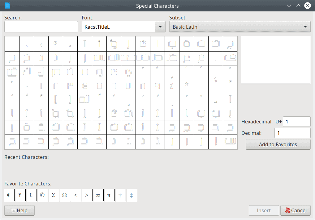
Then, I went a-huntin’ for non-English characters, and found out that the list of special characters was quite short. A lot seems to be missing.
The cell divider (whereby you freeze a pane, so you can scroll while always seeing certain rows or columns) in Calc is a bit cumbersome, and at first glance, you may think it’s a visual artifact, as it sits too close to the scrollbar. There are some definite visual tweaks that can be introduced, but this ties back into the bigger picture of UI layouts.
Once again, notice the close button – as part of the theme – under the Breeze-themed window button. The two buttons (this time) are not aligned, and the theme’s close icon design is somewhat ambiguous; it references a paper sheet with a red X button, which would probably mean a written document rather than a spreadsheet, plus deletion rather than close action.
Conclusion
If we look at LibreOffice in isolation, and ignore the Microsoft side of the story, it’s a pretty solid suite, with lots of great things. It’s also free, and that’s not a negligible element. But then, there are also things that need to be improved and fixed – and fast. I believe that momentum is slowly ebbing across the entire open-source space, especially products that have a strong Linux presence. It could be the usual wear-‘n’-tear, it could be some sort of inspirational crisis, or just the harsh reality of things in early 2019. While LibreOffice is making progress, it’s not doing that fast enough. Now, cue competition, and things are ever worse.
LibreOffice needs a more consistent UI, with fewer but better designed layouts that will always render nicely, without having to worry about fonts or DPI or anything of that sort. The editing of images and charts is slow and inefficient. The styles can be streamlined a whole order of magnitude. Finally, we do have to contend with Microsoft Office and the file format compatibility. This remains a big issue. Unless LibreOffice users can create files and send them knowing those files will open correctly on other people’s machines, it will always remains an underdog. And at some point, the hope will fade. Let’s all hope that LibreOffice can sustain its energy to become more than a pro-am experiment. In a way, your freedom depends on it.
After all, if you ain’t first, you’re last.
Cheers.
[sharedaddy]


In this matter, I totally agree with your points. if you need to make content to share with MSOffice users , you must use MSOffice (to avoid problems). That is the hard, cold truth. Fortunately, it’s not my case. But from time to time I need to access to some data in Excel sheets, Word docs and so on. I’ve tried LibreOffice several times to open those and very rarely was a positive experience. So I use WPS. It’s much faster, much accurate (although not perfect) and much smaller (at least in my machine).
Agreed. And about WPS, too. Unlike LO it supports MDI (multiple document interface) with a tab for each document. Would have been nice if they put effort into a working MDI rather than superfluous layouts.
I solved my problem with Softmaker Office… the compatibility with MS Office is excelente or you can use FreeOffice.
If the weight of criticism falls on aesthetics, LibO seems to do it … well. I think that TDF should abandon the MS pattern and focus on being a better suite to become a reference and not a by-product or a bad imitation.
Once LibreOffice 6.0 came out I dropped it. The interface has completely changed and it’s like having to relearn the package. I am converting all my Thinkpad laptops to OpenOffice, which I have always preferred to LibreOffice. The interface has remained the same.
The interface didn’t change that much. The standard interface is still there.
What interface has changed? Are you referring to the Toolbar? Are you looking for View > User Interface > Standard Toolbar?
I readily admit that I can be classified only as a casual user of a spreadsheet program.
The need arose a while back to collect data, analyze it, and–as a courtesy–provide graphical information. I have LO 6.x as well as Gnumeric in my arsenal of “office apps’. I have no idea how much room ‘Calc’ takes of the ? 500 MB needed by LibreOffice, but I think Gnumeric takes around 1 MB.
There was no comparison; using LO’s ‘Calc’ was intolerable compared to the use of Gnumeric.
And one other thing: I was absolutely astounded by Gnumeric’s “Statistics” entry on the menu. When was the last time you saw ‘Fourier Analysis’ offered by a spreadsheet program? There are at least twenty-nine choices, including ANOVA, covariance, correlation, normality tests, regression, and many more. It’s an amazing program.
I’ve un-installed LibreOffice. Gnumeric (which can also be used as a very good flat-file database) and Abiword do everything I need an office suite to do. No, I do NOT make, nor let myself be subjected to, slide presentations.
There’s plenty of statistics options in Calc as well. There’s options for sampling, descriptive statistics, ANOVA, chi-square test, correlations, covariance, etc, etc.
There are hardly any ‘statistics options’ at all (eleven), with a very small window presented for each with two “fill-in-the-blanks” windows for EACH: “input range” and “output range”.
Understandably, LibteOffice is NOT proud of their effort–“STATISTICS” does not even appear on the main menu. In order to find ‘statistics’, one must go to “Help” on the main menu, and use the ‘search’ function. Then one gets pointed to these statistics ‘tools’ of questionable value.
Use the Tabbed Bar, and Statistics as an option is visible on the Data tab.
I don’t have to outline all the Statistics options on Calc for you when you can install and check them yourself. Nor was I saying that Calc was superior to gnumeric in that regard. I was saying it also had a few options, and that’s under focus from Calc developers with more Statistics options in development for 6.3.
Maybe you should go take a pill to calm your nerves and not be so controntational.
TDF is not a very large organization. It has around 5 or 6 people in its payroll.
Most of the work in LO is done by volunteers or employees of other companies. And it’s hard to organize that when those developers need to answer to the priorities of their employers.
You are obviously unaware of the VERY large, VERY EXPENSIVE website of this “…not a very large organization…” which exists for the sole purpose of the “…around 5 or 6 people in[sic] its payroll…”
Since you are not at all familiar with the website of The Document Foundation, I suggest you take a look at it, here–
https://www.documentfoundation.org/
Hey Jawhenry, yes I am aware of the website. It’s not very large nor very expensive. It’s well designed so maybe that gives you the impression that it is expensive? At least something is being done right then!
But again, the TDF is not a big organization, and a big part of LO is volunteer driven so maybe tone down the criticism. If you want professionally developed software (even open source) you do have other options. Take a look at Only Office for example. It’s also open-source and supported by a single company so it might be more to your liking.
Yes, interoperability with Microsoft Office will always remain a big issue with LO. Other Office suites directly use MS Office filters. LO does not do this.
Also, there’s a severe lack of developers that can do their work directed towards priorities of the community and not that dictated by their employers. As for the problems with icon cropping and so on, those things ARE QAed. But if no one reports them it’s hard to fix it no? Especially when the QA is done by the community. If you think this is a problem report it at Bugzilla so that the bug can be detected and bisected.
“Yes, interoperability with Microsoft Office will always remain a big issue with LO…”
This is no excuse. The reasoning you just offered is, “It’s bad, and it will always be bad.” If this is LibreOffice’s position, then it’s time to look elsewhere. Something which comes to mind is an old saying attributed to the (pardon the lack of political correctness) American Indian: “If you find yourself riding a dead horse, it’s time to change horses.”
Perhaps it’s time for you to change horses.
“…those things ARE QAed. But if no one reports them it’s hard to fix it
no? Especially when the QA is done by the community. If you think this
is a problem report it at Bugzilla so that the bug can be detected and
bisected.”
Validation testing and QA are most definitely not the responsibility of the user, but of the developer..
This is the mentality which has insidiously crept into software development and is THE reason for all the seriously flawed software which, unfortunately, is now the norm. Software developers, including Operating System developers, are extremely happy–almost ecstatic–to see users accept this situation.
“This is not only a very poor excuse; it is
excuse. The
reasoning you just offered is, “It’s bad, and it will always be bad.” If
this is LibreOffice’s position, then it’s time to look elsewhere.
Something which comes to mind is an old saying attributed to the (pardon
the lack of political correctness) American Indian:”
it’s not an excuse. I agree with you. It’s bad. It was a statement of fact.
The problem with LiibreOffice is that, from the very beginning, The Document Foundation tried to be too ‘cutsie’; LibreOffice was, and is, designed to be not a word processor, but a “document processor”. There’s a world of difference, and because of all the differences, Microsoft has, and never will, lose any sleep about widespread adoption of LibreOffice…but you can count on a lot of lost sleep if you’re depending on compatibility–ever–with Microsoft Office / Word.
For a real eye-opener, see
LibreOffice Logic
Bruce Byfield / March 30, 2016, OCS-Mag, at http://www.ocsmag.com/2016/03/30/libreoffice-logic/
The most interesting (damning?) part of the article is the last paragraph:
“…LibreOffice has more unique twists of logic in its design, but these nine are the ones most likely to trouble users…
“Switching to LibreOffice means a change in expectations…
“…If nothing else, learning LibreOffice means that you will probably find learning Scribus or other desktop publishing programs easier, because their logic will be far closer to LibreOffice’s than to Microsoft Word’s…
“…However, even if you only stay with LibreOffice…LibreOffice allows you to do more with your documents, and that is more than enough reason to ENDURE the transition to it.
I think the key element that is missing is big picture view and focus to get basic functionality right. LibreOffice still lacks a proper update mechanism on macOS in 2019. There has been work on implementing the mozilla updater but I don’t think that is in the current release. Feature creep is happening. LibreOffice has so many options and customization variants that it seems it misses to provide defaults that “just work” for the majority of users. And those should be rock solid. But with LO so many details are flawed.
Why is dev time spent on adding and keeping Firefox Themes intact? Who uses that and who cares about it in an office application? Having cinderella in the menubar is just not a good idea. So focus, drop useless stuff like firefox themes and work one providing two themes: light and dark and make those respect and reflect default system settings on linux, macOS and win.
The most frustrating part is, that most of those things have been known and unaddressed for years. E.g. on macOS you are able to type into the about window. How that is even possible is beyond me and I am unaware of other macOS apps “capable” of that.
Still hope a focus can be found and resources spent wisely. The fact that there are over 1k regression bugs currently is worrying and I wonder if there is a problem with code quality? Obviously LO is complex and code base huge. Question indeed is, how this can be improved and further regressions prevented and code base brought to a better state.
I use LibreOffice extensively to prepare books for one of my websites. Some of these books are very large, sometimes over 1000 pages, and some of them have not only chapters, but sections dividing up the chapters. Sometimes there are even pictures, charts and diagrams involved. The Table of Contents are all auto-generated from the Section, Chapter, and Subheading styles.
LibreOffice has served me very well, and the few times I’ve gone back to use Microsoft Word, I’ve found myself struggling to find all the options that LibreOffice packs into it’s Styles, especially the Paragraph Styles.
I solve the problem about the Styles list in LibreOffice, by using almost all my own custom styles, filtering the list (with the dropdown filter at the bottom of the Styles list) to show either “Custom styles” only, or “Styles in Use”. I also assign shortcut keys that I can execute with my left hand, for the Styles that I use all the time: Alt-C, Alt-B, Alt-R, Alt-T, etc. Once these are set up (this is done in the Customization dialog), I can work very quickly with the Styles, without having to constantly navigate over to the styles list.
I actually like the Tabbed (full, not compact) interface, and use it regularly. Once you figure out where everything is, it is very convenient. I also leave the menu bar in place, as there is still the occasional option in there, which I don’t know how to find quickly.
One of the reasons, I am sure, why Libre offers so many choices in it’s layout, is because the open source community is made up of large numbers of very individualistic people who all think it should be only done ONE way (their way). So if you only offer a few choices, many get offended. Some even get offended if you offer any other choices except theirs! It is a different audience than MS Office, and that’s fine…maybe there never will be a day when it can replace MS Word or Office, that’s fine. There’s nothing wrong with choices and variety. How many people in the MS Office community howled bitterly when the ribbon interface came out?! And they didn’t get any choices, it was pushed on them.
As I said, there are some areas where LibreOffice can do things which MS Office cannot do. I use the Draw program to make diagrams, then copy them to the clipboard. Then I do a “Paste Special” (Shift-Ctrl-V) and paste as GDI Metafile. This gives me a vector graphic that is fully resizable without loss of quality. It’s pretty sweet. Probably I could do something similar with Visio and Word, but that would involve much more money, as Visio does not come with MS Office.
Maybe I’m the only one, but I am a happy LibreOffice user!
This is more Microsoft’s fault in restricting Office to a proprietary format.
If everyone used an open source format like odt, many compatibility problems would go away.
Its absurd in this day and age, people can’t save their work in a common format.