Recently, a new team composed by extremely talented designers was formed. Their goal? Design the visual appearance of KDE 5. Known as The Visual Design Group (VGD), they will ultimately design what will become the default look. There’re relatively newcomers on the group as well as old faces, Nuno Pinheiro the lead designer behind KDE 4’s Oxygen iconography, Plasma and desktop theme among them.
Just as exciting, perhaps even more, they’re asking the community to be more involved in the design process, you can participate and share your own thoughts, drafts and mockups at the KDE forums.
So far so good. The problem is VGD is separated from the UI and UX design. What does this mean? It means they will likely create a new widget theme, Plasma theme and iconography, but that’s it. This is a major problem, having a nice overall theme design is just half the story, in fact, is not even half the story. The default look can be changed at any moment by any user, this is KDE not Apple’s OS X, but the UI and UX design can’t be changed by an end-user.
KDE’s UX designers need constant input from visual designers
Let me start by saying one thing: I don’t think KDE should reduce the number of options available, I don’t want it to be GNOME or Pantheon or OS X. What I think is how KDE presents its options could be vastly, vastly improved. In other words, I don’t think the criticism KDE sometimes gets for being too complicated or too cluttered with “unnecessary” options is rooted on the options themselves but on how they’re presented to the user.
Good visual UX design has measurable consequences on how users approach and interact with a product. For example, a very cluttered interface overwhelms users, they feel intimidated, like they won’t be able to use it properly. The same application with the same exact options but presented in a cleaner manner doesn’t feel this way.
Consistency is also an important feature of a desktop environment, the user should be able to recycle as much as possible what he learned in one application to the next one. Otherwise you unnecessarily increase the learning curve of your DE. A consistent widget theme, Plasma theme and icon theme are not nearly enough to accomplish this. Applications needs to be designed with a specific way in mind.
This isn’t to say that developers shouldn’t deviate from the norm, the idea is to set guidelines not the law of the software land. Developers should and will deviate from the guidelines if they feel their programs are not well serviced by sticking to them. Moreover, most developers aren’t either visual designers or UX designers, having a comprehensive set of guidelines with both visual and UX elements is helpful not detrimental. That way you don’t end up with stuff that looks like this (the problem isn’t Oxygen at all):
It teaches them how to make applications users know how to interact with and feel please to look at (not just when looking at the individual icons, or widgets, but the app as a whole, remember Aristotle’s maxim: The whole is bigger than the parts).
Visual designers should be able to tell UX designers what they’re doing doesn’t look good at all, regardless of the theme, and how it could be improved.
Obviously, some applications are more complex than others. It’s relatively easy to make an image viewer feel welcoming, doing the same with something like The GIMP is an exponentially more difficult task. Which brings us to the second point.
KDE’s visual designers needs constant input from UX designers and developers
Let’s take a look at a very pretty mockup from the forum of the VDG:
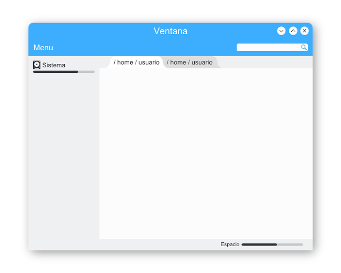
It looks really nice, the problem is almost no application in the entire KDE ecosystem is quite that simple. It may be adaptable to a few of them, namely the subset consisting of simplest of them all. In other words, Visual Designers need constant input from UX designers because they need to create a visual design that looks beautiful when applied to real world applications. Making a simple window with a few buttons and no or almost no content that looks nice is easy, making a real application gorgeous is not. They need to know what are the features and UI elements that will appear the most in applications and how they will be used. Therefore, UX designers should be able to tell them when their design looks good on paper yet doesn’t look good on real world user interfaces.
UX designers and VDG shouldn’t be two teams, they should be a single team
Given that they both need constant input from each other and how both are in a position to correct each other (for different, yet valid reasons), they should form a single team. The entire visual design of KDE is a creation for which both teams are responsible, however, changing the theme is trivial, changing the UX is not. They need to be integrated since the very first day because they need to work together to achieve a coherent, good looking, consistent design and guidelines that will help other developers achieve the same.
Cooperation is obviously harder than working solo, but the end product is much better as a result. VDG is a great step forward because they recognize this, is not a single person in-charge of the visual design, is a group of people working together. Very talented people mind you, all perfectly capable of doing something like this alone. They won’t always agree, they will need to work out compromises and on top of that they’re even encouraging feedback and ideas from the community. They deserve a tip of the hat, we need to take that same ethos and apply it to the entire design of KDE.
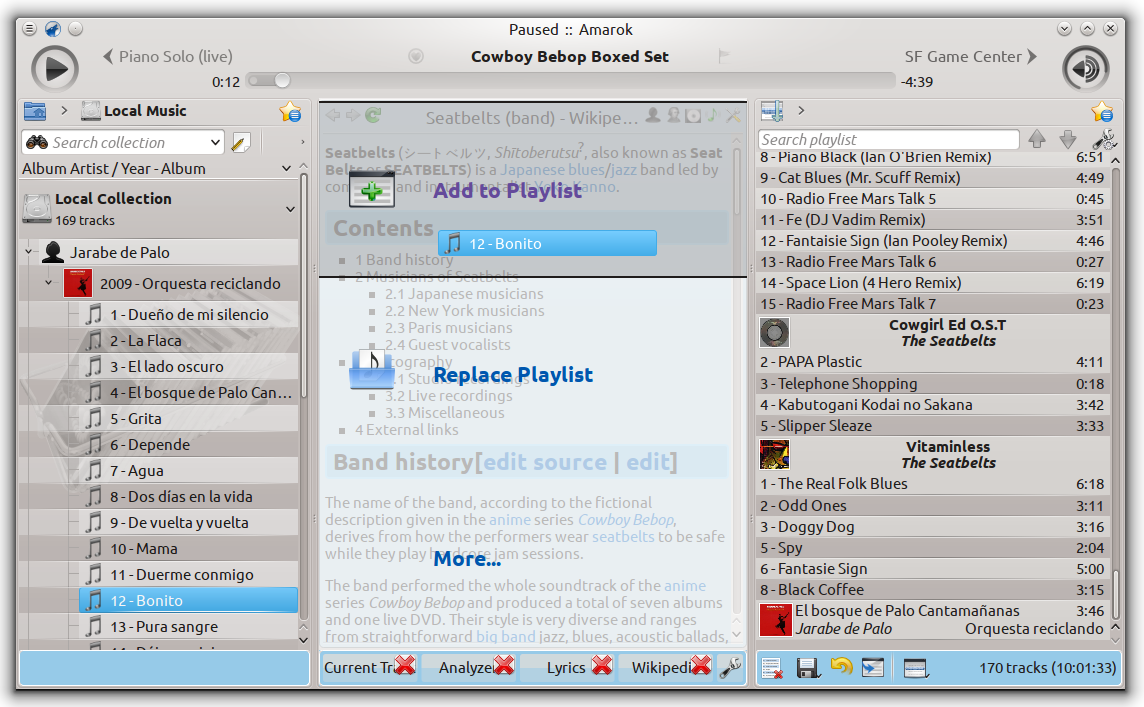
When both UX and visual designers work together things look more like this:
Than our two previous examples.
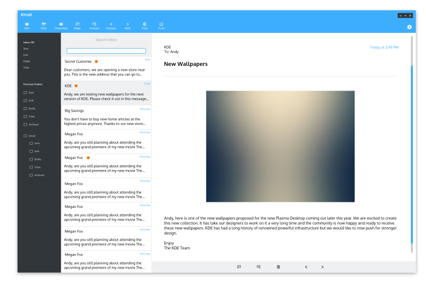
Note: I’m not endorsing the last concept as what should become KDE 5’s design (although it looks really nice and functional), I’m merely pointing out how superior the results are when these two groups of people work together. The last design looks pretty much as an evolution of the simple window draft informed by real world applications, the UX design of KMail was also modified by the designer to look better than it currently does, in other words, is an example of what I’m arguing.
[sharedaddy]


Please, not the same flat design as everyone and their dog has been pushing the last few years. These mockups look exactly like *all* the other UIs out there. Websites, OSes, everything uses the exact same design. Only the shade of blue differentiates one website or OS from another. Please, KDE, don’t go that way.
As I clarified at the end I’m not endorsing the last design, the point of the article is the two groups should work with each other, not to give my support to a specific design.
That said, that mockup looks very clean and I wouldn’t mind if KDE ended up looking like that (not that it is even possible as long as the UX and VDG aren’t a single team). There were a few comments regarding mixing flat and 3D elements too (precisely to avoid being yet another flat looking piece of software). Although is worth noting visual design is trendy and flat is trendy right now. Everything is still at early stages though.
If you have any particular idea and have the time to make a draft, or perhaps even better, a mockup you can go the forum yourself 🙂
IMHO, everything is better than current KDE design, I really like its functionality and extensibility but that bubbly design is awful.
Looks cool, I like it. I think an iOS look is the way to go.
I’m not trying to claim that particular design is the way to go (although as I said I like it). The point of the article is about the two teams working together.
For clarity, folks from the KDE HIG usability group have been and are working together with the folks in the Visual Design Group. They are aware of and frequently visit and provide input to topics that come up in the VDG forums.
Additionally, the HIG folks have been very involved in integrating the new Visual Design Guidelines into the HIG. There is a mutual understanding from both sides of the need to work together. Naturally, the Visual Design Group will be more free form with a flow of ideas that may or may not comply with the HIG. That’s ok. Ideas that get traction can be refined over time into more concrete ideas that can withstand a either a usability review, developer scrutiny or both.
Hope this helps!
I’m glad to hear that. I read directly from Jens that you mostly only did visual design (and he implied that you had relatively little influence on UX), not to mention Aaron was a bit snarky about the whole thing. Although he seemed hopeful things were going to change, since some on the UX side were eager for new ideas.
Thanks for you work on KDE by the way 🙂
Well tbh we DO have a lot of back-and-forth with the UX guys (and in many cases we’re one and the same) but the issue here is not replacing the current UX people and I wanted to make certain that we focus correctly first on visuals and make certain that we don’t just kick in open doors or trample toes you know?
Also remember that the work going on in the Open can sometimes differ a bit from the work going on behind closed doors. I wish we didn’t have to but some things are, since we came in so late, sort of panicky and we had to make certain they got done… the idea is that the more comfortable we all are the more open everything will become until that point where we can have someone responsaible for different aspects working 100% in the open on all things.
I never suggested you should replace the current UX guys! I thought the article was clear that I just think both teams need to cooperate all the time (be a single team). I don’t think I ever suggested someone should be replaced.
On the other hand, I think is clear the UX design isn’t determined in the same very participative (from the entire community) way VDG is trying to do things.
Anyway, I really like, as I said, the ethos of how you’re doing things! Again, thanks for your work on KDE.
Just a reminder that everyone is invited to join, comment or simply have a look at the VDG efforts:
Overview: http://forum.kde.org/viewforum.php?f=285&start=20
Wallpapers: http://forum.kde.org/viewtopic.php?f=285&t=120497
Cursors: http://forum.kde.org/viewtopic.php?f=285&t=119857