Nailing the perfect software design is tricky. It is all too easy to confuse simplicity of aesthetics with simplicity of functionality. A piece of software can be deceptively plain looking – Google search for instance, but it can do a hell of a lot. On the other hand, you may have something with a huge amount of buttons and toggles and whatnot, but in essence, it does very little.
The quest for the ultimate GUI package manager in Linux continues. We’ve had dozens of tools come and go over the past decade or so, each trying to offer that fine mix of intuitive search, useful information and great looks. KDE has also seen a range of programs appear and vanish, but so far, the elusive goal remains. The latest Plasma incarnation is Discover, a tool I’ve found wanting in all my previous reviews. Come KDE neon 5.9.3, I’ve given it a fresh spin. Let’s see what it does.
Discovery … Strait – First impression
In essence, Discovery is the front end for whatever powers the innards of the specific distribution. With neon, given that it is Debian-based (or rather Ubuntu), we have apt-get. As such, it replaces Muon and competes with the likes of Ubuntu Software Center, Gnome Software Center, Mint Software Center, and friends.
The layout is simple and inviting. Discover used to struggle initially, with overlapping and clashing elements; just read my Kubuntu 16.04 Xenial Xerus review. This seems to have been fixed, leading to a more simplified look & feel. But now, the question is, does Discover do everything it’s supposed to do, given that lots of visible options and features are gone?
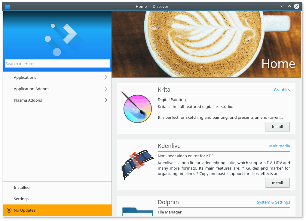
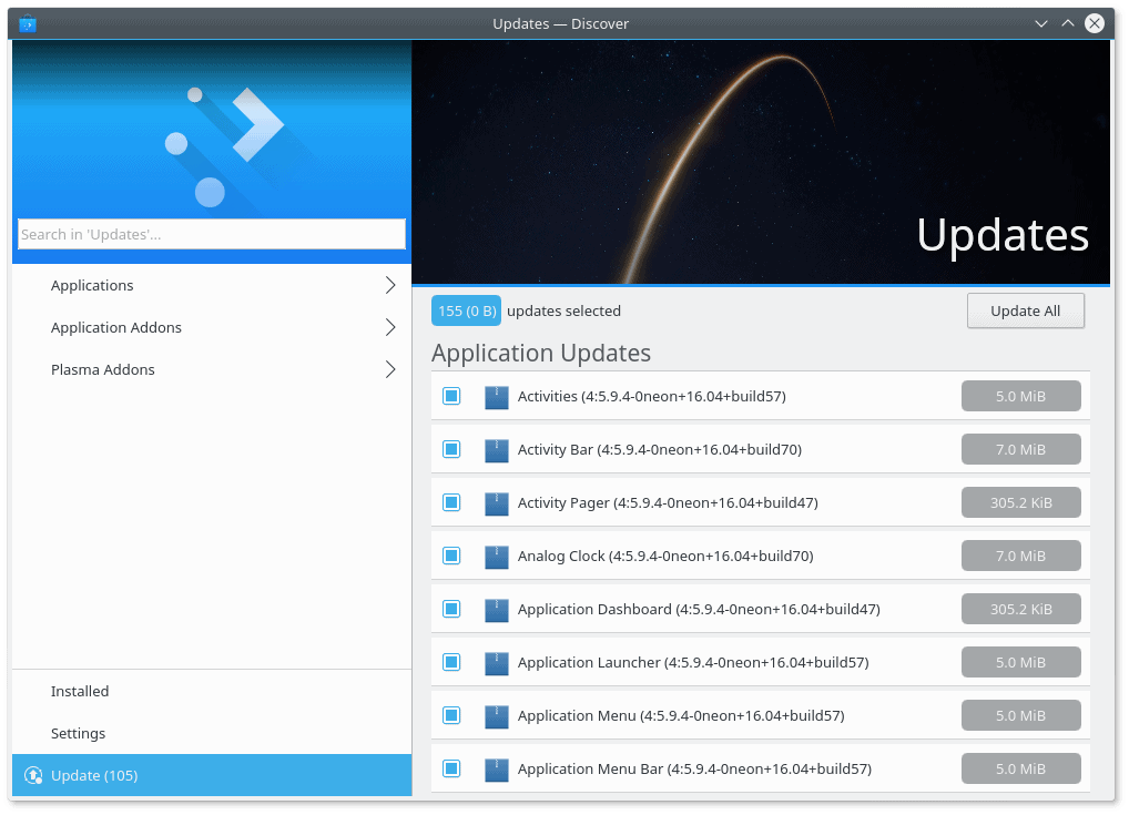
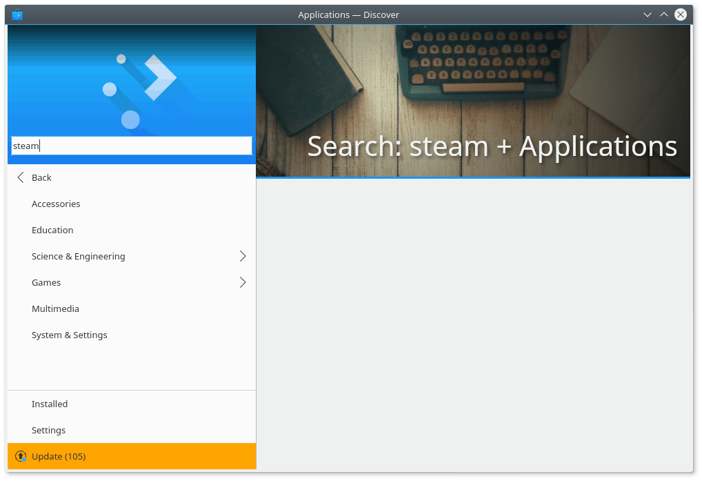
In the left pane, you have search, which you can further enhance by three sub-categories, applications, application addons, and Plasma addons. In the left bottom, you can check your installed software, change settings, and search for updates. On the right side, you get a list of whatever matches your current view. Without anything selected, it’s a list of software available in the repositories.

However, despite an improved, cleaner look, the presentation layer is not very informative. The applications are listed in a seemingly random manner, with no sorting option. You do not see any rating or ranking for listed applications. There are no stars or comments or reviews available to help you decide whether you are interested in the particular software. The scroll functionality is also vague, and items aren’t well delineated, which can cause a bit of eye fatigue.
You get no ‘sort by’ option, no ratings, no reviews, not even the number of found results.
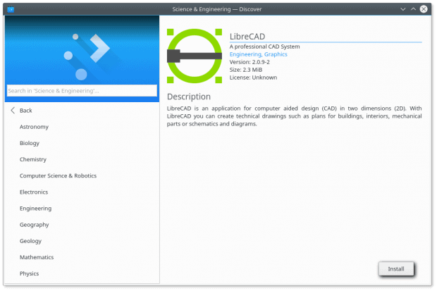
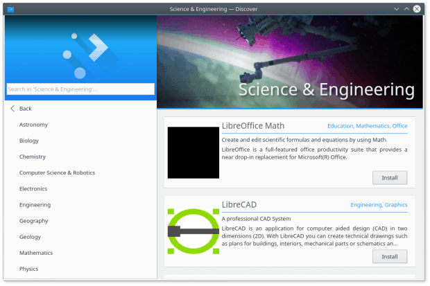
If you do selected an application, the view will switch into a more detailed page, usually with some additional descriptions and several thumbnails. On paper, sounds like a nice end result, but there’s a lot missing. In addition to the aforementioned ratings and reviews, I’d expected recommendations based on the current selection, as well as some sort of general population usage statistics. In other words, like any self-respecting Store, Discover ought to help the user “discover” new programs. This means hinting and goading and showing related search items in a discreet, subtle manner. Then, I’d expect to see any addon software, if available, as well as a link to the official project home page.
The thumbnails are blurred. If you click and expand any which picture, you will get a nicer, clearer screenshot, but the initial impression is pretty flawed. Some programs do not even have any thumbnails.
At the very least, updates seem to be all right.
Distance Traveler Discovery – Searching for software
This was supposed to be a fun journey. It wasn’t. I felt largely indifferent using Discover, as it did not infuse me with any need to actually run it. I was able to find a few programs I thought might be useful, but I got nothing from the software itself. Nothing to make me enthused or engaged. I did install a few programs, with zero emotional investment.
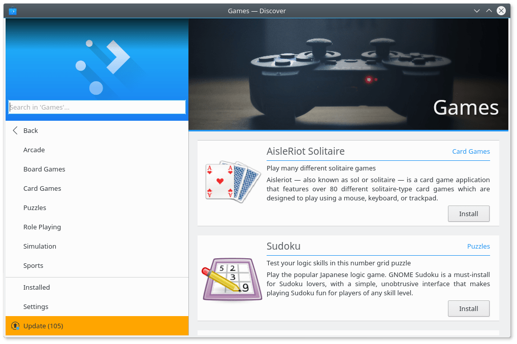
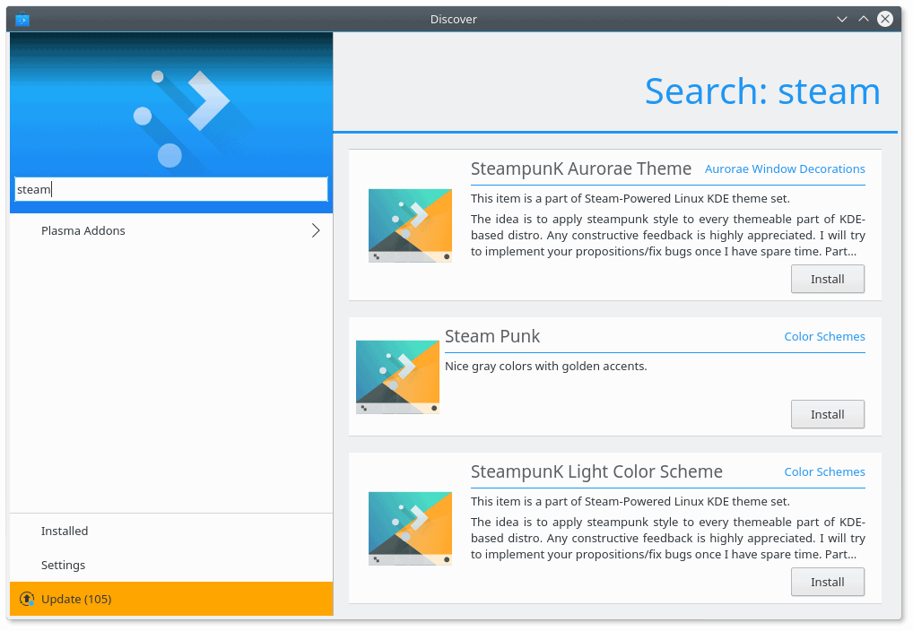
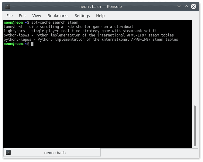
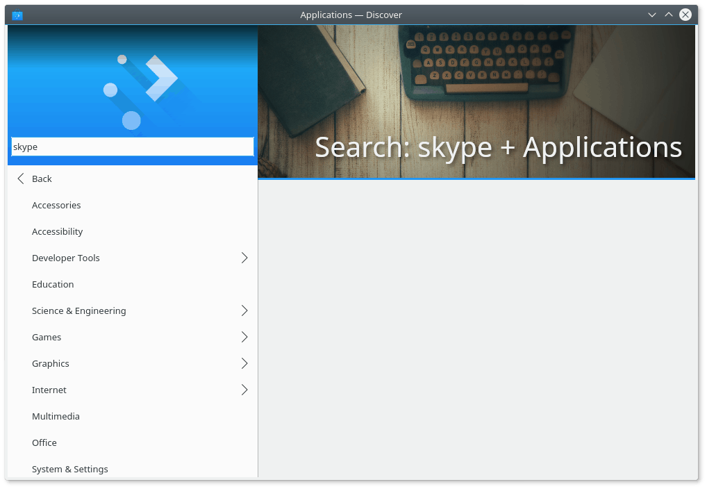
The search is also quite inaccurate, I think. I started with Skype and Steam. On the command line, apt-get returns 4 entries for Steam and 11 for Skype. Discover gave me 0 for each in the application category. But then, searching for Steam under Application Addons, it listed an unknown number of results (at least three that I could count, including some jarring visual bugs), which are not reflected on the command line. So these comes from a different repo source, I guess.
All of these options have a different count – and more worryingly – different results. You need a 3D VLOOKUP to figure it out.
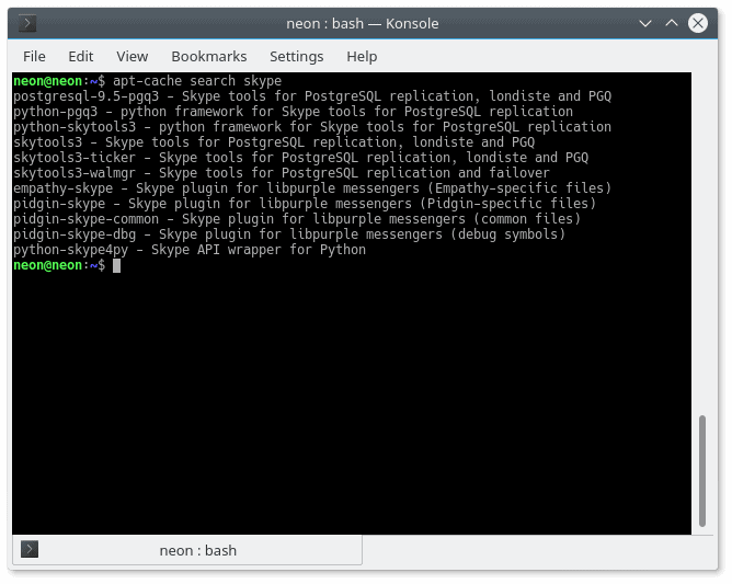
Now, not having a list of found entries is annoying – something like 24 results would be nice. What does frighten me is that two different methods of managing the system give completely different results, and I’m worried which I ought to use. I want a consistent way of managing my box. What if I install something on the command-line interface and something else via Discover? When I search for updates next time using each of these methods, what will I get? If I never run apt-get again, will it update everything I need? Or vice versa, will apt-get obtain everything that Discover can find?
Excluding all other considerations, a GUI package manager is only as good as the quality of its work. If it cannot reliably find software and update my packages, it serves no purpose, no matter how stylish or elegant it may be. The worst thing is, I have no idea how it works and what considerations take place in the background, because the GUI is too simple for its own good. We’re going back to the original idea.
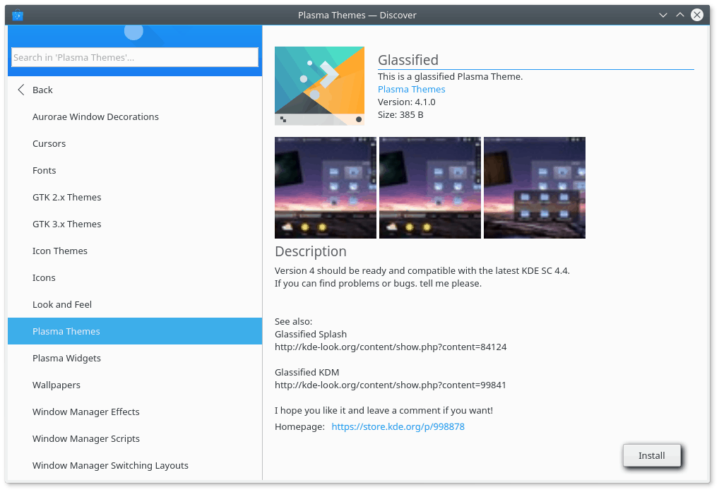
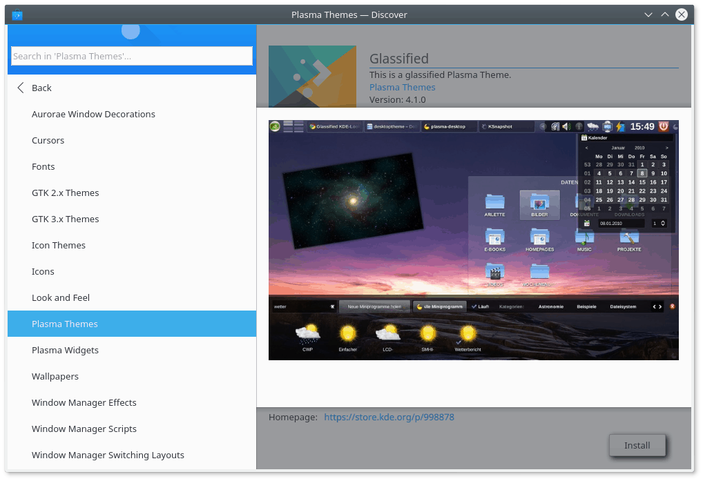
Linux Shuttle Discovery – Addons
Two other categories listed in the interface include decorations for the Plasma desktop, and application extras. The latter is VERY confusing. On one hand, you have purely decorative stuff listed, like color schemes, comics and emoticons. How are these application addons? Then, Kate. What is SDDM and why should I care?
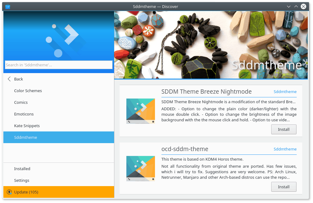
Why are these considered application addons?
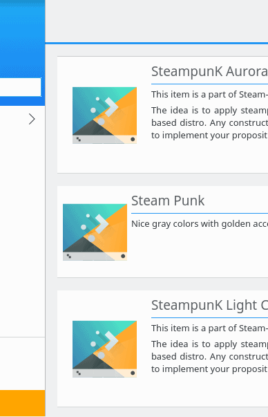
I also wasn’t sure about the Plasma addons, either. Does this category supplement the System Settings new themes/icons functionality? There were a lot of things listed, most of them completely irrelevant to my Plasma desktop. Why would I care about GTK 2.x and GTK 3.x themes, when I’m running Plasma? Then, going through the list of available addons, I read several fairly weird descriptions. Gnome desktop, tested on LXDE, should work on KDE, etc. Hardly inspires to try the software, does it?
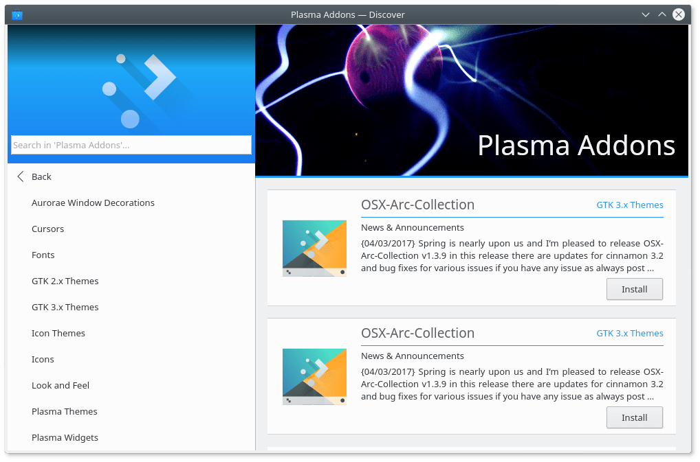
The first thing you get for PLASMA are GTK addons.
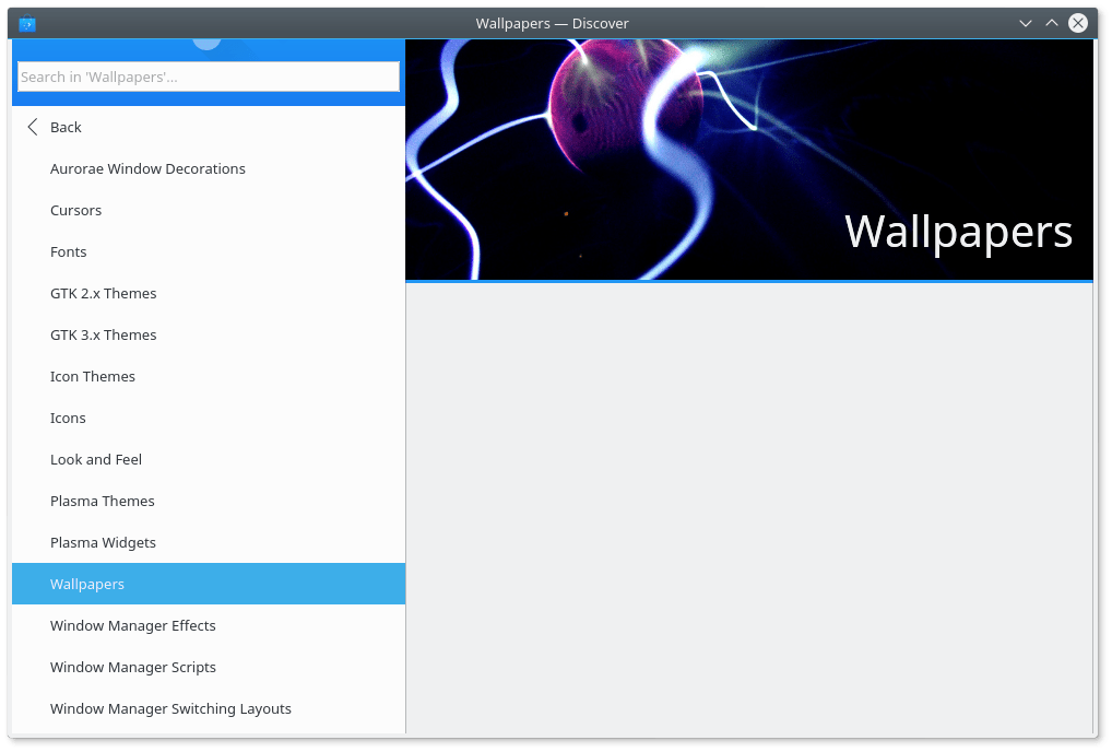
Some of the categories were completely empty, like say Fonts and Wallpapers. Some others are a big mystery. Aurorae, Window Manager Switching Layouts. What. Of course, everything here is totally redundant, because Plasma has its built-in functionality, which is, to be fair, quite broken, but it’s there, and it can be fixed. Maybe. So perhaps Discover is meant to run on other, non-Plasma desktops, but then, I’ve not seen any non-Plasma desktop using it, as it’s inherently part of the software defaults, and all other desktops have their own tools and utilities for managing the desktop look & feel. So I’m not sure what the intended purpose or future goal is. Replace all other tools? Or maybe this is another duplication of an already heavily fragment ecospace?
Settings & software sources
This is a huge problem. Again, recently, in a rush to offer simple, seemingly touch-friendly interfaces, the new generation of package managers appears to have forgotten to include functionality. Discover is a major culprit. The settings category is basically a list of software sources, with two extra buttons. One of these lets you search for updates – unnecessary, as there’s a separate option for that in the left pane. The other is a help button, also quite redundant.
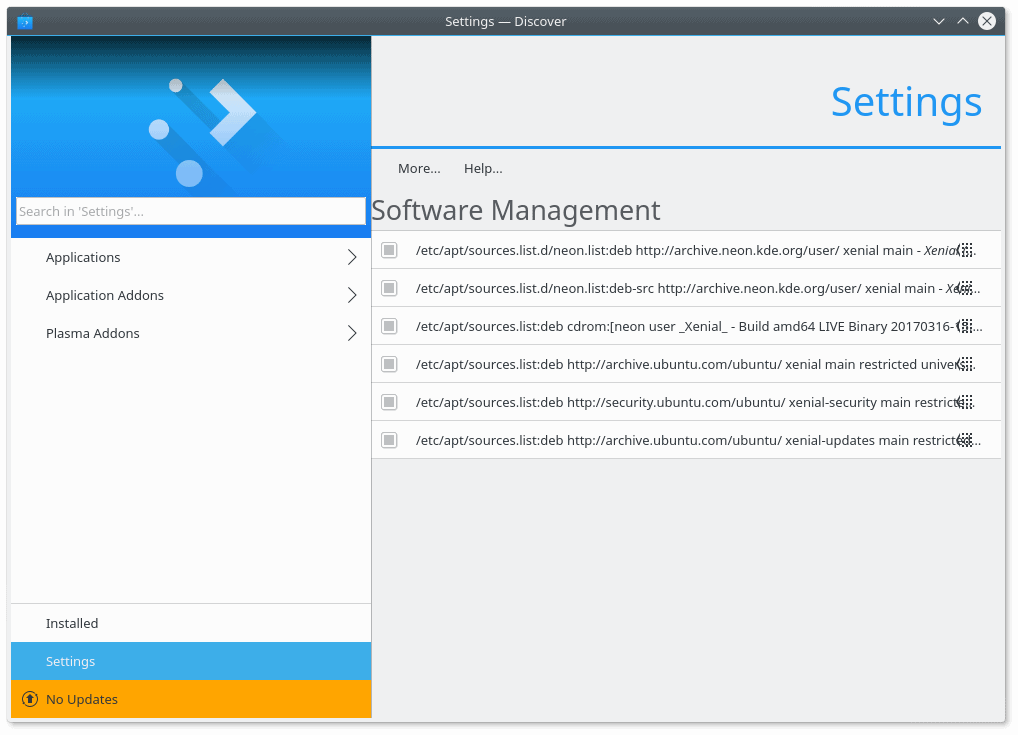
The sources are listed line by line, with the text scrunched against an “edit” button to the right of each line, creating a rather jumbled, busy look. If you do click there, the source will slide left, allowing you to either supposedly edit the source – the button does nothing – or delete it.
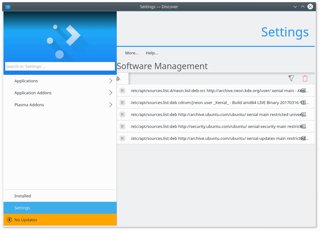
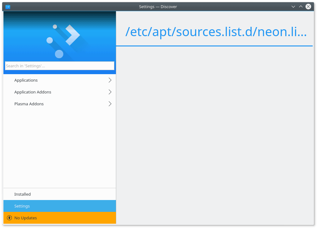
If you click on the edit button or the source itself (not the little edit area on the right), you will advance one level deeper inside Discover’s sub-menu hierarchy, but there’s no back button. You must click on the blue-logo area top left to return to beginning and start fresh. All in all, the Settings piece is still incomplete, and what little functionality it has is rather pointless. Showing software source is fine, but if you cannot really add any new ones in a simple, elegant way, there’s no purpose even having it. In the end, you must use the command line. Given that Discover has been around for some time now, this is alarming.
What now?
Other observations
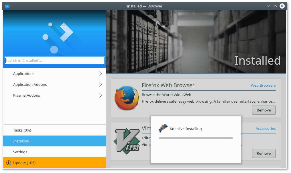
Discover did not remember the windows size when I closed it and opened again. It popped at 3/4 of the screen width and full screen height, even though I’ve selected a different view. The program does not offer any helpful clues as to what it does or when, so you don’t really know if it’s working or waiting.
No commercial integration
This is another big one. I believe all Linux solutions are heading this way – pulling away from any online integration with payware software. Once upon a time, in better days, Ubuntu used to offer this. Now, either there’s no interest or something else is afoot, like huge cost or security challenges with the implementation. Discover is empty of any such option.
It’s a shame, because Ubuntu Software Center (USC) did it well. In fact, largely, it was one of the better implementations of a GUI package manager, with rich, inviting software previews, relevant recommendations, useful categories, and tons of ratings and reviews. If you chose to install something, you would be offer useful extras, and in general, it was as close to a store as any Linux product got in the recent years. Excluding Android of course.
Visual bugs
Now, continuing my State of Plasma mode of thinking. There are dozens of visual papercuts in Discover. Listed program blocks have non-uniform borders; some have them, some do not. Others only have the top or the bottom one, for example, never the sides. The Install button is not aligned to the bottom right corner. The Install button is flat in the main screen, but if you open any which application, it comes with a strong 3D-like shadow. I’m also convinced there’s a difference in the color gradient.
Some applications do not have image previews. A few of them are randomly misaligned, with the image and text indented differently from the rest. Some of the previews are skewed, with the wrong height-width ratio. In other words, they have been resized, but the aspect ratio was not preserved. Take a look at the Firefox example. The previews are also not high-quality or sharp enough, and they also come in different sizes.

To the best of my knowledge, Firefox has a ROUND logo.
Settings actually only reads Software Management. The text has no left padding, and it’s flush against the left border of the right pane. Some of the package descriptions read in a very odd way, including misspelled text and thoughts from the author/developer. Almost like self-managed arguments.
Conclusion
Like I said in the beginning, plain != simple. Unfortunately, too many programs coincide these two concepts. Clean design, zero functionality. Discover sins heavily, with lots of critical features missing that used to exist (or do exist) in other graphical package manager. The search is inaccurate, you cannot edit software sources, you don’t get any ratings or reviews, there’s no commercial integration, the preview images and thumbnails are of low quality, and the workflow is largely counter-intuitive.
Overall, Discover seems to be one of the weaker components in Plasma. It does not seem to follow the KDE ideology, and it lacks functionality to compete on a serious level with competition, including the command line interface. It must evolve significantly and fast before it can be considered for practical day-to-day use. To boldly go where others have gone before. Engage.
[sharedaddy]


LInux desktop is a niche, and projects like Discover will be sure to keep it that way. It’s easy for semi-nerds and above to use the command line for their housekeeping, but nobody will abandon Windows for Linux just for the chance to execute apt-get, dnf, pacman, zypper, etc.
You tell ’em girl!
Except that there are enough of good enough (or even really good) graphical package managers out there.
I effectively can’t remember the last time I installed something with the command line … must be more than 5 years ago, maybe even more than 10 years ago. Maybe you should try any Ubuntu flavor or SuSE, or … ? Might be a refreshing experience for you to try SuSE Tumbleweed or Mint and have GUI tools that let you search for anything in the vast repositories without ever surfing around for installation blobs. Trust me, it’s easy.
Geez, what a disaster. I’d be ashamed to put the KDE brand anywhere near that pile of crud. So it goes with Linux.
“Most software today is very much like an Egyptian pyramid with millions of bricks piled on top of each other, with no structural integrity, but just done by brute force and thousands of slaves. “—Alan Kay
I didn’t read the whole article since I already know these ‘modern’ package managers usually fail miserably (octopi being the most notable exception). On debian and derivaves I usually sudo apt install synaptic.
I can agree with this review quite a lot, except for one stance: Discover is not meant to be a *package* manager, It’s meant to be an “App-Store”, ie. it should only list programs having a GUI (or packages changing a GUI). This explains why an apt-get search for skype will yield different results per definition. That does not say that the different implementation of what exactly is searched by Discover will not give differences for GUI programs as well.
From the GUI perspective I find Discover particularly bad designed with a lot of wasted space all over the place, I tried to use it with a low resolution screen (a beamer in fact), and I can say that in addition to all of the mentioned flaws, it scales extremely bad.
It’s a work in progress, however. But I am uncertain if the current level of brokenness will mature into something that I will finally want to use.
Can’t agree more. Discover is light-years behind the competition. A lot to learn from them. I would restart from scratch…