The days are gone when the Linux desktop was dominated almost entirely by KDE and GNOME. However, the influence of their design philosophy remains, with KDE favored by a third of users, and many modern desktop alternatives, from GNOME itself to Linux Mint’s Cinnamon and MATE using applications originally designed for GNOME. Broadly speaking, KDE’s design philosopy can be described as completist, and designed for users of all levels of experience, while GNOME’s is minimalist, and aimed particularly at new users — although all levels of users can appreciate GNOME design as well.
By “completist,” I mean that KDE applications try to include every function that could possibly be included in a task. Confusion is limited by the setting of intelligent defaults, but more functions are still visible than most everyday uses require. Perhaps the ultimate example of this design is digiKam, which over the year has calved new windows the way that polar ice caps calve glaciers.
At the opposite end of the spectrum, GNOME applications tend to include only the features for the most common use-cases. This choice makes GNOME apps easy to use, but can leave users stranded if any problems emerge. A typical example is Simple Scan, which is so uncluttered that at first it can almost seem confusing.
These two design philosophies are quickly visible on the desktop level. At first, the main difference appears to be that GNOME without extensions uses a working and an overview screen, while KDE uses a single screen, or, if Activities are used, a series of single screens. However, even on first boot, the difference is hinted at. The latest KDE Plasma desktop includes the desktop tool kit, and also supports desktop icons and widgets at installation, all of which allow for extensive customization. By contrast, GNOME removes clutter and presents a uniform look.
At first glance, both GNOME and KDE desktop environments appear minimalist, but KDE’s desktops are customized in accordance with its completist philosophy.
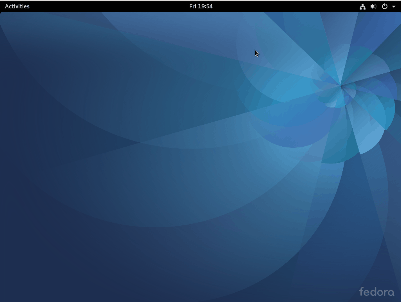
The default GNOME desktop is designed to minimize clutter
However, the difference in philosophy is most obvious in the applications. Admittedly, a few do look almost identical in the two desktop environments. For example, KDE’s Dolphin and GNOME’s Nautilus have slightly different layouts but almost identical functions — no doubt because file management is such a basic function that both need to be fairly complete regardless of philosophy. The same is true of the available archivers.
More often, though, tools for the same function show the design differences clearly, as a comparison of typical applications — K3B and Brasero and Amarok and Rhythmbox — illustrate. Other comparable tools show similar results.
K3B vs. Brasero
K3B is KDE’s CD and DVD burning tool, and Brasero its equivalent in GNOME technology. Both are front-ends for most of the same tools and audio codexes. Yet even at this level, the difference in design emerges: In K3B’s setup, the tools behind the tools can be altered, while in Brasero, they can be configured, but not swapped for equivalents.
When they are running, the difference becomes even more noticeable. On the one hand, Brasero lists five main functions for optical drives. The functions are listed on buttons, rather than the menu, and clicking one opens a sub-window with more instructions. Users who run into trouble can find a few general hints in the Help, but the obvious assumption is that any trouble will be rare and straightforward.
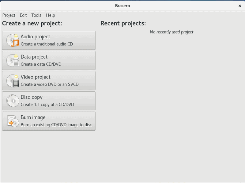
Brasero is a typical minimalist GNOME app, uncluttered and intended for the most common use-cases.
On the other hand, K3b opens on a file manager and buttons. The main window displays only three buttons by default, but immediately below them is a button that displays a complete list of thirteen functions that are also available from the menu, including tools for ripping audio and video sources that Brasero omits. When users are ready to burn, a sub-window opens with at least half a dozen options in each of several tabs. Users can ordinarily ignore almost all these options, yet despite the absence of troubleshooting help aside from the startup hints, if something goes wrong in K3B, users can modify everything from the speed of the operation to the exact burning format. In fact, K3B is so complete that the only major change in several years has been support for new optical drive formats, rather than features.
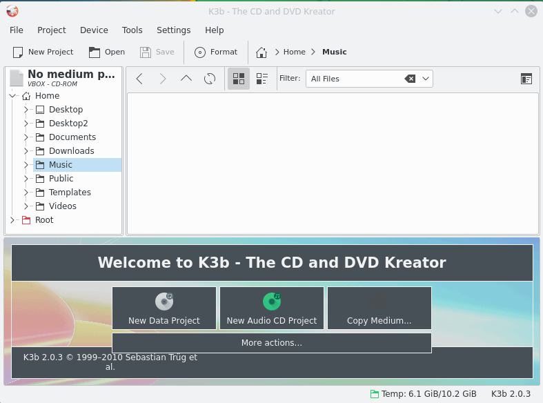
K3B displays three common function buttons, but has a full list of over a dozen, each with its own settings.
Amarok vs. Rhythmbox
Amarok and Rhythmbox are music-players, but the difference could hardly be stronger. To start with, while both play link to online radio and services like Last.fm, Amarok includes plugins for over a dozen, Rhythmbox for two.
Even more importantly, in Rhythmbox the main unit is the track, with My Top Rate, Recently Added and Recently Played lists featured prominently in the window, and little more than lists of currently available tracks In comparision, although Amarok has similar features, it provides for support for both individual tracks and albums.
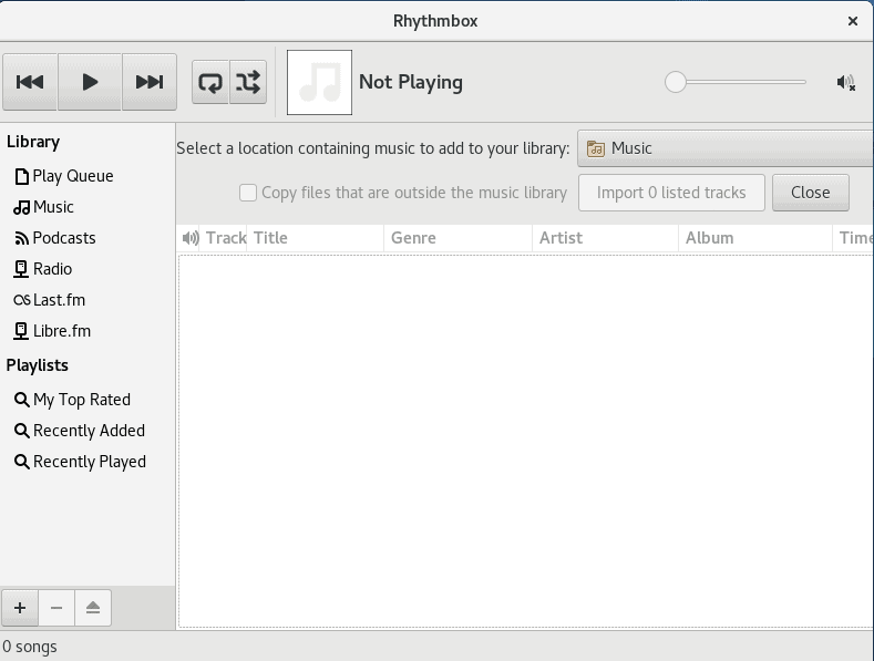
Rhythmbox is designed solely for playing tracks, and little else.
In fact, for those who prefer, Amarok recreates the experience of buying vinyl or CD on-screen. Amarok allows covers to be saved, even when the .flac codex is not being used. Moreover, in the middle of the Amarok window is the Context pane, where lyrics, information about artists and upcoming concert dates and other information is fetched from sources like Wikipedia.
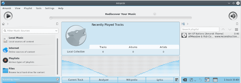
In contrast to Rhythmbox, Amarok is designed for approaching music in several different ways. As a result, it presents a much more complicated-looking interface.
In addition, users can change the tags of albums and tracks, add a summary to display, and create custom labels. Other available tools include an equalizer, subscriptions to musical charts, and even a mood bar that translate the current track into supposedly suitable colors. Users can choose which of Amarok’s features to display or use, but, Like K3b, Amarok is so complete that in recent years it has had almost no features to add.
A Matter of Taste
At first, design philosophy may seem distant from the average user’s concerns. Yet as these examples show, the decision to make a desktop environment minimalist or completist has far-reaching effects on the interface with which you interact.
What is worth remember, though, is that neither design is superior overall. If you are the kind of person who wants only what is necessary on the screen, then GNOME’s minimalism is probably most to your taste. But if you like to have a complete set of functions with provisions for problem-solving and prefer to customize your own way, then KDE’s completism is likely to fit you better. Try each for a few weeks, and decide which one is for you.
[sharedaddy]


But, But..what if i want to have a minimalist desktop with a functionaly complete audio-player, burning software etc..?
why dont have a software(audio-player in this case) without being dependant on a certain desktop environment? This is no good.
Well, Clementine could fit the audio player in this case. Give it a shot! 🙂
There is nothing stopping you from running Amarok or other KDE applications on Gnome.
KDE apps pull the desktop as a dependency, maybe he considers it dead weight…
KDE apps pull their dependencies, that usually doesn’t include the plasma desktop. Dependencies are not dead weight; they are the things needed for the application to work as designed.
The desktop dependency is.
The desktop dependency of what is what?
If an app asks to install the KDE desktop as a dependency, it is a deadweight….
Perhaps, but given that kde apps generally do not depend on the plasma desktop I don’t really know what you are talking about. My guess is that if you can find an app that depends on plasma-desktop, there’s probably a good reason for it.
>If you can find an app that depends on plasma-desktop, there’s probably a good reason for it.
If you say so…
Libraries, yes; the whole desktop, no. Strangely enough, the same is true when installing GNOME apps in a KDE system: they come with a shitload of libraries. The complaint that KDE apps are bloated is unjustified. Especially so since disk space is so cheap these days and even more so compared to what Windows apps install.
“KDE’s Dolphin and GNOME’s Nautilus have slightly different layouts but almost identical functions — no doubt because file management is such a basic function that both need to be fairly complete regardless of philosophy.”
As a long-term KDE/Dolphin user who has recently been experimenting with Gnome, I was rather astonished to read that. The difference between Dolphin and Nautilus, surely, goes way deeper than difference in layout. With Nautilus, the functionality you see in the open window is all you get. There are almost no meaningful configuration options. You can’t split the screen to view directories side by side. The search function is basic. There is no menu bar. Toolbars are non-existent, never mind configurable. Navigation through a hierarchy of folders must be done with the back button because there is no “up one level” button.
On the other hand, Dolphin has the split window function; it incorporates a sophisticated search function that can search for strings inside files; the menu bar is present and packed with useful functions; the toolbars are endlessly configurable so you can have an up button and you can put it wherever you damn well like.
You can argue about which is better, but you surely can’t say that their functions are identical.
I`ve never seen such a controversial topic like this, handled so tactfully…
Gnome : less is more, so let’s take many thing abd make them even less . . . .c. well useful
Kde : more is more, and more, and more, so add many thing even though some of them is not actually that. . . use. . . . ful