And a short time to get there, I’m east bound, just watch LXQt run. Yes. In a fashion similar to my rather exhaustive review of Plasma a bunch of weeks back, I am now going to give LXQt its due spin, rinse and ironing. Brace yourselves, or rather, grab some food and drink, for it shall be long.
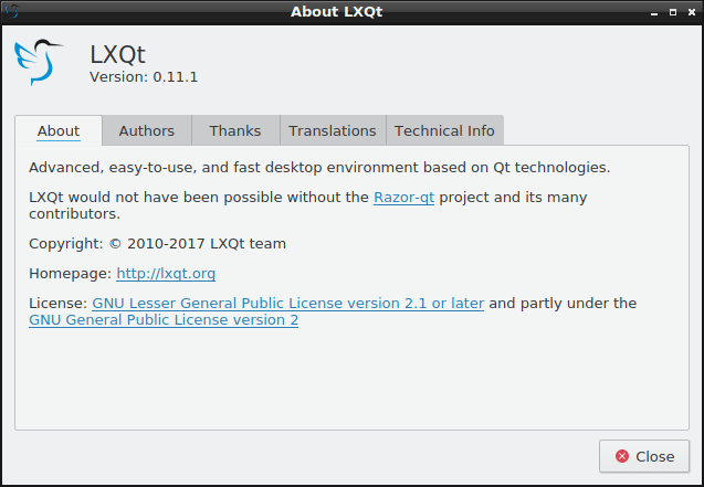
Now why LXQt? Because it has a history richer than the Kingdom of Navarre. We have a desktop environment that is a culmination of two separate projects, LXDE and Razor-qt, both of which underwent the Dedoimedo massage treatment in the past. Moreover, we talked about LXQt back in 2014, and it is time for some fresh testing. Again, from the usability perspective, mind. Let us commence.
Testing LXQt is difficult
This may sound like a weird statement, but if you wish to test LXQt, you will have to do a fair amount of less-than-trivial search and wonder. On the official website, the download page points to an indexed list of the 0.10 release, a 2015 offering, whereas version 0.11 has been announced in September 2016. You can navigate up the tree and get to the sources for the latest edition, but all of the packages are offered as individual files, and there’s no one archive that you can easily download and compile.
Another option is the GitHub page and downloading the archive (or the repo), but this did not help me advance my goal in the slightest. This vector of fun seems to be intended for developers, so the abundance of shell scripts and .md files won’t make you into a smarter user.
If you do not want to build the software on your own, you can also try testing pre-built software, through a number of popular distributions. Unlike KDE neon, which offers the latest Plasma edition on top of Ubuntu LTS, there’s no such image available for LXQt. Instead, you will need to choose a distro and install the desktop environment as you would any other software.
My obvious choices were either Ubuntu (or rather Linux Mint 18.1 Serena) and Fedora 25. I started with the former, and soon learned that the official repositories only have the older 0.10 release available. Reading through the installation instruction, I also learned the Lubuntu PPA, which used to have the latest stuff, is no longer the recommended option, and you should manually reinstall the image every time there’s a new version available.
To complicate things further, if you do want to start with the Lubuntu desktop and then test LXQt on top of it, you will not find it in the Ubuntu repos either, so you will have to manually download the Lubuntu image. This can deter people from trying LXQt, and it almost feels as if the development team does not wish to have their product found and tested.
sudo apt-get install lubuntu-qt-desktop
Reading package lists... Done
Building dependency tree
Reading state information... Done
E: Unable to locate package lubuntu-qt-desktop
Luckily, Fedora 25 does offer the 0.11 release of LXQt. So I had a dilemma. What now? Well, I actually decided to test both! I will start with the Linux Mint testing with the older framework, and then compare to the one available in Fedora. This will allow us to compare the progress in LXQt, and understand how the usability has changed in the span of one year. Should be most interesting.
0.10 release
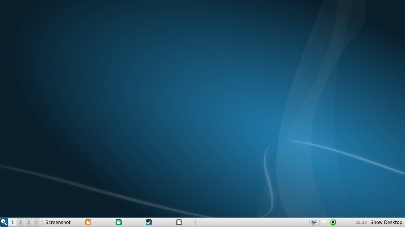
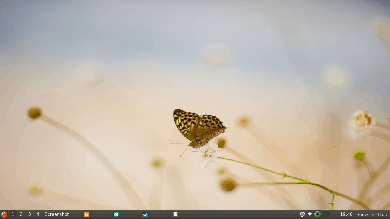
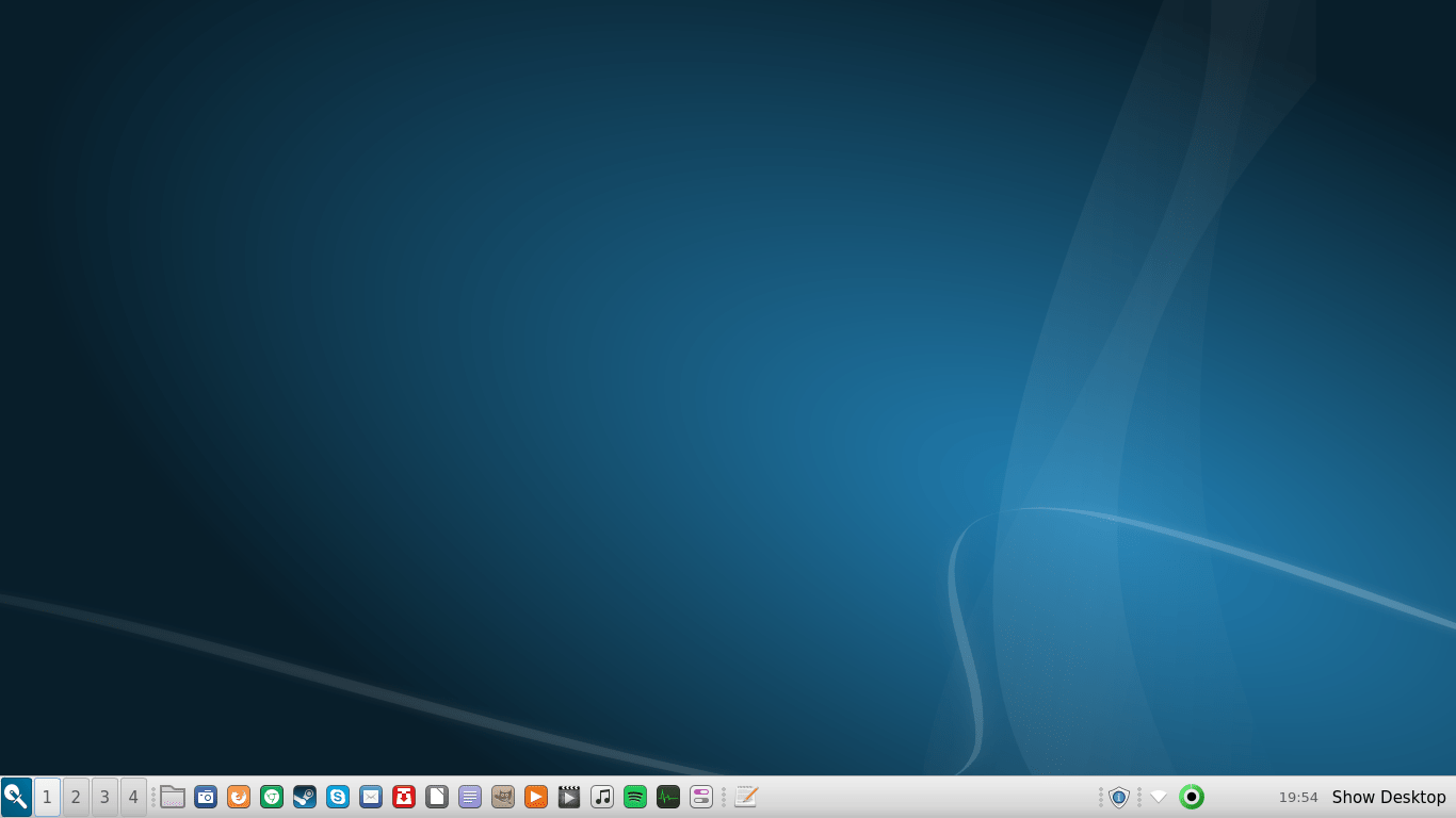
I installed the LXQt meta package using apt-get from the command line, logged out and then logged into the new session. The LXQt desktop is fairly spartan, with a simple wallpaper and a bottom panel. You have the menu, the workspaces, a quicklaunch placeholder, and a system area on the far right. Nothing too exciting or bling-blingy. One of the reasons for this is because it is meant to be the lightweight counterpart and/or alternative to Plasma, and it is built on the same foundation, using the Qt app framework.
LXQt feels a bit raw and unfinished, which it is, given its young age – and the fact it has been born out of wedlock of two other desktop environments. Compared to Plasma, the level of consistency isn’t very high. It isn’t the most intuitive setup, and it is geared for the more hardcore Linux user. This is typical of many less popular, more niche environments.
The list of preferences is longer than the list of installed applications. System settings are available through several channels, reminiscent of how Xfce was before it started consolidating its setup to a more newb-friendly layout. This may appeal to experienced users and those who seek control, but they will definitely deter others. Moreover, Plasma is also known for a notorious level of detail, but the workflow is much more intuitive.
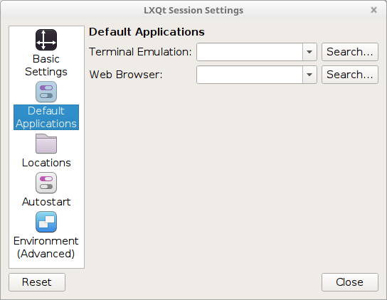
Overall though, I do not have too much to share at this point, as it was rather difficult for me to separate pure LXQt from pure Linux Mint. Unlike the neon experiment, I was using the new desktop inside a tweaked and polished system with all the programs and goodies that I needed. Therefore, let us explore the dark side.
Visual inconsistencies
Boy, there are many. This is not meant as a jibe, but after working with Plasma, which offers a fairly consistent and uniform experience, LXQt feels like an explosion of senses, and not necessarily in a good way.
The immediate eye glare is the bottom panel. Take a look at the virtual desktops. No.4 does not have a right margin, whereas the other three do, but no.1 also has a separate left margin, which also happens to be of a different color, unless it’s meant to indicate the active desktop. The background is also different, and the numbers are not centered.
The problem is even worse when you cast your eyes to the right. The system area comes with several icons, none of which follows any particular styling discipline. To be fair, this is only true for two of the icons, because I wasn’t able to see the other two at all. They were invisible against the panel, with the default theme.
Tooltips are also generated wherever your mouse pointer is, so they may partially or wholly overlap elements or the panel, which can be quite annoying. If you have OCD, this desktop will not help reduce your anxiety.
The quicklaunch area also needs a lot of rework and polish. I decided to start adding new shortcuts there, and the only way to achieve this is indeed drag-n-drop. The applications will be stacked with the newest entry to the right, so you need to think carefully how you add the icons, as you will then need to re-shuffle them. You cannot drag icons, you will need to right-click and then move them either to the left or right. With lots of shortcuts, this becomes a very tedious job.
Unfortunately, the placement is the least of your worries. For some reason, the icons were placed with a hefty margin of several hundred pixels around them, and very soon I had managed to run out of space in the panel, pushing the task manager completely out of the view. But then, most of my icons were also gone, and there was no way to scroll horizontally to get to them. Imagine a browser tab bar that has no arrows.
Half the added shortcut icons are missing, having pushed into oblivion somewhere on the right; this also made the system are collapse on itself, and the icons are now overlapping; there’s no way to get to the missing shortcuts, and you must fix this either by removing the extra shortcuts or by reducing the spacing of icons under task manager, even though this setting is supposed to affect only task manager icons and not the entire panel.
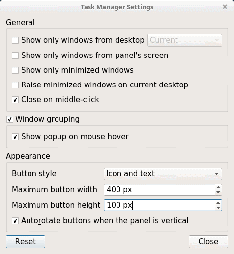
You will need to change the maximum button width to roughly the size of your icons (based on panel and icon height), which will lead to the expected result you normally see elsewhere.
The tedious work of sorting out shortcuts still remains, though.
Some of the icons were displayed as text only – and others as icons. I was not able to find any commonality to this behavior, so I assume this is a glitch. But then, there’s still more to be said about the panel.
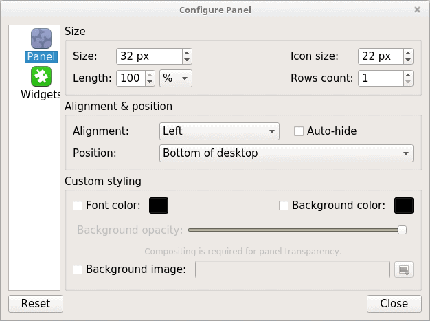
If you try to edit the panel, you will notice the configuration tool is non-resizable, and this includes the left-side pane, resulting in the word Widget being obscured by the area on the right. This isn’t really pretty. Might be a resolution or DPI issue. Or something.
Themes & icons
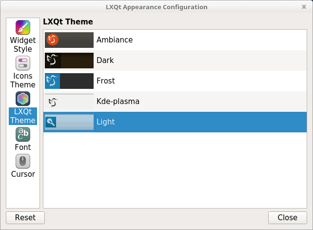
Management of themes and icons in LXQt is a bit cumbersome and frustrating, especially since there’s isn’t really one central place you can use to change the look & feel of the entire desktop. Seemingly, your one-stop shop is the LXQt Settings > Appearance. Here, you have the option to tweak widgets, icons, themes, fonts, and the mouse cursor.
I started playing with various themes, just to see how this affects the overall look & feel. The panel elements definitely changed, including subtle differences in position and size, and some of the themes actually did offer visible icons for volume and mounted icons, whereas others did not. The wallpaper also automatically changed – and the system overrode my selection of backgrounds.
Now here comes the hotstepper, if you change the icon theme globally, the icons in the quicklaunch and those in the task manager for open applications will end up using two different themes. This does not seem to have an immediate, obvious fix, so something must be hard-coded in the system.
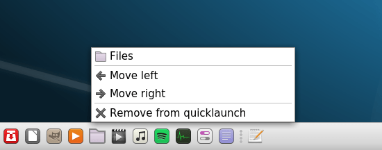
Notice the text editor icon in the quicklaunch (the right most one), and then, the icon for the same application in the task manager. The latter does not respect the system icon theme change.
Here it is, the so-called Triple Point Issue, or the Three Font Problem, depending whether you prefer thermodynamics jokes or references to popular fiction. Either way, this single screenshot shows no less than THREE different icon families used here. And we also have some inconsistency with the shortcuts, even if you ignore the rest. But there’s more.
This screenshot further emphasizes the issue with icon themes; the file manager does not use the new set, either.
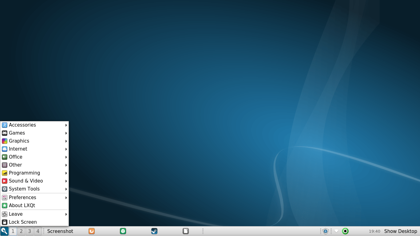
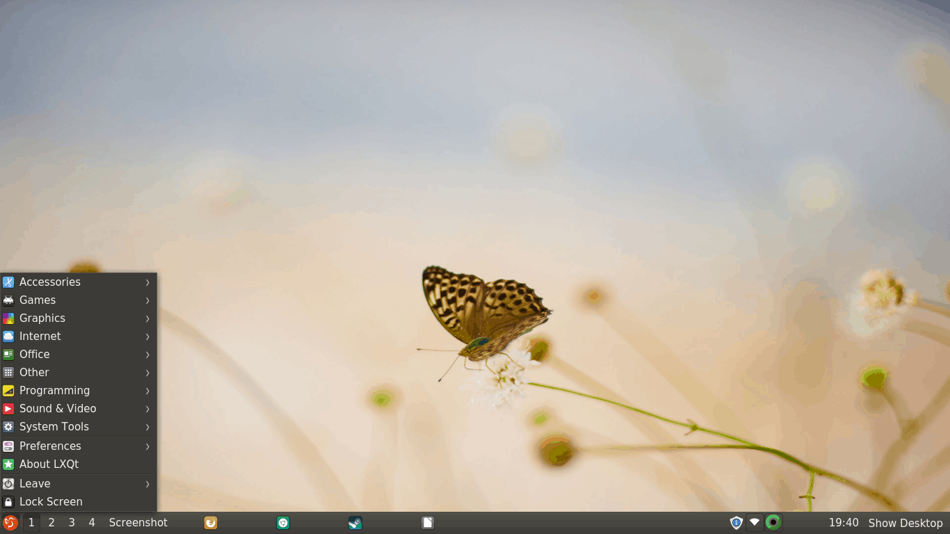
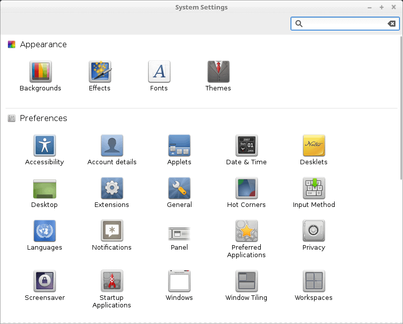
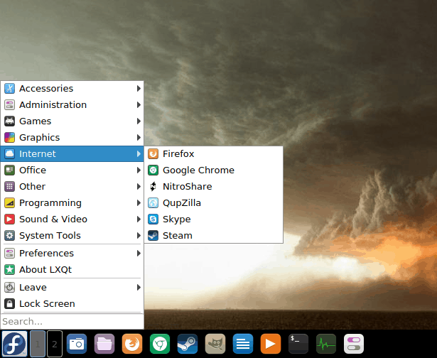
The system menu uses the Faenza icon set, which remains fixed, regardless what icon theme you choose. It is also hardcoded in the System Settings menu.
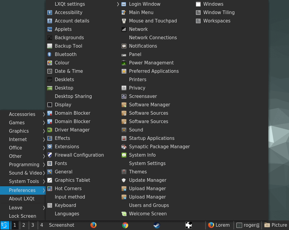
The system menu uses Faenza, no matter what you select; some of the entries do not have icons at all; on the functional side, there are way too many options and would-be duplicates.
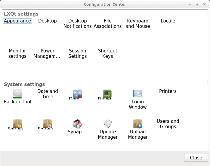
The LXQt Configuration Center, on the other hand, uses a mix of Faenza icons – and nothing at all, as the entries were badly scrambled up, with missing icons, overlapping text, partially obscured elements, and no consistency in placement or alignment, possibly due to bad DPI. Again, on the functional side, I am not sure why there should be System Settings in two separate places, nor why the system menu should have LXQt settings listed twice.
Last but not the least, the panel and the task manager also have a vertical misalignment. It isn’t huge, just 1-2 px at most, but the icons for open applications ride slightly higher. Pay attention to the settings icon (LXQt Settings), and once again, observe the inconsistency in the icon theme choice, as it is almost randomly respected in different cases.
Wallpaper
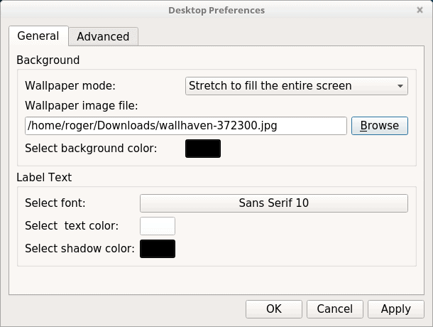
If you wish to change the wallpaper, it’s a manual game with no previews. Remember I said there’s no one central place to rule them all and in the desktop bind them? This is another windows slash menu where you can make font changes for your desktop.
Fonts
This remains the Pandora’s Box of Linux, and LXQt is no different from most other desktop environments. The default font selection is not good enough for prolonged use, with low contrast and poor clarity, much like Fedora with Gnome 3.
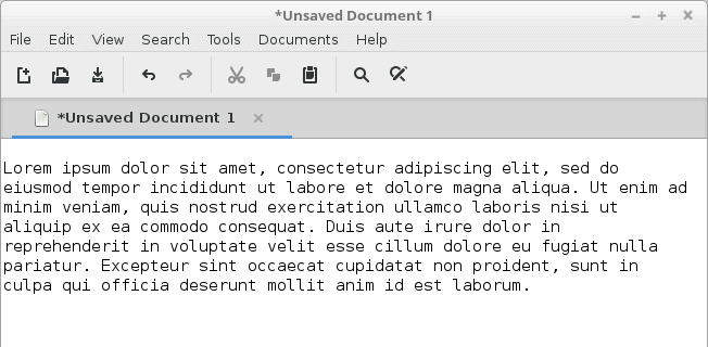
LXQt uses DejaVu, with anti-aliasing set to RGBA and hinting to slight. The default font looks thin and pale.
I spent a little bit of time playing with different font options, and none of them made any significant difference. I am not sure if the desktop environment or specific themes have hard-coded overrides, but this is definitely something that requires further attention.
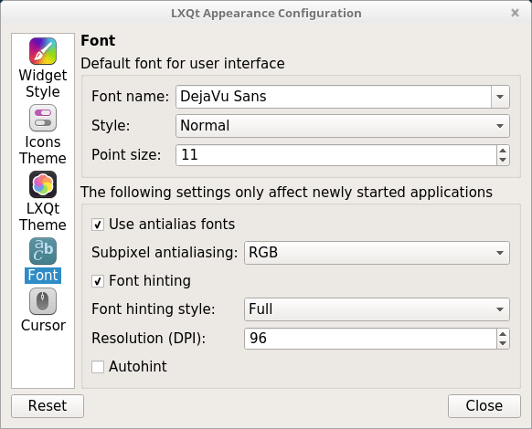
There were no visible changes in font clarity and crispness, regardless what anti-aliasing and hinting options were selected.
Other visual issues
If you resize windows, there will be no ‘live’ action. Only once you release the mouse cursor will the windows be redrawn, so I guess this has to do with compositing perhaps. Either way, it makes for a rather clunky experience.
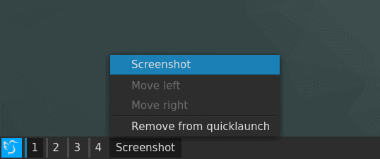
The screenshot tool is transparent, ever so slightly, and I was not able to find a way to tweak this. Again, some of the programs seemed to have a mind of their own, with distinctive theming that was different from the defaults.
I had not found a simple way to change the window decorations, and I believe this needs to be done through the Openbox configuration tool, which is yet another utility for tweaking the look & feel of the system.
Functional problems
Alas, the issues were not just restricted to how LXQt looked, but also how it behaved.
Touchpad
This was a really sore point, and it annoyed me no end. There is no way to actually configure your Touchpad in LXQt, and it did not respect or use the system setting I had configured in Mint Serena in the Cinnamon session. Searching online and going through the official bugzilla, I stumbled upon a rather sad thread explaining why certain options were added (or not), and there were quite a few outstanding bugs on this seemingly trivial, no-brainer issue. Furthermore, everyone was talking about switching to Kwin, and how it makes sense.
To make it all worse, the Touchpad was way, way too sensitive, so not only was I fighting ergonomics, I was also wrestling with basic functionality.
Volume control
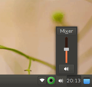
The slider did not affect the music playback in either Xplayer or VLC at all, so I believe LXQt is somehow dependent on the entire LXDE/LXQt app stack to work well, but this is not something you encounter in other desktop environments, and it’s not an acceptable outcome. Anyhow, I was not able to affect the level of audio in my programs, unless I did it manually in each one.
Quicklaunch
Some of the applications could not be added to the quicklaunch, and some, after being added, would not launch. For instance, LXQt Settings is one of the victims of the latter, and this is probably because it’s a functional group rather than a specific application, but then, why allow it to be added in the first place then?
Other niggles
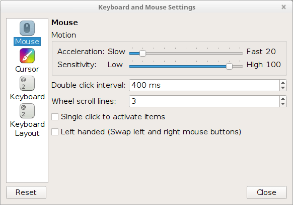
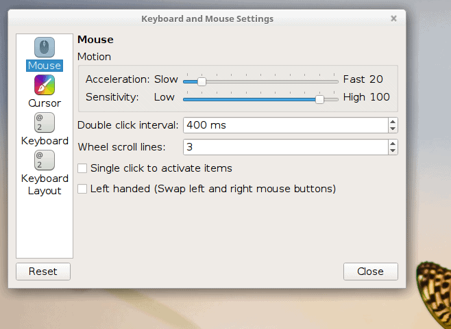
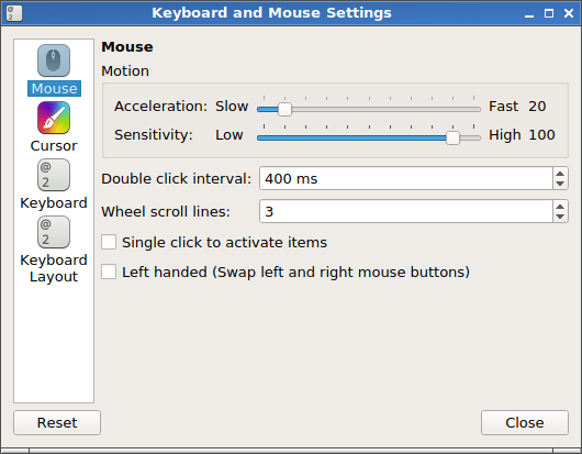
The mouse cursor setting exists in at least two places in the system. Some of the menus cannot be minimized, like for instance the keyboard & mouse settings menu.
Customization
I was having a very tough time sorting out and taming LXQt to my liking. I did not do this at all in my Plasma review, but I felt it was absolutely necessary here, as the defaults were just not usable. I was unable to consume the desktop in a fun way without significant modifications, and even then, the results were less than ideal, with many lingering, hard-coded problems and inconsistencies.
I also discovered that logging out of the session – and rebooting also yielded different results in terms of visual layout. You may label this a visual inconsistency, but I believe it falls in the functional category, as there’s no reason why desktop elements should remain cached after you log out of a running session. But this is probably a deeper discussion. The end result of this paragraph is, some of the icons did change to the new theme eventually, but some others had not, and others yet were still missing.
Wax on, wax off, log off, log on – does not help; a reboot is needed to make LXQt 0.10 fully purge and cleanse its charkas for best visual effect… maybe.
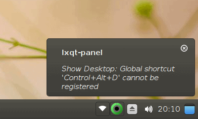
Likewise, the system area had healed itself of some of its woes, coming with an icon rather than text for Show desktop, and the missing applets were finally showing up, even though they were using their own individual styling, irrespective of the global settings. System area spacing remains an issue.
0.11 release
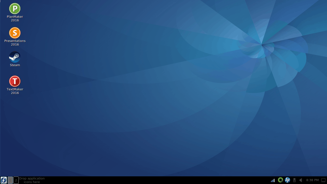
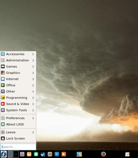
Now, let’s see what happened on Fedora with the latest and greatest LXQt. Anyhow, LXQt 0.11 does not differ too much from its predecessor. The desktop is simple, spartan, lean in detail, and still somewhat inconsistent. I had huge icons on the desktop, a barely visible quicklaunch text in the bottom panel, and the system area with a whole spectrum of colors.
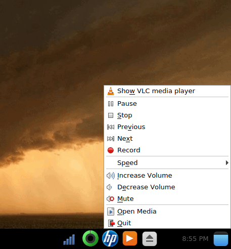
From a usability perspective, the new release is somewhat friendlier. For example, you do get a level of system integration when it comes to media playback. VLC icon was displayed in the system area, and I had the option to change tracks and control the volume. There were some other, functional issues, though (more later). Also, please ignore the visual side of things for the moment, we will get to that.
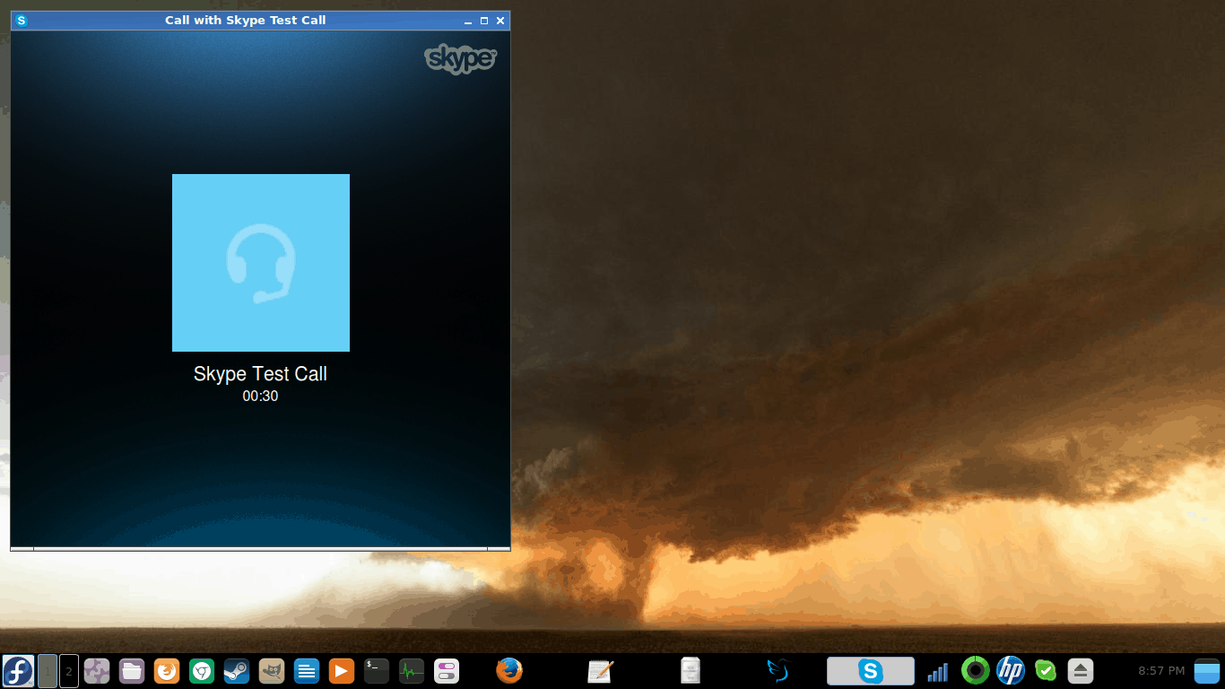
I also tested Skype, and it worked fine – you have the option to change the Audio backend, and while they are calibrated differently, they all provided reasonable functionality, and the changes were effective live.
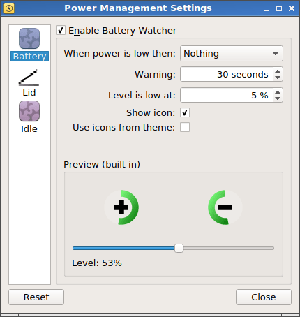
The power management side of things has slightly improved. You do not get any in-depth power profiles, but the basics are robust enough. You also have the option to use a theme icon, so this can help the visual element, but it is not a default setting. I tried this, and it did nothing. Moreover, the power icon displays only the percentage, but not the time left.
LXQt apps
I also decided to check how well the bundled stack of software behaves. All desktop environments come with their own set of programs, which are supposedly designed to work best, or at least, better than others in that particular setting. However, this rarely works in practice, because most of the successful and popular Linux programs are not tied into any one particular environment.
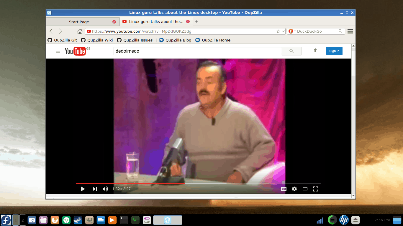
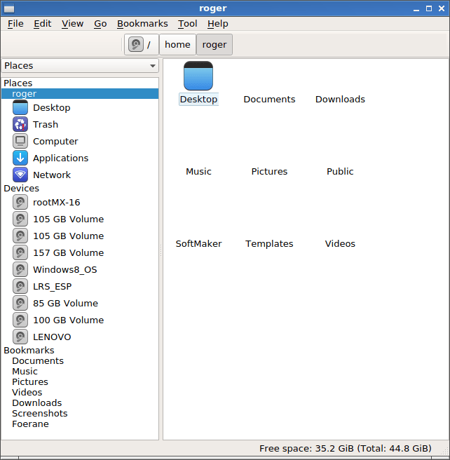
QupZilla seems like an okay browser, and it behaved reasonably well during my testing. On the other hand, PCmanFM file manager was struggling to display icons. Moreover, the left side pane requires some visual polish, and it feels like it’s vertically squashed. However, it did correctly import favorites used in Files, and it did not have any problems accessing network shares.
Visual bugs and other insects
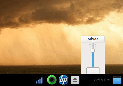
LXQt 0.11 does use more of the Plasma framework under the hood – which in an odd way reduces its distinctiveness margin, as the more it becomes like Plasma the less incentive there is for it to exist and be used. But let’s ignore this argument for a moment. Notice the system area. You have a Wireless icon from a typical Gnome hi-color set, the independent power icon from the LXQt set, the HPLIP icon, which is truly its own, then several Plasma-like icons, with a very bad color contrast. The clock is barely readable. Now, we have only just begun.
Adding new shortcuts works better than before, but only to a degree. You get Breeze icons, which is an odd choice, but that’s a subjective argument, and the spacing is saner, however the placement is still FIFO, and you must manually re-order icons one click at a time if you don’t like the arrangement. The shortcuts are of different sizes shapes and colors, not necessarily well suited for the default dark panel. The screenshot icon is missing art, probably because Spectacle is a new addition, and the graphics pack must be intended for KSnapshot.
The layout and size problem becomes even bigger once you launch applications and then minimize them. First, the apps open at full width and then get narrower as you launch additional programs, which can be a little clunky. Second, minimized apps have black text on black background, so there’s no indication what other programs you may have started. Third, this creates a visual gap, so it appears as if an active program is running at an arbitrary position in the task manager.
Themes & customization
I wanted to see how the whole desktop look & feel front has changed. It has, for the better, there’s definitely been improvement in this space, and LXQt 0.11 does offer more themes, and they are ever so slightly more refined than before. But only marginally so. The overall problem remains, with different icons, sizes, placement, and other little glitches. This time, though, you do have the option NOT to override user-defined wallpapers.
Changing themes, I hit the vanishing system area icons issue again, and with minimized apps in the task manager, it was looking rather odd. The screenshot tool finally had its rightful icon again, although it’s a generic pick. And there was again a mix of icon themes, with the applications in the task manager showing the generic set as opposed to the globally defined theme. The system area seems to have a mind of its own.
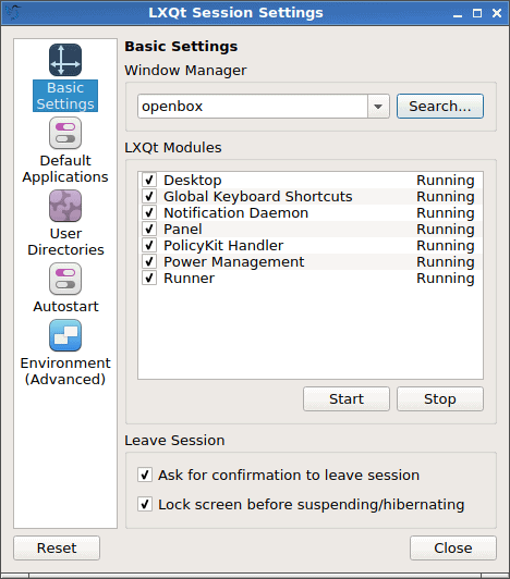
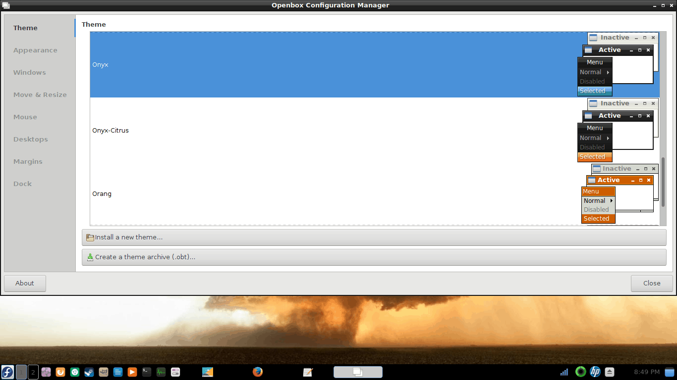
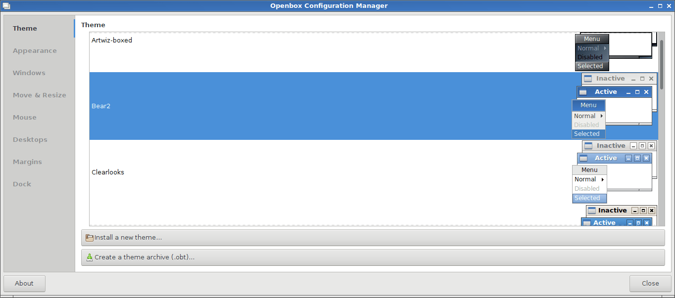
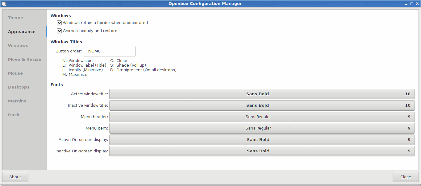
I was also interested in changing window decorations and tweaking individual bits and pieces of my selected theme. As it turns out, you need Openbox for this. Again, we have a mix and mash of everything, with Openbox and Kwin side by side, none fully realized or utilized.
The Openbox Configuration Manager comes with its own set of inconsistencies, theme and font wise, plus it offers additional tweaks that are not available through the standard LXQt Configuration Center. Some show up twice, and others are completely irrelevant.
On the bright side, some of the hidden menus are more nicely ordered and aligned than before, with fewer overlaps and clashes. However, I’m still not sure about the whole Openbox, KWin thingie. I know the technical differences, but are they really important or relevant to the average user?
More visual problems
And then, we have the Triple Problem again. This leads to a less-than-ideal, unpolished experience with users, and can diminish from the long-term relevance of LXQt as a lightweight alternative to bigger, beefier desktop environments.
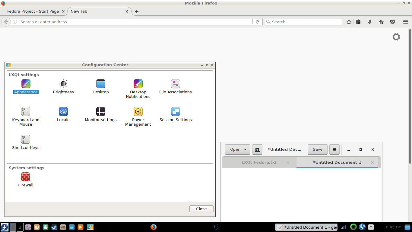
A Clash of Titans, I mean a clash of styles; we have multiple window decorations and icon themes used simultaneously, creating a disjointed view.
Functional papercuts – and sword slashes
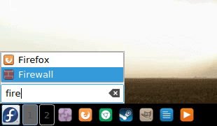
The overall usability has improved. The newer version is friendlier, but it still has a lot of ground to cover before it can be considered stable and mature for everyday use. The system menu does come with a built-in search functionality. However, the menu cannot be invoked with the Super key, and the search box does not clear after you close the menu, so the next time you launch it, it will still contain whatever string you’ve used previously.
As I’ve mentioned above, too many features and options show up in multiple locations multiple times. You can now control and change fonts through the Openbox Manager, too, so this is really odd. LXQt Configuration Center, Openbox Manager, desktop itself. All of this should go under a single umbrella and still remain usable. Plasma is a good example, if still a bit of an overkill. Anyhow, more font tweaks. But we will touch the fonts side of things in a jiffy.
Volume control remains an issue – Fn buttons did change the slider position in the mixer, but it did not affect the playback volume in any way. I had to manually do it, which means there’s still something missing in the backend, across the entire application space. And logically, I should not have to depend on any particular program set to be able to control the volume.
There is still no option to control the Touchpad, however, for some reason, the system was far less sensitive to my typing, so the level of intrusiveness was much lower. However, this seems to be pure chance.
Fontses, my precious
The Font Connection is still strong in this one. Overall, the Configuration Center is much cleaner now, and it comes with a more logical assortment of functions, but from the purely ergonomics perspective, the fonts are still too thin and too pale. I believe too many desktop environments and programs are designed with a very Web-like mindset. Now, online, you usually spend a little bit of time reading (minutes rather than hours), you can arbitrarily increase font size, you can also switch to a reading mode, which normally strips out any formatting, and you try all sorts of tricks to make text more visible. People do not have this luxury in the desktop environment, most of the time (except Plasma, which really gives you full control), and prolonged use can lead to fatigue. I’ve also noted this in online office suites, but this is a separate discussion for another time.
However, the presence of System settings is still baffling, as why would a desktop configuration center contain any system tools? And if one, why not all of them? For that matter, we have the duplicity of effort again, and the random scattering of functions, which creates a sense of hecticness and ultimately reduces productivity.
Relevance
All in all, LXQt is an interesting offering, but it is way too chaotic, way too jumbled to present a coherent, sustainable solution to the end user. However, this is expected from a young project, and all other, more mature desktop environments have had many years to grow and evolve and polish their overall look & feel, with even more funding and bigger teams. So judging them on equal basis is quite difficult, but it has to be done, because when someone install a new desktop environment, they probably expect the same behavior they know from familiar use cases.
And herein lies the big trap with LXQt. It is the over-arching relevance, especially when pitted against the likes of Xfce. It is hard to judge the merit of lightweight desktop environments on modern hardware, and my 2015 Lenovo G50 laptop, with an i3 processor and 8 GB of RAM is definitely not indicative of anything. It can handle all modern offerings with ease, and while there are some differences in responsiveness and battery life, it probably won’t tell us the whole story. Which is why we must look back.
My weakest system is a 2009 Asus Netbook, with a single, hyperthreaded Atom core and 1 GB of RAM, currently running Xubuntu 14.04 Trusty Tahr LTS image. This 7-year-old laptop works quite well with its existing operating system. Sure, you cannot expect blazing performance, and things take time. But overall, the results are more or less consistent with how things were with previous editions of Ubuntu and Xubuntu, and it still delivers an impressive user experience. Xfce offers a coherent and fairly consistent work environment.
This creates a difficult situation for LXQt. Yes, one may argue that any two desktop environments are unnecessary, and deep fragmentation is part of the Linux ecosystem. However, if we ignore the bigger picture and just focus on what LXQt does, it has to at least match Xfce to become a serious alternative. True, Xfce was an under-performer for a long time, and it took many releases before it finally reached a stable, mature and polished level. But in this race, LXQt will actually have to outpace competition in order to become a household item. Because if it reaches the Xfce (or any other desktop) maturity in 2-3 years at the current level, it will already be obsolete. This is not an enviable situation, especially when you add other considerations into it, like resources, money and adoption rate.
If I look at what LXQt 0.11 offers, it already uses portions of the KDE/Plasma framework, so perhaps therein lies the key to success. Rather than creating a new desktop bottom up, using parts of the Plasma desktop, it would make more sense to create a stripped down version of Plasma, more suitable for lower-end devices, top down.
Conclusion
LXQt feels like an experiment in thinking, tinkering and development, and there does not seem to be an ultimate goal with a clearly defined end state. The prolific and colorful origins, the co-existence of its root projects, and the multitude of technologies involved present an additional layer of complexity. Then, in between versions 0.10 and 0.11, there has been only a relatively small delta in terms of quality, functionality and user-friendliness.
Comparing the two, unfortunately, most of the visual bugs remain. Options are present in multiple locations, sometimes in more than one place. There isn’t a uniform method to control the system and its behavior, and some of the settings seem hard-coded in applications while others are ignored when you alter the defaults. Functionality, LXQt does not cooperate – or is not aware – well with non-LXQt software, if such a stack may or should be defined. The workflow is not very intuitive. There has been some progress, but not enough.
Like the old song goes, we got a long way to go and a short time to get there. At this point, I am not certain LXQt has enough oomph to weather the infancy problems and rise above the early development stage woes. This is a non-trivial effort, and mostly, it demands sharp focus and strict definitions on usability. Then again, I am not aware of any golden formulas or paradigms when it comes to UI design or user experience in Linux. Some practices are followed, but they are not enforced, definitely not across different desktop environments and applications, and some of the choices are purely development-driven. Which should not be.
It is worthy of an experiment and some rigorous testing, just to get the feel of what it does and how it works. However, LXQt is still not production ready, and it remains a niche offering for hardcore users and enthusiasts, who are interested in Qt first and foremost, rather than any wider populace of users, who just seek to fire and forget and enjoy their machines.
Well, I shall keep an eye and follow this project. I hope you enjoyed this long and possibly exhausting review. The quest for the Linux desktop perfection continues. See you.
[sharedaddy]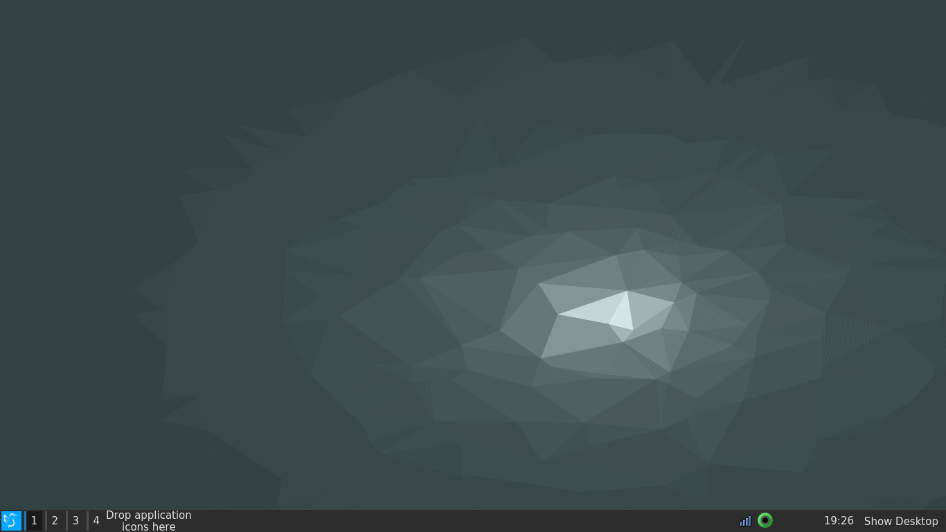









I think you are missing the point or at least my area of interest.
LXQT could very well be a perfect arm desktop as we move away from the Wintel area.