Plasma is KDE’s and therefore Netrunner’s desktop and workspace. I’ve explained what Plasma is and how to change it to your liking in the past. Unlike its competition KDE puts the user in charge of his or her desktop, and in the mobile age of technology, KDE should get an easy and pleasant experience for touch-input devices as well mouse pointing devices, specially when Windows 8 is coming out, and many people migrating from a Windows 8 PC will now have this feature.
This is where Homerun hits the scene, developed by Aurélien Gateau and Shaun Reich, whom contribute to Gwenview and Plasma respectively (among many other things), and sponsored by Blue Systems, it provides everything a touch interface needs, including the usual smooth animation found on mobile devices.
Before we get into Homerun we should first know how to install it, we’ve got that covered both in video and written form. Just run the following commands:
Add the PPA into your sources
sudo add-apt-repository ppa:blue-shell/homerun
And then install it:
sudo apt-get update && sudo apt-get install homerun
Homerun can be used in two different ways, as a menu replacement or as your desktop. To enable the former we just click in the cashew or right click on the desktop and select Add Widgets > Homerun. You can search for the term to find it faster, double click it and then drag it to where you want it to be.
To enable the latter we need to change the layout, doing so is as easy right clicking in the desktop and selecting Desktop Settings > Layout > Homerun. Instead of just appearing when you click the menu, it will replace Folder View and will become your main desktop.
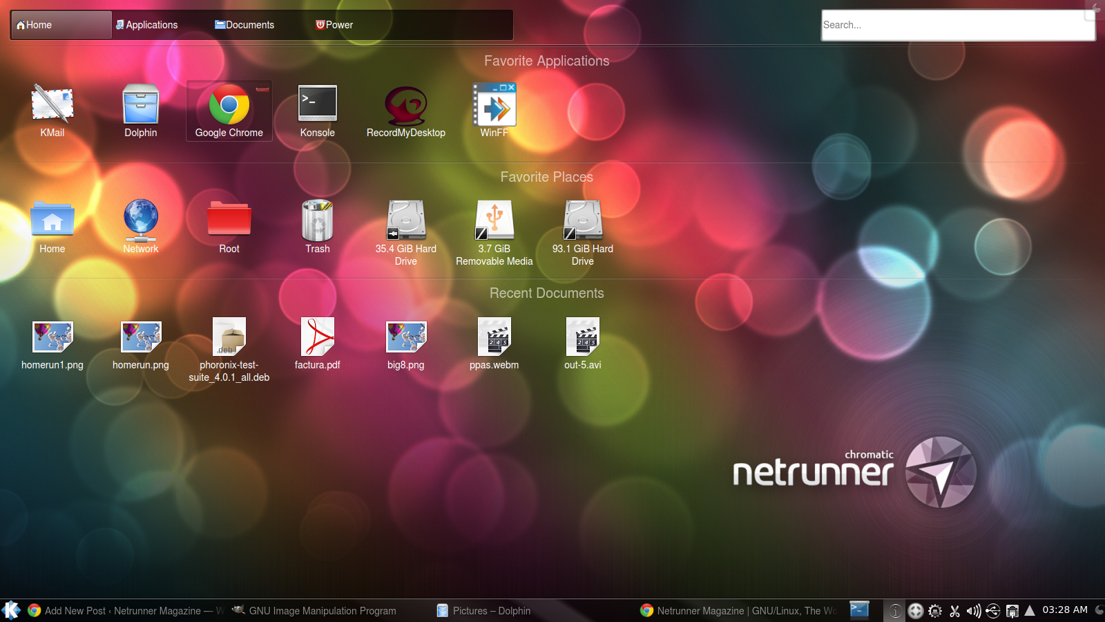
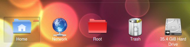
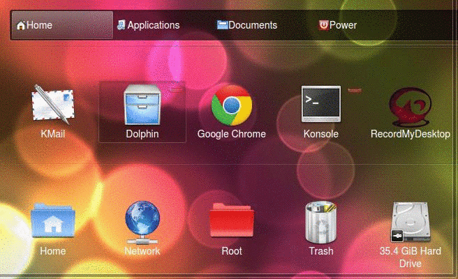
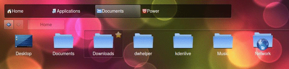
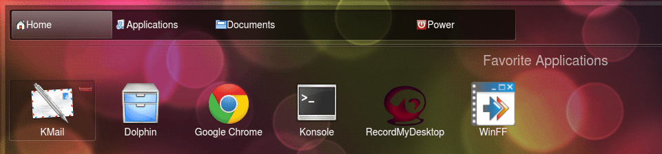
A simple yet complete interface with four tabs: Home, Applications, Documents and Power. The first tab shows our favorite applications, favorite places, recent documents as well as recent application and commands. If you hover over any of your favorite applications or places you can remove it by clicking it on the red minus button.
When tabs are switched Homerun uses the same animation all plasma tabs make use of, it’s pretty animation and is nice is a pleasing change from the regularly static non-animated applications (this is gradually changing though, this can be seen in some parts of Dolphin, but specially on Muon Discover), as it can be seen in the following gif:
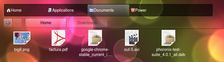
Clicking on any application has the expected result, clicking on documents however doesn’t. Instead of opening the folder in Dolphin (or the default file system browser) it opens inside Homerun itself, it’s not until we get to the document we’re looking for that Homerun opens an external application.
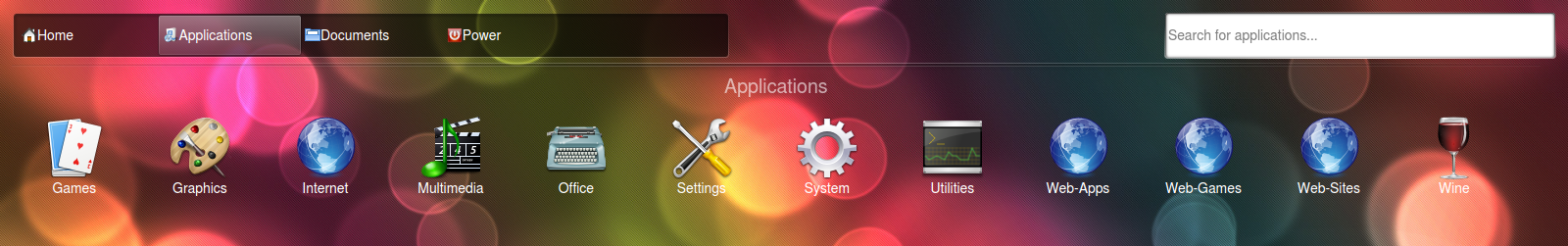
In the second tab all the currently installed apps are found arranged by categories, as it can be seen in the first animated gif. Browsing categories is analogue to browsing folders.
If we launch an app constantly, perhaps it can become a bothersome experience to search or go find it in the application tab every time, so with a simple click we can add it to our favorites. Just hit the star icon while hovering, once again the action is blessed with a beautiful animation

The third tab displays your home folder (but it reminds the last place you were on). As mentioned before, folders open inside homerun, one of the things users will find pleasing here as well as in the Applications tab is the presence of the breadcrumb accompanied by a back and forward buttons to make navigating folders and categories as comfortable as possible.
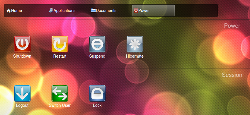
Finally, from the fourth tab labeled Power you can manage your session: logging out, switching user or locking, and turn off, reboot or put to sleep your computer.
Is Homerun better or worse than its competition?
It should be noted that Homerun is still in early development, but even in its current state it greatly outdoes Apple’s offering, which is nothing more than a grid of icons similar to the iPhone’s grid of icons, there’s little contest here.
On the other hand, Windows 8 tries to offer a similar touch-friendly “launcher”, with its new style Metro. A new beautiful style that reminds me of something taken out from a motel wall in the 60’s
Whether you like its look or not is a subjective issue, what’s not subjective is how broken the experience is. Going from something scarily similar to the former picture to the regular Windows’ desktop feels confusing to any user. It wouldn’t be so bad if you only landed on the Desktop or Metro when you wish, but sadly from Microsoft that isn’t the case, you will be constantly jumping from two completely different unrelated experiences. Try to open an image from the file manager? Oops, you’re in Metro. Try to open any app that isn’t pinned on the Desktop? Metro. You want to tweak some settings while on metro? Oops, you’re now in the desktop.
If you happen to dislike Homerun in Netrunner (for example, if you don’t feel comfortable using it with a mouse, or in a big screen) you can simply disable it and replace it by another layout. Moreover, if you like it, you don’t face the nightmare of what seems like Alien software in your operating system. Instead Homerun looks right at home in the context of Plasma and KDE: the style is the same, it follows your Plasma theme, it matches your Qt theme, it uses the same icons, it opens the application you expect to open, it can be used as a menu, or as your desktop, it has big targets, yet it’s still comfortable to use with a mouse, it shows you places, recent documents, not just a grid of glorified icons. It’s just a richer experience. It’s a home run for KDE and while its still the first inning, it represent a bold step into supporting a touch friendly interface for the future users of the platform.
Here is a video showing Homerun in action:


Thanks for an interesting article. I think I will give it a try for a while.
I’ve only tested it for a few minutes, and I already love it. I rarely see my desktop for open windows, and this gives me instant access to a great SAL enabled “desktop”.
One small beauty spot is that I couldn’t find a way to rearrange my favourites. Maybe it’s there but d’n’d with or without modifier keys doesn’t work.
Call me old fashioned, but I really like the classic menu. It’s easy to find what I want, but I’ll give KDE credit for giving us a number of choices, unlike certain other desktops.
Can you tell me what your plasma theme is, it’s really nice!
I don’t understand why kde doesn’t have options to change task manager’s font color, they’re really hard to see.