The first thing a user is expected to interact with, at least in any operating system with a graphical interface, is the main menu. Yet, outside of touch devices, there’s very little consistency across platforms. This suggests we haven’t yet figured out how to design a main menu for PCs in a way that satisfies most. Why is it so hard?
What’s a main menu for?
Before designing anything we got to be sure what is purpose is. The purpose of a main menu may seem obvious: to launch applications. This, however, is too simplistic. A slightly better way of picturing it is somewhat along the lines of to find and launch applications (surely main menus now offer more than this, including the classics shutting down or rebooting your computer). Our main problem is how the user is supposed to find applications, the second part is comparatively trivial (click an icon, the application launches). There are many general approaches, most with pros and cons.
Old-school
If you’re searching for an application, you may not know it’s name, or even the application itself, what you do know is what you want to do. By breaking applications into categories users can find applications regardless of any previous knowledge. It also lends itself to discoverability, it’s easy for the user to be curious and check the applications available on each category, since he has a grasp of what the applications are for.
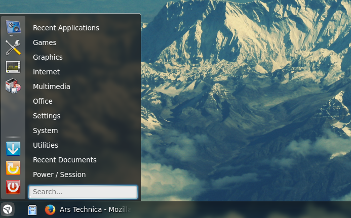
The problem with this design is it forces users to go through the categories each time. Yet categories are mostly useful only when a user is yet to familiarize with the available software, it’s a nuisance latter on. Even if favorites or modern search are offered, it’s clear these menus are designed with those features as secondary.
Favorites-centric
This design focuses on giving easy access to favorite applications. It usually consists of a simple list with all applications marked as favorite. The advantage of this method its efficiency once the user knows what he wants. He doesn’t need to browse menus or search for stuff. A couple of clicks will suffice.
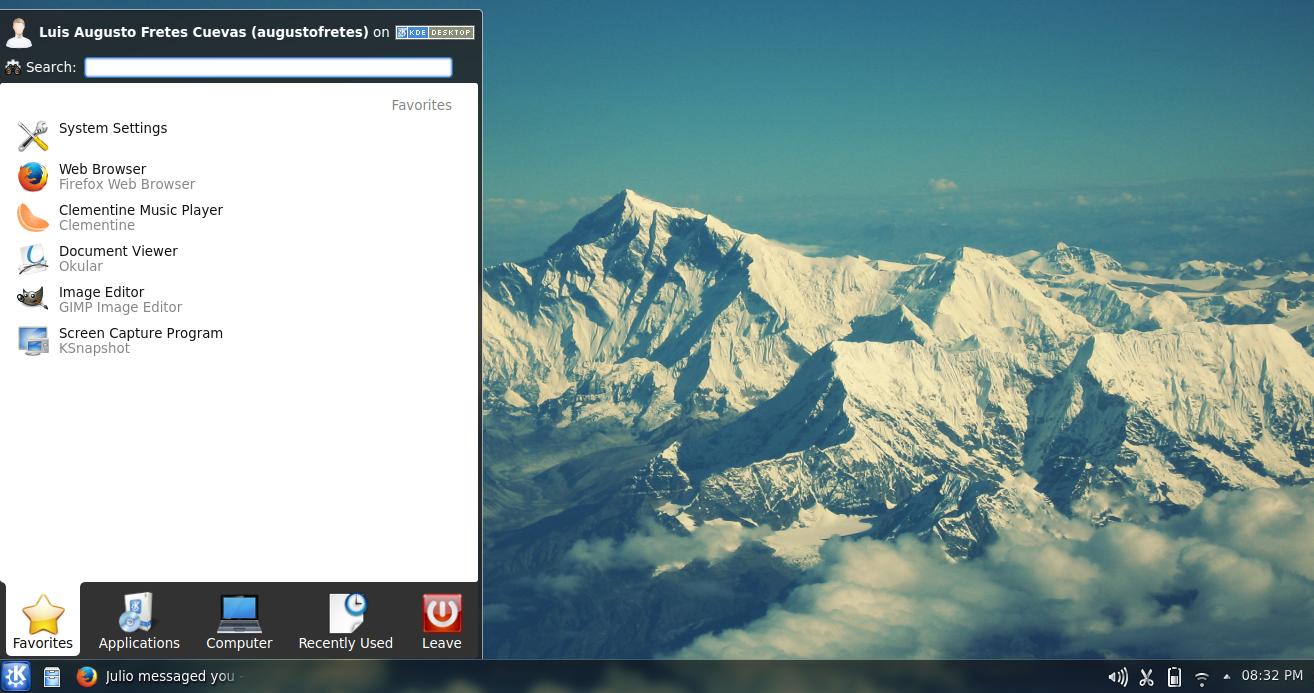
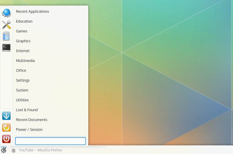
On the flip side, if the user is not familiarized with the applications finding and testing them is rather troublesome. For example, Kickoff is absurdly slow if you want to find some sort of application using categories, the animations are slow, going from one category to other requires at least 3 clicks, it’s absolutely suboptimal. This hurts discoverability and therefore disproportionally hurts new users.
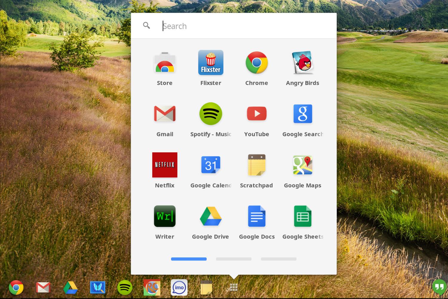
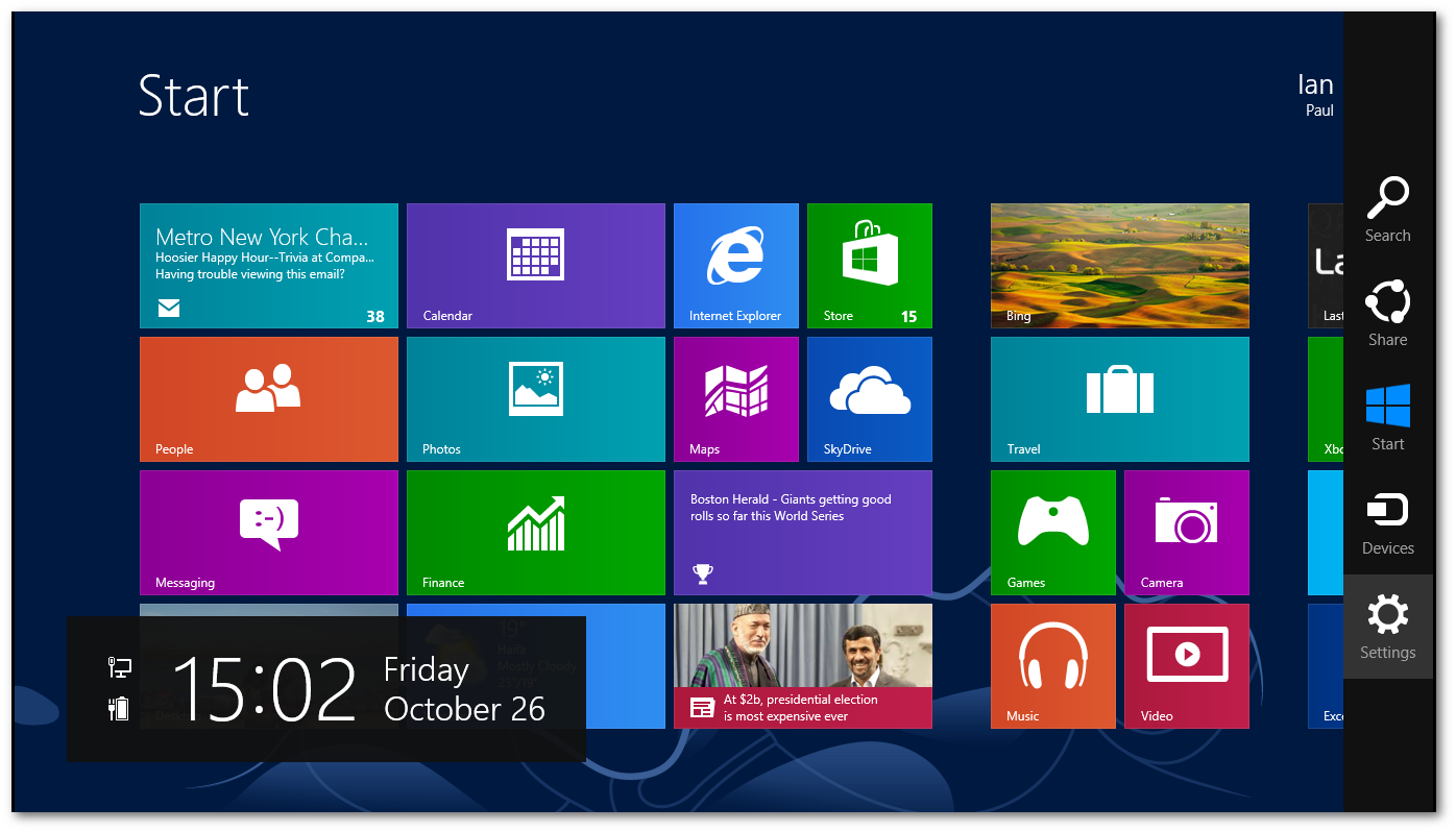
Grid of icons
This is the style from touch devices imported to PCs. I don’t think this method has any redeeming qualities. It merely transports an interface that works well with touch input to a system in which that input is almost non-existent or merely gimmicky. It doesn’t provide fast access to favorites by itself, it doesn’t provide any sort of discoverability and it looks cluttered.
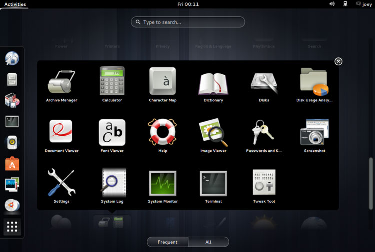
True, this method is usually complemented with a dock, which serves as your favorites section, but since it doesn’t provide any advantage over other styles, dock or not, it’s not worth using it (you can have a dock and a decent main menu).
Search oriented
As it should be clear by its “name”, this is the kind of menu that is designed with searching as it primary function. This particular style has many strengths. The user doesn’t need to know the name of any application because all kinda metadata can be indexed, a user may search for music and searching can bring the music player or the music editor among other music-related programs or content.
The main disadvantage of this style is it loses on discoverability because it doesn’t offer a way to browse through the catalog (except by guessing). It also requires, without further extension, to type every time the user wants to open a program.
Ridiculous
Mix the worst from the grid of icons, old-school, favorites-centric styles and you get the following:
A mess which isn’t good at anything. It’s not a good favorites menu, it’s not good for browsing through your entire catalog of applications, it hurts new users and is clearly designed for an input that is not the main input on PCs. Being as bad as it is it shouldn’t come as a surprise Microsoft is entirely ditching it for its next version of Windows.
KDE has the best two menus out there
Since none of these approaches is perfect some developers have tried to mix them up to obtain the best of each world. Netrunner’s choice is pretty solid, it has a favorites section and offers search, but favorites feel relegated to a corner. Kickoff on the other hand is great for searching and using favorites, but browsing through your catalog is not. Kickoff and Kicker are actually pretty close to the sweet spot. Especially in their most recent incarnations on Plasma 5.
The changes on their new versions may seem purely superficial, but the “start typing to search” on Kickoff is a major improvement or how searching now works on Kicker. Browsing through menus with Kickoff is horrible. Can this be fixed? The major idiosyncrasy of its design is to put the tabs at the bottom. Why? I’m sure the reasoning goes “that’s closer to where the pointer is when you open it”. I’ve never considered this argument good at all.
To start with, then my favorite applications should be listed as an inverse list that goes from first favorite on the bottom to the last one on top, then the content inside those tabs should be at the bottom and not the top. Then the same should be true of every other plasma widget or icon on the system tray, Klipper should show my latest copied text at the bottom, my active WiFi connection should be at the bottom too with available connections ordered from bottom to top by signal strength, and on and on.
Truth to be told, is pretty universal that humans read from top to bottom and in western cultures from left to right. So those tabs are in fact the last thing any user reads the first time they open Kickoff. I think putting them at the bottom isn’t a good decision.
If the tabs were put on the left side of the menu (in the form of text or icons) it seems like they should be able to implement old-school navigation on Kickoff without compromising the other parts of it. In fact, Kicker looks pretty close to what I have in mind:
Just instead of showing your favorite applications on the left, it could show the sections of Kickoff. Homerun’s kicker compromises favorites and Kickoff compromises browsing, by mixing them, maybe we could get a menu that doesn’t compromise in any front.
[sharedaddy]

What do you think of the Cinnamon menu? Category, search, a favourite bar and esthetic imho. But while I love it, I’m curious as to what you would find lacking =)
Eons
It flatters me that you are curious about my opinion :). I think Cinamon’s menu is pretty good. What I found lacking about it is the same I found lacking regarding Kicker (or any modern “old-school menu”). In essence, both have the same design, the differences are just a bit padding and that Cinamon developers chose to always display the second column, while Kicker only shows it when you hover over a category.
https://dl.dropboxusercontent.com/u/41325853/menus.png
I personally think Kicker’s approach is better, Cinamon’s menu can look cluttered because of this choice, moreover, I think it has a bit too much white space.
However, as I said, I think it’s a pretty good menu too.
Cheers, Luis.
vaya un mexicano metido en netrunner, genial
yo solo pasaba por acá pero vi el tema y como ya estuve buscando por mi cuenta hace algun tiempo pero sin resultados ¿cómo puedo hacer para que no muestre “Recent Documents” en el menu?
al igual que indicar que folders no quisiera “indizar”
saludos cordiales.
i just installed the latestest Netrunner and i really like the start memu.
it’s clear and easy to use.
the normal kde menu is awkward to use and requires more clicks to navigate through the choices.