Three decades ago, StarDivision, the ancestor of LibreOffice and OpenOffice, was designed as an intermediate desktop publisher. However, many LibreOffice improvements are designed for users who insist on using it like a typewriter and entering manual formatting. Unofficially, I have been told that LibreOffice developers feel that, since manual formatting is the way most people use it, development for people who want advanced typography is a low priority. Finally, however, in the 5.3 release, LibreOffice has given advanced users a major feature: the ability to add advanced features automatically — a feature that, after almost a century and a half, gives home typists the ability to do advanced typesetting.
That sounds like an exaggeration, so let me explain. Typewriters were a major advance over handwriting, but still fell short of producing copy that was as polished as what a printing shop could do. To add bold on most typewriters, a typist had to backspace and type over the same letters again, often blurring the letters. Adding italics was even worse, because they could only be indicated by the old copy editing notation of underlining.
Word processors were a significant improvement over typewriters, but still generally fall short of complete professionalism. For instance, Bold and italic were available with a few clicks. However, far too many word processors continue to manufacture their own small capitals, the letters used to improve the look of several upper case letters in a row — and, often, the result was hideous.
If a typist wanted other advanced features, such as old style figures in which each number has its own baseline, or ligatures, the single characters that replace awkward letter combinations such as ff or tt, the best they could hope for was to insert them manually from a Special Character dialog, squinting at the rows and rows of non-standard English characters, or else memorizing the Unicode for characters they often used. Often, users can’t be bothered — and who can blame them?

True small caps vs. the small caps manufactured by LibreOffice. As you can see, the manufactured ones are a clumsy makeshift
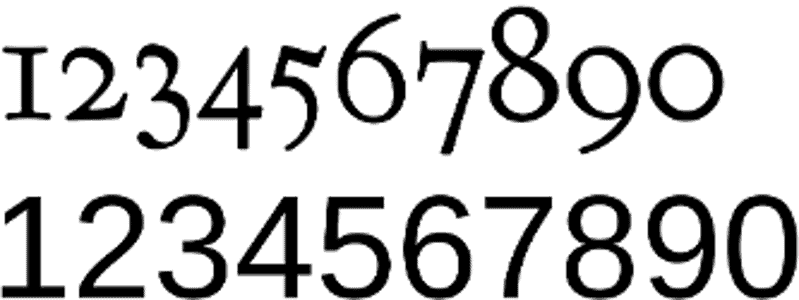
Above: Old style figures. Below: Proportional or Ranging figures.
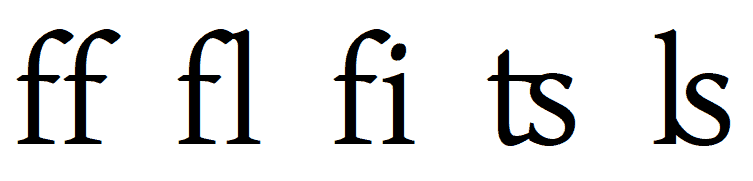
Ligatures replace two letters with awkward spacing, such as the first and third pairs here with a single character, such as the second, third, and fourth. The ligatures available vary with the font.
From the first, LibreOffice and its ancestors have had a slightly higher standard of professionalism. In particular, it can be configured so that two en dashes automatically become an em dash, the figure they have substituted for since the days of the typewriter. Similarly, LibreOffice allows manual line divisions and hyphenation so that users can, if they care to make the effort, create a fully Justified line (one which takes up all the space between the left and right margin) without the extra spacing between characters or words that disfigures Justified lines in more word processors.
However, for other professional touches like old style figures or ligatures, LibreOffice has been no more convenient that the average word processor. A few years ago, the Typography Toolbar improved the adding of advanced typographical touches, but only for fonts that were Graphite-enabled.
Graphite is a so-called smart font feature that adds advanced typographical features automatically when a font supports them, similar to Uniscribe and DirectWrite on Windows. It was developed by SIL International, a missionary organization that specializes in delivering texts in minority languages. As well as Graphite, SIL is responsible for the SIL Font License, the standard license today for free-licensed fonts, as well a variety of free fonts, such as Gentium, Doulos, and Charis.
Unfortunately, Graphite never really caught on, and only a handful of fonts have ever supported it. Unless users wanted to use the same fonts over and over again, it was a limited solution, since after a couple of years it became clear that it was unlikely to ever be widely supported, especially since it was used almost entirely for free-licensed fonts.
Enter HarfBuzz
What has changed in LibreOffice 5.3 is the introduction of the new font-rendering engine HarfBuzz. HarfBuzz has its shortcomings, such as a lack of support for Type 1 or Postscript fonts that means that designers with Type 1 fonts either have to buy new ones or else convert them using FontForge. However, in support for advanced typography features, HarfBuzz is pure gold.
Basically, if an Open Type font has advanced typographical features, LibreOffice 5.3 will use them without any user intervention and regardless of the font file format Not all fonts have exactly the same features — for example, different sets of ligatures are especially common — but, with LibreOffice 5.3, the situation is as good as anyone can hope it to get, and Graphite is essentially obsolete.
If anything, the challenge is to not use advanced features. You might, for example, prefer not to use old style figures in a table or a spreadsheet cell, where they can be hard to read. As well, at times, the use of some features such as small capitals, may not be automatic.
Fortunately, a workaround exists. In LibreOffice 5.3, you can add the markup developed for the same purpose in X?TeX. This markup can be entered on the Font tab for characters, paragraphs, and their styles. The markup is poorly documented in LibreOffice — for example, what are the differences between Mark Positioning and Mark-to-Mark Positioning for diacritical marks? — but a little experimenting will reveal the differences if a feature matters to you.
Typographical markup is entered after the name of a font, with no extra spaces. It is followed by a value, usually a 1 to indicate that the feature is turned on. Occasionally, other values can be entered, such as On for regular kerning, or Uppercase for kerning for combinations of capital letters.
Some useful markup includes:
:smcp=1 (converts uppercase letters to small capitals)
:liga=1 (applies standard ligatures)
:pnum=1 (converts old style figures to proportional figures)
:onum=1 (converts proportional figures to old style figures)
:frac=1 (converts fractions to smaller fractions with a diagonal line)
:frac=2 (converts fractions to small nut fractions with a horizontal line)
:mark=MarkToBase (adds diacritical marks)
A full list of available markup is available online.
New Opportunities
The advantages of this new feature cannot be exaggerated. LibreOffice copy is already being used directly for book layout, especially among technical publishers, but now the final professional touches no longer have to be added manually, which saves time. And for those who use multiple languages, accents and diacriticals can be positioned as preferred.
LibreOffice is one of the first free software applications to support this features. However, HarfBarf is spreading, and it won’t be the last. Meanwhile, with LibreOffice 5.3, the average user can now produce copy that is almost indistinguishable from that released by professional publishers — assuming, of course, that they make the effort to explore and set up the necessary features. After a century and a half, this advance seems long overdue.
[sharedaddy]

I have never read such a valuable and information-packed tutorial in so few words. And disguised as an “article”, at that.
Thank you.
Found out that this guy has a really good book on libreoffice at lulu, just ordered it.
Poetry has so many benefits for kids. It is not only a great medium for rendering information
but children also find poems very delightful. Poetry recitation and memorising is a fun activity that you can
engage your kid in. Let’s take a look at some famous, funny and rhyming poems for kids. Along with that, we shall
discuss how you can select a poem and teach your kid to recite it.